| 文件 | 最后提交记录 | 最后更新时间 |
|---|---|---|
docs: separate Component API docs from shared Kit guides (#3006) ## Summary Component API pages currently live inside the shared Kit documentation. Move their English and Chinese sources and canonical URLs to `/component/*` and `/zh-CN/component/*`, with independent collections, sidebars and Markdown endpoints. Keep shared design, coding and future GPUI guides under `/docs`. Set the primary navigation to Docs → Component → Base → Shell → App Stories, with the corresponding Chinese navigation. Update homepage links, component demo routing, cross-references, sitemap and LLM indexes. Old component HTML addresses redirect to the new pages; old Markdown endpoints remain readable and advertise the canonical URLs. Most changed files are unchanged component documents moved to the new directory. ## Test Plan - [x] Website production build with Pagefind completes. - [x] `bun run test:seo`: all 11 checks pass, including every component page's canonical/legacy HTML and Markdown URLs, shared guide locations, separate sidebars, cross-links and navigation order. - [x] `git diff --check`. Browser automation could not initialize in the local runtime; validation covers the built pages and routes. Deployment is not part of this PR. --------- Co-authored-by: Codex <codex@openai.com> | 1 个月前 | |
dialog: Support configurable entrance animations (#3405) ## Description Dialogs always slide from the window top to their resting position while fading in. When a dialog rests low in a tall window, it crosses much of the window before settling. Add a shared `DialogEntrance` API so applications can choose the entrance for both `Dialog` and `AlertDialog`: ```rust dialog.entrance(DialogEntrance::FadeSlide) alert.entrance(DialogEntrance::Fade) ``` | Entrance | Behavior | | --- | --- | | `SlideDown` (default) | Existing slide from the window top with its original timing and easing. | | `Fade` | Fade in at the final position without movement. | | `FadeSlide` | Fade in with short downward travel from above the resolved resting position. | | `None` | Display the surface and backdrop immediately. | `Fade` and `FadeSlide` use the theme's normal duration and enter easing. `FadeSlide` uses the theme's short motion distance and applies travel after window-boundary positioning, so a dialog clamped upwards still moves relative to its actual resting position. Travel is shortened when there is insufficient space above the surface, and pointer hit testing follows the moving surface. Reduced motion immediately displays the final state for every option. A zero theme duration also skips the fade entrances. Surface opacity, shadows, and the backdrop use the same entrance timing. Closing remains immediate. The Dialog story exposes all four choices under Options → Entrance. Dialog and AlertDialog documentation is updated in English and Chinese. ## Public API ### gpui-component - `#[non_exhaustive] pub enum dialog::DialogEntrance { SlideDown, Fade, FadeSlide, None }` — Select the shared entrance presentation. Implements `Clone`, `Copy`, `Debug`, `Default`, `PartialEq`, `Eq`, `Serialize`, and `Deserialize`. - `DialogEntrance::SlideDown` — Default; preserve the existing slide and fade entrance. - `DialogEntrance::Fade` — Fade at the final position without movement. - `DialogEntrance::FadeSlide` — Fade with bounded, theme-defined downward travel. - `DialogEntrance::None` — Immediately show the surface and backdrop. - `Dialog::entrance(self, entrance: DialogEntrance) -> Self` — Choose the dialog entrance. - `AlertDialog::entrance(self, entrance: DialogEntrance) -> Self` — Apply the same entrance policy to an alert dialog. ## Breaking Changes None for existing consumers. The API is additive and `SlideDown` preserves the existing default behavior. ## Validation - `cargo test -p gpui-component --lib dialog -- --nocapture` — 17 passed, covering resolved-boundary travel, intermediate positions, top-edge limits, pointer hit testing, builder defaults, AlertDialog forwarding, reduced motion, immediate keyboard dismissal, and zero theme duration. - `cargo check -p gpui-component-story` — passed. - `cargo clippy -p gpui-component -p gpui-component-story --all-targets -- --deny warnings` — passed. - `cargo fmt --all --check` and `git diff --check` — passed. Implementation, tests, and documentation were generated with AI assistance. The story was compile-checked; its animations were not manually compared across platforms. --------- Co-authored-by: xxww0098 <shefkie1957@gmail.com> Co-authored-by: Jason Lee <huacnlee@gmail.com> | 13 天前 | |
docs: separate Component API docs from shared Kit guides (#3006) ## Summary Component API pages currently live inside the shared Kit documentation. Move their English and Chinese sources and canonical URLs to `/component/*` and `/zh-CN/component/*`, with independent collections, sidebars and Markdown endpoints. Keep shared design, coding and future GPUI guides under `/docs`. Set the primary navigation to Docs → Component → Base → Shell → App Stories, with the corresponding Chinese navigation. Update homepage links, component demo routing, cross-references, sitemap and LLM indexes. Old component HTML addresses redirect to the new pages; old Markdown endpoints remain readable and advertise the canonical URLs. Most changed files are unchanged component documents moved to the new directory. ## Test Plan - [x] Website production build with Pagefind completes. - [x] `bun run test:seo`: all 11 checks pass, including every component page's canonical/legacy HTML and Markdown URLs, shared guide locations, separate sidebars, cross-links and navigation order. - [x] `git diff --check`. Browser automation could not initialize in the local runtime; validation covers the built pages and routes. Deployment is not part of this PR. --------- Co-authored-by: Codex <codex@openai.com> | 1 个月前 | |
attachment: Adopt the composer design with built-in remove, retry and progress (#3195) ## Summary The `Attachment` family becomes the composer attachment of the Longbridge design: the card geometry, the status treatment and the controls every composer used to wrap by hand are now the component's defaults, verified against the design board and rendered headlessly at each step. `AttachmentGroup` also learns to fade its edges and to scroll through a caller's handle, which is what a composer row needs. ## Changes - **Group scrolling** — `AttachmentGroup::track_scroll(&ScrollHandle)` lets the application drive the row (paging buttons, "scroll to newest"), and `with_edge_fade(color)` draws a short gradient at an edge only while attachments continue past it, with a 200 ms transition. - **Image rounding** — gpui clips rectangularly, so a media image never got the slot's corner radius and poked out of the card's rounded border; the image now carries the radius itself, including a caller's `.rounded()` refinement. The status scrim does the same. - **Composer geometry as defaults** — a `Medium` chip is 56 px tall, 232 px wide once it carries content, with a 38 px media box, 13 px title, `radius.lg` corners and a full-strength destructive border when failed; the other named sizes scale the same geometry. A vertical attachment without content is an image tile: a square the media fills flush with the border, its corners one border width tighter than the card's. - **Status drawn by the slots** — an icon slot shows a spinner (primary) while in progress and the alert glyph once failed; an image keeps its colors and takes a scrim instead: 35 % with a white spinner while in progress, 55 % with the retry control once failed. A failed attachment that offers no retry reads as a rejection and shows the ban glyph. - **Built-in controls** — `on_remove` rides a small surface-colored disc with a hairline border on the card's upper trailing corner (hover on desktop, always on touch; the card reserves the overhang so rows stay aligned). `on_retry` renders a round button over a failed image or a localized "Retry" link after the typed description. `progress(percent)` turns the spinner into a determinate ring (`ProgressCircle`), draws a 2 px bar along a chip's bottom edge and appends "· 62 %" to the description. The bar is a filled path whose ends trace the inner corner arcs, since gpui clips rectangularly and a rectangle could not hug the rounded corners. `tooltip(text)` shows the failure reason on hover. All key their state on `id(...)`. - **Media glyph size** — an icon child without its own size follows a per-size glyph scale (14 / 16 / 20 / 24 px for `XSmall` … `Large`) instead of the card's text size, and the failed and ban glyphs use the same scale. - Docs (`website/component/attachment.md`, zh-CN), the story and the builder tests follow. Observed on the way, left alone: `ButtonCustomVariant` thins its `color` to 20 % (`mix_oklab(transparent, 0.2)` interpolates alpha the wrong way round), so the remove disc sets its surface on the instance. ## Public API ### gpui-component - `AttachmentGroup::track_scroll(mut self, handle: &ScrollHandle) -> Self` — scroll the row through the caller's handle instead of the group's own state. - `AttachmentGroup::with_edge_fade(mut self, color: impl Into<Hsla>) -> Self` — fade an edge into `color` while it hides attachments. - `Attachment::on_remove(mut self, handler: impl Fn(&ClickEvent, &mut Window, &mut App) + 'static) -> Self` — corner remove control; requires `id(...)`. - `Attachment::on_retry(mut self, handler: impl Fn(&ClickEvent, &mut Window, &mut App) + 'static) -> Self` — retry control while `Failed`; requires `id(...)`. - `Attachment::progress(mut self, percent: f32) -> Self` — determinate ring, bottom bar and percentage while `Uploading` (0–100, clamped). - `Attachment::tooltip(mut self, text: impl Into<SharedString>) -> Self` — hover tooltip on the card; requires `id(...)`. - `IconName::RefreshCw`, `IconName::CircleAlert`, `IconName::Ban` — join the default component icon set (used by the retry and failed glyphs). - Locale keys `Attachment.Remove`, `Attachment.Retry` (en, zh-CN, zh-HK, zh-TW). ### Behavior changes (no signature changes) - `Attachment` defaults: radius `radius_tokens().lg` (was `radius_2xl()`), fixed per-size chip geometry (was content-sized with `min_w_40`), 13 px title at `Medium` (was `text_sm`), failed border at full destructive strength (was 30 %), failed description at full destructive (was 80 %). - `AttachmentMedia`: in-progress and failed images take a scrim instead of dimming to 60 %; an icon slot replaces its children with the status glyph while in progress or failed; images and scrims carry the slot's corner radius. ## Test plan - `cargo test -p gpui-component attachment` (15 tests, incl. the new builder/layout tests) and `cargo test -p gpui-kit-assets --test icons` (the default bundle now counts 104 icons) - `cargo clippy -p gpui-component -p gpui-component-story` - Headless renders of every composer state (hovered tile, uploading, 62 % progress, failed, rejected, empty; chips complete / uploading / failed / rejected) compared against the design board. --------- Co-authored-by: Claude Fable 5.1 <noreply@anthropic.com> | 25 天前 | |
avatar: Draw the initials fallback from an even OkLCH hue ring (#3026) ## Description `Avatar`'s initials fallback picked its color with `cx.theme().blue.hue(ix * 15 / 360)` — 24 hues rotated in HSL, every one inheriting the theme blue's saturation and lightness — and drew the text in that color over the same color at 20% alpha. Rotating hue in HSL does not preserve perceived lightness, so a fixed `S`/`L` yields a raw rainbow: `#eaea24`, `#24ea24`, `#ea24ea`. Yellow-green initials landed at **1.2:1** against their own tint. The alpha tint also composited over whatever surface sat behind the Avatar, so contrast was not something the component could control at all. The fallback now draws from a ring of 12 evenly spaced OkLCH hues held at a fixed lightness and chroma. Rotating hue in OkLCH holds perceived lightness constant — measured deviation across the ring is at most `0.025 L` — so every avatar carries the same visual weight. The background is opaque rather than an alpha tint, and the border follows the hue; an Avatar showing an image, or the anonymous placeholder, keeps the neutral border. Contrast between the initials and their background, measured across all 12 hues: | | before | after | | ----- | ------------- | ---------------- | | light | 1.21 – 5.72 | **4.79 – 5.85** | | dark | 3.59 – 10.50 | **7.53 – 8.00** | The after ranges are not just above WCAG AA but narrow, which is the point: the old spread meant two avatars side by side could differ threefold in how heavy they read. `oklch()` in `theme/color.rs` is the only public addition, and it sits next to the Oklab conversions that already back `Colorize::mix_oklab`. `IdentityColor` is private to `avatar.rs`, since the Avatar is its only consumer. One value is worth calling out: the border carries the most chroma sRGB holds at its lightness for *every* hue. Matching `neutral-200`'s lightness (`L 0.922`), which is what `theme.border` resolves to, clips 6 of the 12 hues to the gamut edge and makes the outline uneven — so the ring sits slightly darker at `L 0.89`. A test pins this, because raising the chroma would silently flatten a third of the ring with nothing else to catch it. The whole change was written with Claude Code and reviewed by the author. | Before | After | | - | - | |<img width="552" height="202" alt="file-5dd3d04d2979d07776684692ea549c06" src="https://github.com/user-attachments/assets/25c13d04-aeda-441c-9f17-b5a72244f890" /> | <img width="575" height="216" alt="SCR-20260910-kptv" src="https://github.com/user-attachments/assets/85a057df-a0c1-4a99-a3a0-f21ba3473f0d" /> | ## How to Test - `cargo test -p gpui-component --lib avatar` — two new tests: WCAG AA across the ring in both themes, and the sRGB gamut bound on the border. Both were verified to fail when the values they guard are moved. - `cargo clippy --workspace --all-targets` - `cargo run` → Avatar story → the **Fallback** section, in light and dark themes. ## Checklist - [x] I have read the [CONTRIBUTING](../CONTRIBUTING.md) document and followed the guidelines. - [x] Reviewed the changes in this PR and confirmed AI generated code (If any) is accurate. - [x] Passed `cargo run` for story tests related to the changes. - [ ] Tested macOS, Windows and Linux platforms performance (if the change is platform-specific). (Only macOS was tested; the change is platform-independent color math.) Co-authored-by: Claude Opus 5 (1M context) <noreply@anthropic.com> | 1 个月前 | |
docs: separate Component API docs from shared Kit guides (#3006) ## Summary Component API pages currently live inside the shared Kit documentation. Move their English and Chinese sources and canonical URLs to `/component/*` and `/zh-CN/component/*`, with independent collections, sidebars and Markdown endpoints. Keep shared design, coding and future GPUI guides under `/docs`. Set the primary navigation to Docs → Component → Base → Shell → App Stories, with the corresponding Chinese navigation. Update homepage links, component demo routing, cross-references, sitemap and LLM indexes. Old component HTML addresses redirect to the new pages; old Markdown endpoints remain readable and advertise the canonical URLs. Most changed files are unchanged component documents moved to the new directory. ## Test Plan - [x] Website production build with Pagefind completes. - [x] `bun run test:seo`: all 11 checks pass, including every component page's canonical/legacy HTML and Markdown URLs, shared guide locations, separate sidebars, cross-links and navigation order. - [x] `git diff --check`. Browser automation could not initialize in the local runtime; validation covers the built pages and routes. Deployment is not part of this PR. --------- Co-authored-by: Codex <codex@openai.com> | 1 个月前 | |
text_view: Follow the container's text color so rich text reads in filled bubbles (#3329) Closes #3326 ## Description `TextView` paints its own text color on its root, so it does not inherit the color a `Bubble` sets on its content. In a `Filled` bubble, Markdown is drawn in the theme `foreground` on the `primary` surface: white on white in dark mode. Links (`primary`) disappear too, and code backgrounds (`accent`/`muted`) are tuned for the page, not for a `primary` surface. The first revision added `BubbleVariant::text_view_style(cx)`, which callers passed to every `TextView` in a bubble. That repeated the bubble's variant at each call site and would have needed the same method on every other colored container, so the fix now lives in `TextView` itself: - **Follow the container's text color.** A `TextView` without an explicit `.style()` takes the text color its container sets (`window.text_style().color`, or its own `.text_color()`). - **Same-polarity surfaces** (Secondary, Destructive, a popover): only the body text changes. Links, code and borders keep the theme colors. - **Inverted surfaces** (`Filled`, whose `primary` fill is dark on a light page and light on a dark one): when the inherited color is more than 0.6 away from the style's foreground in Oklab lightness, links, muted text (block quotes), code and inline-code backgrounds, borders, selection, the table header and body backgrounds are all derived from it. The dark flag flips, so todo checkboxes pick the right icon. The installed syntax highlighter is left out, since its colors are made for the page. - **Opt-in in Base, on in Component.** `TextViewDefaults::with_inherit_text_color(true)` enables it. Component turns it on because its Root sets the theme foreground. A Base-only window that sets no root text color would otherwise inherit GPUI's default black. `Bubble` needs no change, since it already sets each variant's text color. ## Screenshot Filled, Secondary and Destructive bubbles with a link, inline code, a block quote, a todo list, a fenced code block and a table, in the light and dark themes, read correctly. Before this change, the Filled bubble's text, link and table were invisible in dark mode. ## Public API ### gpui-base - `gpui_base::TextViewDefaults::with_inherit_text_color(self, inherit: bool) -> Self`: makes text views without an explicit style follow the text color their container sets, adapting every color on an inverted surface. - `gpui_base::TextViewDefaults::inherit_text_color(&self) -> bool`: whether that is enabled. ### gpui-component No items are added. Text views now follow the container's text color by default, because Component installs `with_inherit_text_color(true)`. ## How to Test - `cargo test -p gpui-base -p gpui-component` - `text_color_of_a_matching_surface_only_replaces_the_body_text` and `text_color_of_an_inverted_surface_derives_every_color_from_it` cover the color derivation in both themes. - `text_view_follows_the_text_color_of_its_container` checks that a view under a container with `primary_foreground` text resolves to that color with a flipped dark flag, and that an explicit `.style()` still wins. - Manually: render `Bubble::new().child(TextView::markdown("reply", text))` with links, code, quotes, todos and a table in each variant, and toggle the theme. ## Checklist - [x] I have read the [CONTRIBUTING](../CONTRIBUTING.md) document and followed the guidelines. - [x] Reviewed the changes in this PR and confirmed AI generated code (If any) is accurate. - [x] Passed `cargo run` for story tests related to the changes. - [ ] Tested macOS, Windows and Linux platforms performance (if the change is platform-specific) (not platform-specific) 🤖 Generated with [Claude Code](https://claude.com/claude-code) --------- Co-authored-by: Claude Opus 5.5 (1M context) <noreply@anthropic.com> Co-authored-by: Jason Lee <huacnlee@gmail.com> | 19 天前 | |
docs: Certify AI-facing consumer recipes (#3109) ## Summary - Add isolated, tested consumer recipes for application bootstrap/Root overlays, Button extension-trait imports, controlled Checkbox ownership, and retained Input subscriptions. - Validate recipe metadata and marker-only synchronization, and surface `Tested consumer recipe` provenance in LLM documentation outputs. - Repair Root overlay argument examples and Button trait imports across English, Chinese, and skill documentation. ## Verification - `python3 script/check-ai docs` — passed (9 published fragments; 6 inventory tests). - `python3 script/check-ai rust` — passed (isolated consumer compile and tests, including controlled-value and retained-input regression tests; component contracts). - `cargo fmt --check` — passed. - `cargo clippy --workspace --exclude gpui-shell --locked -- --deny warnings` — passed. - `cd website && bun run test:showcases` — passed (13 tests). - `rg -nU 'Root::render_(?:dialog|sheet|notification)_layer\\(\\s*cx\\s*\\)' website skills README.md` — no matches.\n\n## Skipped / unavailable\n\n- `cd website && bun run build && bun run test:seo` could not complete locally: the build requires the CI-approved sibling showcase checkout at `gpui-kit-showcases/scripts/validate.ts`, which is absent. Consequently `bun run test:seo` was not run locally; CI should provide this gate.\n | 1 个月前 | |
docs: separate Component API docs from shared Kit guides (#3006) ## Summary Component API pages currently live inside the shared Kit documentation. Move their English and Chinese sources and canonical URLs to `/component/*` and `/zh-CN/component/*`, with independent collections, sidebars and Markdown endpoints. Keep shared design, coding and future GPUI guides under `/docs`. Set the primary navigation to Docs → Component → Base → Shell → App Stories, with the corresponding Chinese navigation. Update homepage links, component demo routing, cross-references, sitemap and LLM indexes. Old component HTML addresses redirect to the new pages; old Markdown endpoints remain readable and advertise the canonical URLs. Most changed files are unchanged component documents moved to the new directory. ## Test Plan - [x] Website production build with Pagefind completes. - [x] `bun run test:seo`: all 11 checks pass, including every component page's canonical/legacy HTML and Markdown URLs, shared guide locations, separate sidebars, cross-links and navigation order. - [x] `git diff --check`. Browser automation could not initialize in the local runtime; validation covers the built pages and routes. Deployment is not part of this PR. --------- Co-authored-by: Codex <codex@openai.com> | 1 个月前 | |
carousel: Add a Carousel component (#2867) ## Description Adds a GPUI-native Carousel component inspired by shadcn/ui Base, with composable content, items, controls, and optional pagination. ## Changes - Supports horizontal and vertical snapping, pointer and trackpad gestures, keyboard navigation, controlled selection, looping, and reduced motion. - Adds semantic sizing, theme-based presentation, multiple-item and spacing examples. - Adds focused state tests, Story coverage, localization, and English/Chinese documentation. ## Testing - cargo check -p gpui-component -p gpui-component-story - cargo test -p gpui-component carousel --lib (23 passed) Manual Story/UI validation is pending. Implemented with AI assistance and refactored to follow project conventions. Closes #2861 --------- Co-authored-by: Floyd Wang <gassnake999@gmail.com> Co-authored-by: Claude Fable 5.1 <noreply@anthropic.com> Co-authored-by: Floyd Wang <codelife721@gmail.com> | 1 个月前 | |
plot: Keep finished appears across remounts with `PlotAppearScope` (#3308) ## Summary A plot's appear (#3296) lives in its element state. GPUI drops element state for anything not painted in a frame, so a plot inside a virtual list — `list`, `uniform_list`, a `List` row — forgets its appear once it scrolls past the overdraw and draws in again every time it comes back. The only workaround so far was `.appear(false)`, which gives up the appear entirely. `PlotAppearScope` wraps the region that repaints its plots on and off: ```rust PlotAppearScope::new(("transcript", conversation_id), list(state, render_row).flex_1()) ``` - A plot inside it that finished appearing is remembered by its global element id and appear generation. Painted again after a gap, it gets `PlotAppear::complete()` straight away: no `Presence` tracking and no frames, and hover is not held back. - A new `appear_generation` still replays, and a plot taken away mid-appear draws in again from the start. - The memory is the scope's own element state, so it lasts exactly while the scope is painted every frame. Closing the view, or giving the scope another id (name it after the content), draws its plots in afresh. - The innermost scope wins. The scope takes no part in layout: it hands on its child's `LayoutId`, so a self-sizing child such as `list(..).flex_1()` keeps working unchanged. - Without a scope, behavior is unchanged. It works for every `Plot`: the built-in charts and hand-written plots, since the check sits in `track_appear`, which `PlotElement` already calls. ## Public API ### `gpui-base` ```rust pub struct PlotAppearScope // remembers finished appears across remounts impl PlotAppearScope { pub fn new(id: impl Into<ElementId>, child: impl IntoElement) -> Self } impl IntoElement for PlotAppearScope impl Element for PlotAppearScope ``` Re-exported as `gpui_component::plot::PlotAppearScope`. ## Breaking Changes None. ## Test plan - [x] `cargo test -p gpui-base -p gpui-component` - [x] New tests in `plot::appear`: - A remount inside a scope after the appear finished is complete at once and asks for no frames. - A new generation still replays. - A remount before the appear finished replays. - A renamed scope, or one that stops being painted, forgets. - Without a scope, a remount replays as before. - [x] `cargo clippy -p gpui-base -p gpui-component --lib --tests -- --deny warnings` - [x] Docs: `website/base/plot.md`, `website/component/chart.md` (en + zh-CN), `release-notes.md` This is a `gpui-base` change: the appear state it extends already lives there. Co-authored-by: Claude Opus 5.5 <noreply@anthropic.com> | 22 天前 | |
setting: Name bool fields after their setting's title (#3524) Closes #3381 ## Description A checkbox or switch with no visible text is announced without a name. Following the direction in the review of #3440, this doesn't fall back to the element id: - `BoolField` passes the setting's title to its `Checkbox`/`Switch` as `accessibility_label`. Every bool setting used to be `Checkbox::new("check")` or `Switch::new("check")` with no name. - `Checkbox::accessibility_label` and the en/zh-CN checkbox docs now say that a checkbox without visible text must set one. Checkboxes named by their child text are unchanged. ## Screenshot No visual change. UI Automation on Windows, Settings story (`cargo run -- settings`): | Before | After | | --- | --- | | Switch: *(no name)* | Switch: "Dark Mode" | | Checkbox: *(no name)* | Checkbox: "Auto Switch Theme" | | 3 more switches: *(no name)* | named after their settings | ## How to Test - New integration test `controls::bool_settings_are_named_after_their_titles` renders `Settings` with a checkbox and a switch setting and checks their labels from the painted frame. It fails without the change (`[None, None]`). - `cargo test -p gpui-kit --features test-support,component --test integration`: 392 passed. `cargo test -p gpui-component`: 721 passed. - `cargo clippy -p gpui-component -p gpui-kit --all-targets -- -D warnings`, `cargo fmt --check`. - Windows 11: checked with UI Automation on the Settings story, as above. Not tested on macOS or Linux, but the change isn't platform-specific. ## Checklist - [x] I have read the [CONTRIBUTING](../CONTRIBUTING.md) document and followed the guidelines. - [x] Reviewed the changes in this PR and confirmed AI generated code (If any) is accurate. - [x] Passed `cargo run` for story tests related to the changes. - [x] Tested macOS, Windows and Linux platforms performance (if the change is platform-specific) 🤖 Generated with [Claude Code](https://claude.com/claude-code) --------- Co-authored-by: Claude Opus 5.5 <noreply@anthropic.com> Co-authored-by: Floyd Wang <gassnake999@gmail.com> | 3 天前 | |
clipboard: Add accessibility_label to name the icon button (#3354) ## Description `Clipboard` renders an icon-only `Button`. Without an accessible name, screen readers announced it as just "button", and accessibility-driven UI tests could not find it by name. The accessibility guide requires a name on icon-only buttons. `Clipboard` now gives its button the existing localized "Copy" name by default. Applications can use `Clipboard::accessibility_label` for a more specific name, such as "Copy API key". The tooltip remains a separate hint and is not used as the name. The English and Chinese Clipboard docs show the default and contextual override. ## Screenshot No visual change. This only adds an accessible name. ## Public API ### gpui-component - `gpui_component::clipboard::Clipboard::accessibility_label(self, label: impl Into<SharedString>) -> Self`: overrides the default localized "Copy" name with a context-specific name for the clipboard button. ## How to Test - `cargo test -p gpui-kit --features gpui-kit/test-support --locked --test components` — 4 passed locally, including `clipboard_reports_default_and_explicit_accessibility_names`. It checks that an unnamed `Clipboard` announces "Copy" and an explicit name overrides it. The default-name assertion failed before the follow-up fix. - `cargo clippy -p gpui-component -p gpui-kit --all-targets --features gpui-kit/test-support --locked -- --deny warnings` — passed locally. - `cargo check -p gpui-component --no-default-features --locked` — passed locally. - `rustfmt --check crates/component/src/clipboard.rs crates/kit/tests/components.rs` and `git diff --check` — passed locally. - `cargo run -- clipboard`: the Clipboard story renders and works as before (author's original manual check). ## Checklist - [x] I have read the [CONTRIBUTING](../CONTRIBUTING.md) document and followed the guidelines. - [x] Reviewed the changes in this PR and confirmed AI generated code (If any) is accurate. - [x] Passed `cargo run` for story tests related to the changes. --------- Co-authored-by: Claude Opus 5.5 (1M context) <noreply@anthropic.com> Co-authored-by: Jason Lee <huacnlee@gmail.com> | 17 天前 | |
website: Keep versioned docs links inside their version (#3243) Documentation pages read under `/versions/main` or `/versions/<tag>` linked back to the default version through site-root links (`/docs/entity`, `/component/...`), which often 404 there because the default is the latest release. ## Links stay in their version - 124 site-root links in `docs`, `component`, `base`, `shell` (en and zh-CN) now link the `.md` file relatively. zh-CN pages that linked English Base pages now link the Chinese ones. - `remarkDocLinks` prefixes any remaining site-root docs link with the build's base, so released snapshots (v0.6.6 still has such links) stay inside `/versions/<tag>` too. - Redirect destinations (`/docs/dock` → `/component/dock`, …) and the zh-CN → en language switch kept dropping the version base; both are fixed. - The 404 page, which GitHub Pages serves for every missing path, looks for the same page in the other versions and offers it ("This page is not in the v0.6.6 (latest) documentation, but it exists in main."). It also now loads the site stylesheet; it was unstyled before. ## GPUI snapshot version in one place Pages write `{{gpui_pre_version}}` in prose, code and docs.rs links. It resolves from the `gpui` entry of the workspace `Cargo.toml`; `script/build-website-versions` passes each revision's own value. The `.md` endpoints and `llms-full.txt` expand it as well. ## Maturity labels `maturity: [preview | experimental | showcase-only | platform-dependent | stable]` in frontmatter renders mono labels under the title, linking to a new Maturity section on the docs home. Marked: Mobile and WebView (Experimental, Platform-dependent), WebAssembly (Showcase only: it currently serves the component showcases, not shipped applications), all GPUI Shell pages (Preview), Native Extensions, SystemNotification and TitleBar (Platform-dependent). Unmarked pages are Stable. ## Checks - `bun run test:docs` (sources, no build): no site-root docs links; relative links resolve, in the same locale when possible; no hand-written pinned `gpui-pre` version or versioned docs.rs gpui-pre URL; known variables only; en/zh-CN maturity match. - `bun run test:links`: every `<a>` and redirect in a build reaches a built page; `test:versioned-examples` repeats it at `/versions/test/`, where leaving the version fails. - Test Docs now also runs on `Cargo.toml` changes. Verified locally with a production-shaped build (v0.6.6 at `/`, this branch at `/versions/main`): all website tests pass, the v0.6.6 snapshot passes the link check at `/versions/v0.6.6/`, and the 404 fallback works for `/docs/entity` and `/zh-CN/docs/entity`. Publishing a release that contains the new GPUI guides is what makes `/docs/` show them; this PR does not change which version is the default. 🤖 Generated with [Claude Code](https://claude.com/claude-code) --------- Co-authored-by: Claude Opus 5.5 (1M context) <noreply@anthropic.com> | 25 天前 | |
color_picker: Add ColorSelect, a framed field that opens the picker (#3289) In a form, `ColorPicker` renders a bare swatch. It does not share the height or frame of the inputs around it, and an empty swatch reads like an unchecked Checkbox. `ColorSelect` draws the picker like a `Select`: a framed field with a swatch of the current color, its hex value and a caret. Clicking anywhere on the field opens the same popover as `ColorPicker`. Keep `ColorPicker` for compact swatches such as toolbars. | Size | Height | Swatch | Text | |---|---|---|---| | XSmall | 20 | 12 | 12 | | Small | 24 | 14 | 14 | | Medium | 32 | 16 | 14 | | Large | 44 | 20 | 16 | Height, padding and text follow Input and Select. While no color is selected, the field shows Select's placeholder ("Please select"), which `placeholder` overrides. Also in this PR: - `ColorPicker` now applies its `Styled` refinements to its root. It implemented `Styled`, but the refinements were accepted and ignored. - The ColorPicker story has a Color Select section, and the Form story uses `ColorSelect` for its theme color field. - The English and Chinese ColorPicker docs describe `ColorSelect`. ## Public API ### gpui-component - `pub struct ColorSelect` (in `color_picker`): a color picker drawn as a framed field that opens the picker popover. - `ColorSelect::new(state: &Entity<ColorPickerState>) -> Self`: creates the field for a picker state. - `ColorSelect::featured_colors(self, colors: Vec<Hsla>) -> Self`: sets the featured colors at the top of the palette. - `ColorSelect::placeholder(self, placeholder: impl Into<SharedString>) -> Self`: sets the text shown while no color is selected. - `ColorSelect::accessibility_label(self, label: impl Into<SharedString>) -> Self`: sets the name a screen reader announces. - `impl Sizable for ColorSelect`, `impl Styled for ColorSelect`, `impl Focusable for ColorSelect`, `impl RenderOnce for ColorSelect`. ## Breaking Changes None in the API. `ColorPicker` styles such as `.w_full()` or `.mt_2()` now take effect on its root; previously they were silently ignored. 🤖 Generated with [Claude Code](https://claude.com/claude-code) Co-authored-by: Claude Opus 5.5 (1M context) <noreply@anthropic.com> | 22 天前 | |
docs: separate Component API docs from shared Kit guides (#3006) ## Summary Component API pages currently live inside the shared Kit documentation. Move their English and Chinese sources and canonical URLs to `/component/*` and `/zh-CN/component/*`, with independent collections, sidebars and Markdown endpoints. Keep shared design, coding and future GPUI guides under `/docs`. Set the primary navigation to Docs → Component → Base → Shell → App Stories, with the corresponding Chinese navigation. Update homepage links, component demo routing, cross-references, sitemap and LLM indexes. Old component HTML addresses redirect to the new pages; old Markdown endpoints remain readable and advertise the canonical URLs. Most changed files are unchanged component documents moved to the new directory. ## Test Plan - [x] Website production build with Pagefind completes. - [x] `bun run test:seo`: all 11 checks pass, including every component page's canonical/legacy HTML and Markdown URLs, shared guide locations, separate sidebars, cross-links and navigation order. - [x] `git diff --check`. Browser automation could not initialize in the local runtime; validation covers the built pages and routes. Deployment is not part of this PR. --------- Co-authored-by: Codex <codex@openai.com> | 1 个月前 | |
scroll: Bounce scrollable content like NSScrollView, by default on macOS (#3500) ## Description Scrollable content now bounces at its ends the way `NSScrollView` does, and on macOS it does so by default, as native scroll views do. Bounce comes from one shared overscroll engine and one wrapper, `ScrollBounce`. It covers multiline inputs, List, DataTable, Tree, Scrollable, Select, Command, Sidebar, Diff, MessageScroller, the settings page and scrollable TextView. Logical scroll positions stay clamped. Content moves inside its clip, while input frames, table headers, search fields, footers and scrollbars stay fixed. Bounce depends on how precise the scroll input is, not on the device name: - Trackpads and Magic Mouse send precise pixel scrolling (`ScrollDelta::Pixels`). It bounces. - Ordinary mouse wheels send line scrolling (`ScrollDelta::Lines`). It only scrolls, and cancels any bounce in progress. ### One default, one rule for nested areas - **Default.** `ScrollBounce::enabled_by_default()` is the only place the default is decided. It is on for iOS, Android and macOS, the platforms whose own scroll views bounce, and off elsewhere. Components keep their `scroll_bounce(bool)` builder as an override; when it is not set, they defer to `ScrollBounce`. Inputs use the same default. - **Nested areas.** These follow the platform. The innermost area under the pointer takes the whole gesture, including at its ends: it bounces there rather than handing the rest of the gesture to the area around it. - **How it works.** Each area claims the wheel event in the capture phase, before its children paint, so the innermost claim is the one that stands. Only that area then acts. Text inputs take part through the same claim. - **Disabled areas.** An area whose bounce is disabled still scrolls its own child and keeps the gesture; it just stops at its ends. - **Effect on GPUI divs.** Until now, nested GPUI scroll divs scrolled together. - **Popup menus.** These do not bounce, matching macOS menus. ### Matching NSScrollView The desktop motion is fitted to a native `NSScrollView`, measured on macOS by driving it with synthesized trackpad events, and cross-checked against AppKit's own rubber-band functions: | | NSScrollView | This PR | | --- | --- | --- | | Stretch for 100 px of travel past the end (300 px viewport) | 7 px | 7 px | | Largest stretch, by drag or fling | 36 px in Finder | 36 px, eased into | | Release held still: time to halve | 55 ms, moving at once | 55 ms | | Fling into the edge at 1500 px/s: peak | ≈14 px, ≈80 ms after impact | ≈14 px, ≈80 ms | - **Stretch.** It follows AppKit's hyperbolic curve (coefficient 0.075). AppKit stretches by unaccelerated travel, which GPUI does not report, so a hard swipe would run far past native. `ScrollBounceMotion` therefore gains a maximum stretch, 36 px by default on desktop. The stretch eases into it, and a fling never throws the edge past it. - **Return.** A released or struck edge follows `(x + 0.31·v·t)·e^(-12.5t)`, using the same constants as AppKit's `_NSElasticDeltaForTimeDelta`. A fling throws the edge once per gesture, and momentum back into the content scrolls it while the edge returns. - **Fling speed.** It is read over the last 50 ms. Scroll packets carry no timestamp, so a slow frame hands over several at once. Read one by one, a fling through a long list hit the top about 4× too hard. - **Touch and lift.** GPUI reports `MayBegin` as `Started`, and a cancelled touch as a `Moved` of nothing. A touch that lifts without moving now lets go of a held edge. iOS and Android keep the UIScrollView tuning (`0.55`, 524 ms, no maximum). Reduced motion disables displacement. Component documentation is synchronized in English and Chinese. ## Public API ### gpui-base - `pub const fn ScrollBounce::enabled_by_default() -> bool`: whether scroll areas bounce unless told otherwise. True on iOS, Android and macOS. - `pub fn ScrollBounce::scroll_wheel(self, enabled: bool) -> Self`: chooses whether the wrapper owns vertical wheel scrolling through the shared engine. Defaults to true. Pass false for the child-owned touch mode. - `pub fn ScrollBounceMotion::with_max_stretch(self, max_stretch: f32) -> Self`: the farthest the edge goes past its end, whether stretched or thrown. - `pub fn ScrollBounceMotion::max_stretch(&self) -> Option<f32>`: reads it back. - `impl Default for ScrollBounceMotion`: now depends on the platform. Unchanged on iOS and Android. Elsewhere it is fitted to NSScrollView: `tracking` 0.075, `response` ≈503 ms, `max_stretch` 36 px. - `pub fn InputBaseState<M: MultiLineMode>::scroll_bounce(self, scroll_bounce: bool) -> Self`: precise-scroll boundary bounce for TextareaState and EditorState. - `pub fn InputBaseState<M: MultiLineMode>::set_scroll_bounce(&mut self, scroll_bounce: bool, cx: &mut Context<Self>)`: changes the setting at runtime. ### gpui-component Each of these overrides the platform default for that component: - `pub fn List<D: ListDelegate>::scroll_bounce(self, enabled: bool) -> Self` - `pub fn DataTable<D: TableDelegate>::scroll_bounce(self, enabled: bool) -> Self`: headers and scrollbars stay fixed. - `pub fn Tree::scroll_bounce(self, enabled: bool) -> Self` - `pub fn Scrollable<E>::scroll_bounce(self, enabled: bool) -> Self` - `pub fn Select<D>::scroll_bounce(self, enabled: bool) -> Self` - `pub fn Command::scroll_bounce(self, enabled: bool) -> Self`: the search field and footer stay fixed. ## Breaking Changes No existing signature changes. Every existing call still compiles. Four defaults change behavior, compared with `main`: **1. `ScrollBounce` is enabled by default on macOS.** On `main` it was enabled only on iOS and Android. A `ScrollBounce` created without `.enabled(..)` now bounces on macOS too. To keep it still: ```diff - ScrollBounce::new(id, &handle, child) + ScrollBounce::new(id, &handle, child).enabled(false) ``` **2. `ScrollBounce` owns vertical wheel scrolling by default.** On `main`, the child scrolled itself and the wrapper only stretched the deltas the child left unused. Now the wrapper scrolls the handle itself, through the shared engine. Code that relied on the child-owned mode, such as touch emulation or synthesized drags, must ask for it: ```diff - ScrollBounce::new(id, &handle, child).enabled(true) + ScrollBounce::new(id, &handle, child).enabled(true).scroll_wheel(false) ``` **3. `ScrollBounceMotion::default()` changes on macOS, Windows and Linux.** The defaults are now tuned to match NSScrollView, replacing the UIScrollView tuning: - `tracking` goes from 0.55 to 0.075. - `response` goes from 524 ms to ≈503 ms. - The stretch is capped at 36 px. iOS and Android are unchanged. To keep the previous feel: ```diff - ScrollBounce::new(id, &handle, child) + ScrollBounce::new(id, &handle, child).motion( + ScrollBounceMotion::default() + .with_tracking(0.55) + .with_response(Duration::from_millis(524)), + ) ``` **4. Scrollable components scroll differently.** - **They bounce on macOS.** Scrollable (`overflow_y_scrollbar()`), List, DataTable, Tree, Select, Command, Textarea, Editor, Sidebar, Diff, MessageScroller, the settings page and scrollable TextView now bounce on precise scrolling. On `main` none of them did. Each one that has a builder can turn it off: ```diff - List::new(&state) + List::new(&state).scroll_bounce(false) ``` - **Nested areas no longer scroll together, on every platform.** The innermost area under the pointer takes the whole gesture, including at its ends. On `main`: - Nested GPUI scroll divs scrolled together. - MessageScroller handed the wheel to an ancestor scroller once it reached an end. Neither happens now. Sidebar, Diff, MessageScroller, the settings page and TextView have no `scroll_bounce` builder; they always follow the platform default. Everything else listed under Public API is new in this PR, and so additive. ## Validation - `cargo test -p gpui-base -p gpui-component --lib` passes (1361 + 670). The tests include: - Tests pinned to the NSScrollView measurements: stretch, the 36 px limit, still release, fling peak and single throw, reverse momentum without a jump. - A fling whose packets arrive in a burst after slow frames. - A touch that lifts without moving. - Nested areas, where the inner one takes the gesture whether it is enabled or disabled, and a textarea inside a bouncing area. - Bounce interruption, ordinary-wheel exclusion, fixed input/scrollbar geometry, real List/DataTable scrolling and fixed table headers. - The CI test command (`cargo test --workspace --exclude gpui-shell --features gpui-component-story/test-support` with the example crates excluded), `cargo test -p gpui-base-examples`, `cargo clippy` with `--deny warnings`, `cargo fmt --check`, `typos` and `script/check-ai` pass. - The stretch and return match AppKit's `_NSHyperbolicElasticDeltaForReboundDelta` and `_NSElasticDeltaForTimeDelta`, called directly. The maximum stretch follows a measurement in Finder. - Checked in the Story Gallery with a physical trackpad: list and command palette edges, top and bottom. ## AI assistance The original Input bounce implementation was AI-assisted with Claude Code. Codex assisted with the shared engine, review corrections, component integration, regression tests, and synchronized feature documentation. Claude Code measured NSScrollView, refitted the motion, fixed the momentum and release behavior, made bounce the macOS default with one nesting rule, and added Select, Command, Sidebar, Diff, MessageScroller, settings page and TextView support. 🤖 Generated with [Claude Code](https://claude.com/claude-code) --------- Co-authored-by: Jason Lee <huacnlee@gmail.com> Co-authored-by: Claude Opus 5.5 <noreply@anthropic.com> | 6 天前 | |
table: Add `TableState::select_on_modifier_click` (#3523) ## Description The table keeps one selection at a time. An app that wants spreadsheet-style ⌘/Ctrl- and Shift-click selection of several rows keeps its own, and handles those clicks in its delegate on mouse down. The table then selects the clicked row again on the click, so ⌘-clicking a row to take it out of the app's selection is undone at once, and there is no way to stop it. With `select_on_modifier_click(false)`, the table leaves its selected row alone on a modified click, on the row or, in cell selection, on its row header. The click still stops propagating there, as #3469 made every row click do. The default is `true`, so a table that does not set it selects the row as before, and no existing behavior changes. This leaves the table's single-selection model unchanged. Built-in multi-row selection would be a much larger design; this is the smallest change that lets an app build its own on top. The DataTable docs gain a "Modified Clicks" section in English and Chinese. ## Public API ### gpui-component - `pub fn TableState::select_on_modifier_click(self, select_on_modifier_click: bool) -> Self`: whether a row click with ⌘ (Ctrl on Windows and Linux) or Shift held selects the row. Defaults to `true`. ## How to Test ```sh cargo test -p gpui-kit --features test-support,component --test integration table_modifier_clicks_select_rows_unless_turned_off ``` For both settings, the test clicks row 1 and then modifier-clicks row 3: on the row with ⌘/Ctrl and with Shift, and, in cell selection, on its row header with ⌘/Ctrl. With the default, row 3 is selected; turned off, row 1 stays selected. A plain click selects row 3 either way. Removing the check from either click handler fails the test. AI-assisted: written with Claude Code and reviewed by me before submission. ## Checklist - [x] I have read the [CONTRIBUTING](../CONTRIBUTING.md) document and followed the guidelines. - [x] Reviewed the changes in this PR and confirmed AI generated code (If any) is accurate. - [ ] Passed `cargo run` for story tests related to the changes. (Covered by the headless test above; no story sets it.) - [x] Tested macOS, Windows and Linux platforms performance (if the change is platform-specific). (Not platform-specific; this commit passed CI on all three: [run 38688097874](https://github.com/longbridge/gpui-kit/actions/runs/38688097874).) --------- Co-authored-by: Jason Lee <huacnlee@gmail.com> Co-authored-by: Claude Opus 5.5 <noreply@anthropic.com> | 4 天前 | |
date_picker: Support editing the time of day with `TimeField` (#3206) ## Summary DatePicker can now edit the time of day, down to minutes or seconds, on a 24-hour (default) or 12-hour clock. ```rust DatePickerState::new(window, cx) .time_precision(TimePrecision::Second) // or Minute; unset = date only, unchanged .hour_cycle(HourCycle::H12) // default H23 .default_time(NaiveTime::from_hms_opt(9, 0, 0).unwrap()) ``` - A time field appears below the calendar. Picking a date keeps the popup open; every date or time edit emits `Change` immediately. Clicking the selected date again (so double-clicking a date) closes the popup without emitting, as do Enter, Escape and a click outside. - The display format follows the precision and hour cycle (e.g. `%Y/%m/%d %H:%M:%S`, `%Y/%m/%d %I:%M %p`) unless `date_format` is set. - A range picker edits dates only, even with a `time_precision`; a range with times is composed from two single pickers (see docs). - Enter now also closes an open picker (previously it did nothing while open). - The time field and, while editing times, the trigger use tabular figures (`tnum`) so digits keep their width while typing; the AM/PM segment stacks both labels so it keeps the wider one's width. The 24-hour default follows fixed-format libraries (Ant Design, Element) and the conventions of our Chinese-market and trading UIs; GPUI does not expose the system's hour-cycle preference that native pickers follow. ### New `TimeField` - `gpui-base` (**Base-layer change**): unstyled `TimeField` / `TimeFieldState` owning focus, the keyboard model and segment editing (`Role::TimeInput`). - Up/Down step the selected segment and wrap without carry; Left/Right and Tab/Shift-Tab move between segments; digits type with a two-digit buffer and auto-advance; `a`/`p` set AM/PM; Backspace resets the segment. - `gpui-component`: styled `TimeField`, usable on its own in forms. - Docs: `website/component/time-field.md` and `website/base/primitives/time-field.md` (en + zh-CN), catalog entries, the gpui-kit skill, a `TimeField` gallery story and a `time-field` base showcase. ## Public API ### `gpui-base` - `pub struct TimeFieldState` — retained editing behavior for a segmented time field. - `pub fn new(window: &mut Window, cx: &mut Context<Self>) -> Self` - `pub fn precision(self, precision: TimePrecision) -> Self` / `pub fn set_precision(&mut self, precision: TimePrecision, window, cx)` — minutes or seconds. - `pub fn hour_cycle(self, hour_cycle: HourCycle) -> Self` / `pub fn set_hour_cycle(&mut self, hour_cycle: HourCycle, window, cx)` — 24- or 12-hour clock. - `pub fn time(&self) -> NaiveTime` / `pub fn set_time(&mut self, time: NaiveTime, window, cx)` — read or replace the value without emitting. - `pub fn selected_segment(&self) -> TimeSegment` — the segment keyboard editing applies to. - `pub fn focus(&self, window: &mut Window, cx: &mut App)` — focus the field. - `pub enum TimeFieldEvent { Change(NaiveTime) }` — emitted on user edits. - `pub enum TimePrecision { Minute, Second }` — `format(self, HourCycle) -> &'static str`, `truncate(self, NaiveTime) -> NaiveTime`. - `pub enum HourCycle { H23, H12 }` — how the hours of a day are counted; names follow Unicode `hourCycle`. - `pub enum TimeSegment { Hour, Minute, Second, Period }` — one editable component. - `pub struct TimeField` — unstyled element: `new(id, &Entity<TimeFieldState>)`, `disabled(bool)`, `render_segment(renderer)`, `Styled`. - `pub struct TimeFieldSegment` — pre-wired segment passed to the segment slot (`Styled`, `ParentElement`, `InteractiveElement`); `clear_children()` removes the default label. - `pub struct TimeFieldSegmentState` — `segment()`, `value()`, `is_selected()`, `is_disabled()` for decorating a segment. ### `gpui-component` - `time_field::TimeField` — styled time field: `new(&Entity<TimeFieldState>)`, `invalid(bool)`, `Sizable`, `Disableable`, `Styled`. Re-exports `TimeFieldState`, `TimeFieldEvent`, `TimePrecision`, `HourCycle`, `TimeSegment`. - `date_picker::DateTime` — `Single(Option<NaiveDateTime>)` / `Range(Option<NaiveDateTime>, Option<NaiveDateTime>)`, with `is_some`, `is_complete`, `start`, `end`, `date() -> Date`, `format(&str)`. - `DatePickerState::time_precision(self, TimePrecision) -> Self` — edit the time of day too (single mode). - `DatePickerState::hour_cycle(self, HourCycle) -> Self` — 24- or 12-hour time field. - `DatePickerState::default_time(self, NaiveTime) -> Self` — the time a date gets before it is edited. - `DatePickerState::date_time(&self) -> DateTime` / `set_date_time(&mut self, impl Into<DateTime>, window, cx)` — the whole value. - `DateRangePreset::date_time(label, impl Into<DateTime>) -> Self` and `DateRangePresetValue::DateTime(DateTime)` — presets with times. ### `gpui-component-shell` (JavaScript, `gpui-component` module) - `TimeFieldState(): TimeFieldState` — retained 24-hour, minute-precision time state. - `new TimeField(state: TimeFieldState): TimeFieldElement` — segmented time field; `.disabled(disabled: boolean)`. - Mirrored in the JS gallery (`time-field` route) and `component-inventory.json`. ## Breaking Changes `DatePickerEvent::Change` carries `DateTime` instead of `Date`: ```diff cx.subscribe(&picker, |this, _, event, _| match event { - DatePickerEvent::Change(date) => match date { + DatePickerEvent::Change(value) => match value.date() { Date::Single(Some(date)) => { /* … */ } _ => {} }, }); ``` `format` keeps its signature, so `value.format("%Y-%m-%d")` still works unchanged. `DateRangePresetValue` gains a `DateTime` variant, so exhaustive matches on it need a new arm. ## Test plan - [x] `TimeField` editing rules unit tests in `gpui-base` (24- and 12-hour typing, stepping, midnight/noon labels) - [x] `test_time_field_builder` in `gpui-component` - [x] Integration tests in `crates/kit/tests/date_picker.rs`: live changes while the popup stays open; 12-hour typing with `p`; range picker stays date-only and keeps owner-set times - [x] `cargo test` for base, component, kit date_picker, shell - [x] `cargo clippy --workspace --all-targets -- --deny warnings` - [ ] Check the 12-hour field layout in the story (`cargo run -- DatePicker`, "Date and time") - [ ] Check the `TimeField` story and the `time-field` base showcase (`cargo run -p gpui-base-examples -- time-field`); the WASM showcase build is left to CI --------- Co-authored-by: Claude Opus 5.5 (1M context) <noreply@anthropic.com> | 26 天前 | |
docs: separate Component API docs from shared Kit guides (#3006) ## Summary Component API pages currently live inside the shared Kit documentation. Move their English and Chinese sources and canonical URLs to `/component/*` and `/zh-CN/component/*`, with independent collections, sidebars and Markdown endpoints. Keep shared design, coding and future GPUI guides under `/docs`. Set the primary navigation to Docs → Component → Base → Shell → App Stories, with the corresponding Chinese navigation. Update homepage links, component demo routing, cross-references, sitemap and LLM indexes. Old component HTML addresses redirect to the new pages; old Markdown endpoints remain readable and advertise the canonical URLs. Most changed files are unchanged component documents moved to the new directory. ## Test Plan - [x] Website production build with Pagefind completes. - [x] `bun run test:seo`: all 11 checks pass, including every component page's canonical/legacy HTML and Markdown URLs, shared guide locations, separate sidebars, cross-links and navigation order. - [x] `git diff --check`. Browser automation could not initialize in the local runtime; validation covers the built pages and routes. Deployment is not part of this PR. --------- Co-authored-by: Codex <codex@openai.com> | 1 个月前 | |
docs: Explain the open_dialog builder and footer contracts (#3406) ## Description Creating input entities inside an `open_dialog` builder resets editing state when the dialog layer rebuilds. Focusing content unconditionally in that builder can also steal focus from other controls or nested dialogs. These contracts were unclear while building [SkillStar](https://github.com/xxww0098/SkillStar). Document the builder contract for `open_dialog`, `open_alert_dialog`, `open_sheet`, and `open_sheet_at`: - Builders are render closures that may run again when their layer rebuilds. View caching means they are not guaranteed to run on every displayed frame. - Create persistent entities before opening and capture their handles to preserve editing state. - `open_dialog` initially focuses the dialog shell. Set initial content focus only on the first builder invocation, using a separate one-time guard for each opening. The API docs include an input example with a `Cell` guard, and the English and Chinese Dialog pages explain the same lifecycle and focus rules. Clarify the existing footer contract: plain `Dialog` does not generate buttons from `button_props`; those props install action callbacks. Applications compose their own `DialogFooter`. `AlertDialog` generates a default footer when no custom footer is supplied. Correct the private header setter's copied footer description as well. Documentation only; no public signatures or runtime behavior change. ## Validation - `cargo fmt --all --check` and `git diff --check` — passed. - `cargo doc -p gpui-component --no-deps` — passed; warnings remain at unmodified documentation locations. - Runtime tests were not rerun for this documentation-only revision. The documentation revision was generated with AI assistance. --------- Co-authored-by: xxww0098 <shefkie1957@gmail.com> Co-authored-by: Jason Lee <huacnlee@gmail.com> | 13 天前 | |
highlighter: Add syntect as a lighter syntax highlighting backend (#3512) ## Summary Syntax highlighting in gpui-component was tree-sitter only. Every language is a grammar compiled into the application, so an app that just wants highlighted code blocks has two choices: pay for the grammars (all 35 add about 38 MB to a release binary) or go without. gpui-shell hit this: it ships only Rust and JSON, so a TOML fence in a Markdown `TextView` logged `language "toml" is not registered` and rendered as plain text. This adds a second, lighter engine. Neither engine is enabled by default, as before. **`syntect` feature** (`crates/component/src/highlighter/syntect_backend.rs`) - Highlights about 200 languages (syntect plus bat's collection via `two-face`, including TOML, TypeScript/TSX, Swift, Kotlin, Dockerfile, Vue, Svelte, Zig, Nix). Measured in a standalone release binary with strip: **+3.4 MB** (gzip +1.7 MB), against +38 MB for the full tree-sitter set. - Plugs into the same seams tree-sitter uses, so nothing in gpui-base changes: - Markdown `TextView` code blocks: the default code-block highlighter and the shared per-theme cache. - `Input`/`Editor`: an `InputHighlighter` behind `input_highlighter_factory`. Documents up to 64 KiB reparse on the keystroke. Larger ones shift their existing highlights past the edit and reparse in the background after a 150 ms debounce, the same shape as the tree-sitter adapter. - `Diff`: `capture_names` through the shared highlighter type. - Maps TextMate scopes onto the theme's existing highlight names (`keyword`, `string`, `comment.doc`, `function`, `type`, `property`, …), so colors follow the application's theme rather than a syntect theme. The innermost scope that names something wins, so string quotes color as the string. - No syntax tree, so folding follows braces (outside strings and comments) and editing uses the default `Code` context. The feature comment and docs say so. - When both features are enabled, `tree-sitter` is used. The syntect module is not compiled in that case. - The dependencies sit in the shared `[dependencies]` table, so the feature is available on WASM too. **gpui-kit** (`crates/kit/Cargo.toml`) - Forwards `syntect`. Default features are unchanged: a default build still has no highlighter, and an app opts into `tree-sitter` or `syntect`. **gpui-shell** (`crates/shell/Cargo.toml`) - Switches from `tree-sitter-rust` to `syntect`. A script cannot register a grammar, so the runtime has to carry the languages itself; it shipped only Rust and JSON. Release binary, stripped: 77.7 MB → 77.6 MB (gzip 28.5 → 29.3 MB), for about 200 languages instead of 2. - A shell app rendering ```` ```toml ```` and ```` ```tsx ```` fences logged `language "toml" is not registered` / `"tsx" is not registered` with the previous binary, and logs nothing with this one. **Example:** `examples/syntect` (`cargo run -p example-syntect`) is the one build that runs syntect on its own; every other example and the gallery enable tree-sitter. It switches the editor between languages, loads a ~20k-line file to exercise the background parse, and previews TOML/TSX/Dockerfile/YAML/SQL fences. **Docs:** `component/editor.md` and `component/diff.md`, en and zh-CN, describe the two engines and how to choose. ## Public API **gpui-component** - Cargo feature `syntect`: syntax highlighting from syntect and bat's syntax collection, used when `tree-sitter` is not enabled. **gpui-kit** - Cargo feature `syntect` = `["component", "gpui-component/syntect"]`. ## Validation - `cargo clippy -p gpui-component -- --deny warnings` with no highlighter, `tree-sitter`, `syntect` (`--all-targets`) and both; `cargo fmt --check`. - `cargo test -p gpui-component --lib`: 671 pass with `syntect`, 686 with `tree-sitter`. - New tests: - fence names (`rs`, `toml`, `tsx`, `sh`, `jsonc`, `csharp`, `make`, …) resolve to a syntax; - TOML and Rust scopes map to `string`/`comment`/`number`/`keyword`/`function`; - style runs cover the range without gaps; - an edit shifts later highlights and drops the touched ones; - brace folding ignores braces in strings and comments; - a Markdown TOML fence comes out colored through the text view's highlighter. - `cargo check -p gpui-kit` with defaults and with `--features syntect`. Neither dependency tree has tree-sitter crates. - `cargo test -p gpui-shell` and `cargo clippy -p gpui-shell --all-targets -- --deny warnings` pass with `syntect`; `cargo tree -p gpui-shell` has no tree-sitter crates. - Ran `example-syntect` on Linux (Wayland) and checked it by hand: language switching, the large file, and the Markdown fences looked right. - Not checked locally: a WASM build with `syntect` (CI checks the default WASM build). 🤖 Generated with [Claude Code](https://claude.com/claude-code) --------- Co-authored-by: Claude Opus 5.5 <noreply@anthropic.com> | 6 天前 | |
website: Keep versioned docs links inside their version (#3243) Documentation pages read under `/versions/main` or `/versions/<tag>` linked back to the default version through site-root links (`/docs/entity`, `/component/...`), which often 404 there because the default is the latest release. ## Links stay in their version - 124 site-root links in `docs`, `component`, `base`, `shell` (en and zh-CN) now link the `.md` file relatively. zh-CN pages that linked English Base pages now link the Chinese ones. - `remarkDocLinks` prefixes any remaining site-root docs link with the build's base, so released snapshots (v0.6.6 still has such links) stay inside `/versions/<tag>` too. - Redirect destinations (`/docs/dock` → `/component/dock`, …) and the zh-CN → en language switch kept dropping the version base; both are fixed. - The 404 page, which GitHub Pages serves for every missing path, looks for the same page in the other versions and offers it ("This page is not in the v0.6.6 (latest) documentation, but it exists in main."). It also now loads the site stylesheet; it was unstyled before. ## GPUI snapshot version in one place Pages write `{{gpui_pre_version}}` in prose, code and docs.rs links. It resolves from the `gpui` entry of the workspace `Cargo.toml`; `script/build-website-versions` passes each revision's own value. The `.md` endpoints and `llms-full.txt` expand it as well. ## Maturity labels `maturity: [preview | experimental | showcase-only | platform-dependent | stable]` in frontmatter renders mono labels under the title, linking to a new Maturity section on the docs home. Marked: Mobile and WebView (Experimental, Platform-dependent), WebAssembly (Showcase only: it currently serves the component showcases, not shipped applications), all GPUI Shell pages (Preview), Native Extensions, SystemNotification and TitleBar (Platform-dependent). Unmarked pages are Stable. ## Checks - `bun run test:docs` (sources, no build): no site-root docs links; relative links resolve, in the same locale when possible; no hand-written pinned `gpui-pre` version or versioned docs.rs gpui-pre URL; known variables only; en/zh-CN maturity match. - `bun run test:links`: every `<a>` and redirect in a build reaches a built page; `test:versioned-examples` repeats it at `/versions/test/`, where leaving the version fails. - Test Docs now also runs on `Cargo.toml` changes. Verified locally with a production-shaped build (v0.6.6 at `/`, this branch at `/versions/main`): all website tests pass, the v0.6.6 snapshot passes the link check at `/versions/v0.6.6/`, and the 404 fallback works for `/docs/entity` and `/zh-CN/docs/entity`. Publishing a release that contains the new GPUI guides is what makes `/docs/` show them; this PR does not change which version is the default. 🤖 Generated with [Claude Code](https://claude.com/claude-code) --------- Co-authored-by: Claude Opus 5.5 (1M context) <noreply@anthropic.com> | 25 天前 | |
dropdown_button: Add A11y names for the menu trigger (#3410) A `DropdownButton`'s menu trigger shows only a caret, so it has no visible label for a screen reader to announce. The action half is named by the inner `Button`, but the trigger's accessible name fell back to nothing. This change adds `DropdownButton::menu_accessibility_label`, which sets the name announced for the menu trigger. Without it, the trigger gets a localized default ("More options") via a new `DropdownButton.more_options` locale key, so the caret-only trigger always has a name. The default is translated for en, zh-CN, zh-HK and zh-TW, and the storybook docs mention the new builder. Test `dropdown_button_names_its_menu_trigger` asserts both the explicit label and the localized default. ## Public API ### gpui-component - `DropdownButton::menu_accessibility_label(impl Into<SharedString>) -> Self` — Sets the screen-reader name for the menu trigger; defaults to the localized "More options". --- This PR is 100% AI-generated: originally drafted with Claude on 2026-10-04, rebased onto current main (the test was ported to the renamed `#[gpui_kit::test]` macro), reviewed and validated by the contributor: `cargo fmt --check`, `cargo clippy -p gpui-component --all-targets -- --deny warnings`, and the components test suite (7 passed, including dropdown_button_names_its_menu_trigger) are all green. Co-authored-by: Sola <sola-ryu@users.noreply.github.com> Co-authored-by: Claude Opus 5.5 (1M context) <noreply@anthropic.com> | 13 天前 | |
highlighter: Add syntect as a lighter syntax highlighting backend (#3512) ## Summary Syntax highlighting in gpui-component was tree-sitter only. Every language is a grammar compiled into the application, so an app that just wants highlighted code blocks has two choices: pay for the grammars (all 35 add about 38 MB to a release binary) or go without. gpui-shell hit this: it ships only Rust and JSON, so a TOML fence in a Markdown `TextView` logged `language "toml" is not registered` and rendered as plain text. This adds a second, lighter engine. Neither engine is enabled by default, as before. **`syntect` feature** (`crates/component/src/highlighter/syntect_backend.rs`) - Highlights about 200 languages (syntect plus bat's collection via `two-face`, including TOML, TypeScript/TSX, Swift, Kotlin, Dockerfile, Vue, Svelte, Zig, Nix). Measured in a standalone release binary with strip: **+3.4 MB** (gzip +1.7 MB), against +38 MB for the full tree-sitter set. - Plugs into the same seams tree-sitter uses, so nothing in gpui-base changes: - Markdown `TextView` code blocks: the default code-block highlighter and the shared per-theme cache. - `Input`/`Editor`: an `InputHighlighter` behind `input_highlighter_factory`. Documents up to 64 KiB reparse on the keystroke. Larger ones shift their existing highlights past the edit and reparse in the background after a 150 ms debounce, the same shape as the tree-sitter adapter. - `Diff`: `capture_names` through the shared highlighter type. - Maps TextMate scopes onto the theme's existing highlight names (`keyword`, `string`, `comment.doc`, `function`, `type`, `property`, …), so colors follow the application's theme rather than a syntect theme. The innermost scope that names something wins, so string quotes color as the string. - No syntax tree, so folding follows braces (outside strings and comments) and editing uses the default `Code` context. The feature comment and docs say so. - When both features are enabled, `tree-sitter` is used. The syntect module is not compiled in that case. - The dependencies sit in the shared `[dependencies]` table, so the feature is available on WASM too. **gpui-kit** (`crates/kit/Cargo.toml`) - Forwards `syntect`. Default features are unchanged: a default build still has no highlighter, and an app opts into `tree-sitter` or `syntect`. **gpui-shell** (`crates/shell/Cargo.toml`) - Switches from `tree-sitter-rust` to `syntect`. A script cannot register a grammar, so the runtime has to carry the languages itself; it shipped only Rust and JSON. Release binary, stripped: 77.7 MB → 77.6 MB (gzip 28.5 → 29.3 MB), for about 200 languages instead of 2. - A shell app rendering ```` ```toml ```` and ```` ```tsx ```` fences logged `language "toml" is not registered` / `"tsx" is not registered` with the previous binary, and logs nothing with this one. **Example:** `examples/syntect` (`cargo run -p example-syntect`) is the one build that runs syntect on its own; every other example and the gallery enable tree-sitter. It switches the editor between languages, loads a ~20k-line file to exercise the background parse, and previews TOML/TSX/Dockerfile/YAML/SQL fences. **Docs:** `component/editor.md` and `component/diff.md`, en and zh-CN, describe the two engines and how to choose. ## Public API **gpui-component** - Cargo feature `syntect`: syntax highlighting from syntect and bat's syntax collection, used when `tree-sitter` is not enabled. **gpui-kit** - Cargo feature `syntect` = `["component", "gpui-component/syntect"]`. ## Validation - `cargo clippy -p gpui-component -- --deny warnings` with no highlighter, `tree-sitter`, `syntect` (`--all-targets`) and both; `cargo fmt --check`. - `cargo test -p gpui-component --lib`: 671 pass with `syntect`, 686 with `tree-sitter`. - New tests: - fence names (`rs`, `toml`, `tsx`, `sh`, `jsonc`, `csharp`, `make`, …) resolve to a syntax; - TOML and Rust scopes map to `string`/`comment`/`number`/`keyword`/`function`; - style runs cover the range without gaps; - an edit shifts later highlights and drops the touched ones; - brace folding ignores braces in strings and comments; - a Markdown TOML fence comes out colored through the text view's highlighter. - `cargo check -p gpui-kit` with defaults and with `--features syntect`. Neither dependency tree has tree-sitter crates. - `cargo test -p gpui-shell` and `cargo clippy -p gpui-shell --all-targets -- --deny warnings` pass with `syntect`; `cargo tree -p gpui-shell` has no tree-sitter crates. - Ran `example-syntect` on Linux (Wayland) and checked it by hand: language switching, the large file, and the Markdown fences looked right. - Not checked locally: a WASM build with `syntect` (CI checks the default WASM build). 🤖 Generated with [Claude Code](https://claude.com/claude-code) --------- Co-authored-by: Claude Opus 5.5 <noreply@anthropic.com> | 6 天前 | |
empty: Add composable empty states (#3030) Closes #2862 ## Description - Add six stateless, composable parts: `Empty`, `EmptyHeader`, `EmptyMedia`, `EmptyTitle`, `EmptyDescription`, and `EmptyContent`. - Provide optional typed header/content and media/title/description slots with replacement semantics and stable rendering order. Extra root children follow the named slots. - Keep every part independently styleable, with theme-derived colors/radii and rem-based spacing. Media accepts icons, avatars, avatar groups, and arbitrary elements; actions and retained input state stay in the application. No Base-layer changes, dependencies, or component-specific global theme fields are added. - Add Story examples for default actions, outline/background styling, avatars, avatar groups, search results, embedded inputs, constrained layouts, and minimal content, plus matching English and Chinese documentation. - Cover builders and real component composition. The layout regression catches zero-width avatar groups and verifies centered/leading alignment, two rem sizes, and named-slot ordering. - Register all six Empty parts in Component Shell, preserve typed named slots and independently styled parts, and add the inventory entries and a JavaScript Story with application-owned actions and retained input state. - Keep element arguments intact across the shared named-slot bridge so registered `header`/`content` methods receive the same Element values as other registered methods. Existing built-in slots retain their ownership checks. - Remove the optional external reference links from both Empty documentation pages so the generated documentation bundle passes its canonical-route check without changing that check. Composition and spacing reference the shadcn/ui Empty Nova examples while retaining GPUI Component's theme and native controls. ## Screenshot Screenshots are not attached. Visual verification was completed in the signed macOS Story app: individual avatars and avatar groups are centered, constrained Chinese text wraps without clipping, and Empty follows the theme's font-size and corner-radius controls. ## Breaking Changes None. The API is additive; existing imports and consumers remain unchanged. Applications can optionally adopt named parts in place of their own placeholder markup (this is not a required migration): ```diff - div().child("No projects yet") + Empty::new().header( + EmptyHeader::new().title(EmptyTitle::new().child("No projects yet")), + ) ``` The new types are imported from `gpui_kit::component::empty`; GPUI's existing `gpui_kit::Empty` remains unchanged. ## How to Test Passed: ```sh cargo build --locked -p gpui-component -p gpui-component-story cargo test --locked -p gpui-component --lib empty::tests cargo clippy --locked -p gpui-component -p gpui-component-story --all-targets -- --deny warnings cargo test --locked -p gpui-component-shell --all-targets cargo test --locked -p gpui-shell --lib tests::render cargo clippy --locked -p gpui-component-shell --all-targets -- --deny warnings GPUI_COMPONENT_SHELL_BIN=target/debug/gpui-component-shell node crates/component-shell/tests/types/run.mjs node examples/js_story/fixtures/verify-coverage.mjs rustfmt --edition 2024 --check crates/component/src/empty.rs crates/story/src/stories/empty_story.rs typos crates/component/src/empty.rs crates/story/src/stories/empty_story.rs website/component/empty.md website/zh-CN/component/empty.md git diff --check ``` Native verification used `./script/run-story-macos Empty`: - Create project shows `Untitled project`; Reset example restores the empty state. - Clear search removes `Archive` and restores all results; typing `Website` immediately afterward filters the list without refocusing the field. - The input embedded in EmptyContent edits independently of the project-search input. - Avatar and AvatarGroup centering, leading-aligned constrained content, long Chinese text, larger font size, and zero/default theme radii were checked visually. Both Markdown files parse, and their eight Rust code blocks match. The production `buildLlmsContent` output passes the canonical-route assertion and includes both Empty pages. The new host tests cover wrong slot types, replacement semantics, standalone parts, styles, and a working child-button callback; all registered Story examples materialize. Shell CLI tests were run with macOS desktop-service access. The full documentation-site build and Windows/Linux native runs were not performed. ## Checklist - [x] Read CONTRIBUTING and followed the component/design guides. - [x] Reviewed the scoped API and implementation; this component, Story, documentation, and regression coverage were AI-assisted. - [x] Ran the affected Story using the documented signed macOS launch script. - [x] No platform-specific implementation changes. --------- Co-authored-by: Jason Lee <huacnlee@gmail.com> Co-authored-by: Claude Opus 5 (1M context) <noreply@anthropic.com> | 1 个月前 | |
website: Keep versioned docs links inside their version (#3243) Documentation pages read under `/versions/main` or `/versions/<tag>` linked back to the default version through site-root links (`/docs/entity`, `/component/...`), which often 404 there because the default is the latest release. ## Links stay in their version - 124 site-root links in `docs`, `component`, `base`, `shell` (en and zh-CN) now link the `.md` file relatively. zh-CN pages that linked English Base pages now link the Chinese ones. - `remarkDocLinks` prefixes any remaining site-root docs link with the build's base, so released snapshots (v0.6.6 still has such links) stay inside `/versions/<tag>` too. - Redirect destinations (`/docs/dock` → `/component/dock`, …) and the zh-CN → en language switch kept dropping the version base; both are fixed. - The 404 page, which GitHub Pages serves for every missing path, looks for the same page in the other versions and offers it ("This page is not in the v0.6.6 (latest) documentation, but it exists in main."). It also now loads the site stylesheet; it was unstyled before. ## GPUI snapshot version in one place Pages write `{{gpui_pre_version}}` in prose, code and docs.rs links. It resolves from the `gpui` entry of the workspace `Cargo.toml`; `script/build-website-versions` passes each revision's own value. The `.md` endpoints and `llms-full.txt` expand it as well. ## Maturity labels `maturity: [preview | experimental | showcase-only | platform-dependent | stable]` in frontmatter renders mono labels under the title, linking to a new Maturity section on the docs home. Marked: Mobile and WebView (Experimental, Platform-dependent), WebAssembly (Showcase only: it currently serves the component showcases, not shipped applications), all GPUI Shell pages (Preview), Native Extensions, SystemNotification and TitleBar (Platform-dependent). Unmarked pages are Stable. ## Checks - `bun run test:docs` (sources, no build): no site-root docs links; relative links resolve, in the same locale when possible; no hand-written pinned `gpui-pre` version or versioned docs.rs gpui-pre URL; known variables only; en/zh-CN maturity match. - `bun run test:links`: every `<a>` and redirect in a build reaches a built page; `test:versioned-examples` repeats it at `/versions/test/`, where leaving the version fails. - Test Docs now also runs on `Cargo.toml` changes. Verified locally with a production-shaped build (v0.6.6 at `/`, this branch at `/versions/main`): all website tests pass, the v0.6.6 snapshot passes the link check at `/versions/v0.6.6/`, and the 404 fallback works for `/docs/entity` and `/zh-CN/docs/entity`. Publishing a release that contains the new GPUI guides is what makes `/docs/` show them; this PR does not change which version is the default. 🤖 Generated with [Claude Code](https://claude.com/claude-code) --------- Co-authored-by: Claude Opus 5.5 (1M context) <noreply@anthropic.com> | 25 天前 | |
docs: separate Component API docs from shared Kit guides (#3006) ## Summary Component API pages currently live inside the shared Kit documentation. Move their English and Chinese sources and canonical URLs to `/component/*` and `/zh-CN/component/*`, with independent collections, sidebars and Markdown endpoints. Keep shared design, coding and future GPUI guides under `/docs`. Set the primary navigation to Docs → Component → Base → Shell → App Stories, with the corresponding Chinese navigation. Update homepage links, component demo routing, cross-references, sitemap and LLM indexes. Old component HTML addresses redirect to the new pages; old Markdown endpoints remain readable and advertise the canonical URLs. Most changed files are unchanged component documents moved to the new directory. ## Test Plan - [x] Website production build with Pagefind completes. - [x] `bun run test:seo`: all 11 checks pass, including every component page's canonical/legacy HTML and Markdown URLs, shared guide locations, separate sidebars, cross-links and navigation order. - [x] `git diff --check`. Browser automation could not initialize in the local runtime; validation covers the built pages and routes. Deployment is not part of this PR. --------- Co-authored-by: Codex <codex@openai.com> | 1 个月前 | |
setting: Add optional footers outside group surfaces (#3133) ## Description Settings sometimes need supporting text below a group, outside its background or border. A custom `SettingItem` still renders inside that surface. This adds an optional footer to `GroupBox` and exposes it through `SettingGroup`. The footer shares the title's leading edge, sits 8 px under the surface on its own gap, and renders as small muted text like a description, so callers pass plain content. In Settings, it scrolls and filters with its group without adding a sidebar entry or independently searchable item; a group still needs at least one item to be shown. Existing groups without footers are unchanged. Includes gallery examples, English/Chinese documentation, and a search-visibility regression test. No `gpui-base` changes. ## Public API ### `gpui-component` ```rust GroupBox::footer(self, footer: impl IntoElement) -> Self ``` Adds supporting content below and outside the group's surface, aligned with the title and styled as small muted text. ```rust SettingGroup::footer<F, E>(self, footer: F) -> Self where E: IntoElement, F: Fn(&mut Window, &mut App) -> E + 'static ``` Renders a group footer using the current window and application context. Both additions are optional and backward compatible. ## How to Test Passed on Linux with Rust 1.98.1: ```sh cargo fmt --all -- --check cargo test -p gpui-component --locked cargo clippy -p gpui-component -p gpui-component-story \ --all-targets --no-default-features --locked -- -D warnings cargo build -p gpui-component-story --no-default-features --locked python3 script/check-ai docs git diff --check ``` - **580 tests passed**, including footer visibility when a group is filtered out and restored. - Ran the GroupBox and Settings stories under X11/OpenGL. Inspected Normal, Outline, and Fill variants, Font navigation, and a narrower window. - To reproduce, open the Settings story, change **Group Variant**, and select **Font**. - Not run locally: macOS/Windows rendering or the full workspace CI matrix. --------- Co-authored-by: Jason Lee <huacnlee@gmail.com> Co-authored-by: Claude Fable 5.1 <noreply@anthropic.com> | 30 天前 | |
website: Keep versioned docs links inside their version (#3243) Documentation pages read under `/versions/main` or `/versions/<tag>` linked back to the default version through site-root links (`/docs/entity`, `/component/...`), which often 404 there because the default is the latest release. ## Links stay in their version - 124 site-root links in `docs`, `component`, `base`, `shell` (en and zh-CN) now link the `.md` file relatively. zh-CN pages that linked English Base pages now link the Chinese ones. - `remarkDocLinks` prefixes any remaining site-root docs link with the build's base, so released snapshots (v0.6.6 still has such links) stay inside `/versions/<tag>` too. - Redirect destinations (`/docs/dock` → `/component/dock`, …) and the zh-CN → en language switch kept dropping the version base; both are fixed. - The 404 page, which GitHub Pages serves for every missing path, looks for the same page in the other versions and offers it ("This page is not in the v0.6.6 (latest) documentation, but it exists in main."). It also now loads the site stylesheet; it was unstyled before. ## GPUI snapshot version in one place Pages write `{{gpui_pre_version}}` in prose, code and docs.rs links. It resolves from the `gpui` entry of the workspace `Cargo.toml`; `script/build-website-versions` passes each revision's own value. The `.md` endpoints and `llms-full.txt` expand it as well. ## Maturity labels `maturity: [preview | experimental | showcase-only | platform-dependent | stable]` in frontmatter renders mono labels under the title, linking to a new Maturity section on the docs home. Marked: Mobile and WebView (Experimental, Platform-dependent), WebAssembly (Showcase only: it currently serves the component showcases, not shipped applications), all GPUI Shell pages (Preview), Native Extensions, SystemNotification and TitleBar (Platform-dependent). Unmarked pages are Stable. ## Checks - `bun run test:docs` (sources, no build): no site-root docs links; relative links resolve, in the same locale when possible; no hand-written pinned `gpui-pre` version or versioned docs.rs gpui-pre URL; known variables only; en/zh-CN maturity match. - `bun run test:links`: every `<a>` and redirect in a build reaches a built page; `test:versioned-examples` repeats it at `/versions/test/`, where leaving the version fails. - Test Docs now also runs on `Cargo.toml` changes. Verified locally with a production-shaped build (v0.6.6 at `/`, this branch at `/versions/main`): all website tests pass, the v0.6.6 snapshot passes the link check at `/versions/v0.6.6/`, and the 404 fallback works for `/docs/entity` and `/zh-CN/docs/entity`. Publishing a release that contains the new GPUI guides is what makes `/docs/` show them; this PR does not change which version is the default. 🤖 Generated with [Claude Code](https://claude.com/claude-code) --------- Co-authored-by: Claude Opus 5.5 (1M context) <noreply@anthropic.com> | 25 天前 | |
docs: deepen GPUI manual and add release guides (#3232) ## Description Deepen the bilingual GPUI Kit documentation into a practical framework manual. The guides now include runnable exercises for state, rendering, custom elements, painting, text, focus, accessibility, and animation, with clearer expected results and troubleshooting. Clarify what the 120 Hz frame budget means, when GPUI requests frames, and how immediate, retained, and hybrid describe different layers. Preserve the five core layers and explain `gpui-pre` as version-aligned GPUI publication. Add focused packaging and Auto Update guides, including a user-level Linux installer, and expand the asset guides for `icon_assets!`, embedded images, `svg()`, and `img()`. Keep the existing sidebar structure. The page order places WebView after Native Extensions; the new navigation labels are Packaging and Auto Update. Generated Markdown now ends with the existing CC BY 4.0 attribution notice. ## Screenshot Not attached. The interactive frame timeline and documentation pages can be reviewed in the site preview. ## How to Test - `script/check-ai docs` — passed (9 recipe fragments and 6 script tests). - `cargo fmt --all -- --check` and `git diff --check` — passed. - `cargo test -p gpui-kit --test ui --features 'test-support component' --locked` — passed (1 test). - Compiled the new runnable documentation examples in existing example packages; temporary verification files were removed. - Checked the affected English and Chinese pages in the local Astro preview, including sidebar order and Markdown license output. - `bun run build` reached static route generation but stopped because the adjacent `gpui-kit-showcases/scripts/validate.ts` checkout is absent locally. The docs CI workflow checks out showcases separately. ## Checklist - [x] I have read the contributing guide and followed the relevant documentation guidance. - [x] Reviewed the AI-assisted examples against the pinned GPUI APIs and compiled the new complete snippets. - [ ] Story app manual tests (not run for this documentation change). - [ ] macOS, Windows, and Linux performance tests (no platform rendering implementation changed). | 25 天前 | |
website: Follow release versions and highlight diffs (#3284) ## Description Website installation examples and asset API links still named Kit 0.6 after the 0.7 release, and diff blocks in release notes did not distinguish additions from deletions. Pass `GPUI_KIT_VERSION` to each versioned website build, deriving it from the release tag or the Kit manifest for main. Resolve `{{gpui_kit_version}}` in the affected English and Chinese pages, including Markdown exports, and pass the same value to the homepage installation and clipboard snippet. Local development falls back to the checkout's manifest. Existing release-tag snapshots retain their original content; future tags include the variable-based pages. Enable diff highlighting in the shared documentation and release-notes renderer, with green additions, red deletions and blue headers in both light and dark themes. ## How to Test - `bun test --cwd website --timeout 60000` — 39 tests passed. - `GPUI_KIT_VERSION=0.8.1 PUBLIC_SITE_VERSION=v0.8.1 bun run --cwd website build` — passed; verified homepage HTML, hydration props, Markdown exports and asset links use 0.8.1 despite the local Cargo version being 0.7.0. - Verified generated release-notes HTML includes diff colors for both themes. - `bash -n script/build-website-versions` and `git diff --check` — passed. ## Checklist - [x] Read CONTRIBUTING and followed repository conventions. - [x] AI-assisted changes reviewed and verified with focused regression tests and the website build. - [x] English and Chinese documentation synchronized. Native Story and platform performance checks are not applicable to this website change. | 23 天前 | |
diff: Add readonly patch viewer (#3378) ## Summary Add a readonly, virtualized patch viewer for application-supplied unified and Git diff text. `DiffFile::parse` prepares one immutable file per change; one retained `DiffState` displays all files. Applications own patch loading, review comments, commands and saving resolved text. - Unified by default, optional Split, source-coordinate selection/copy, keyboard scrolling and change navigation, folding and filename-based syntax highlighting. - Optional inline word or grapheme emphasis, soft wrapping, header renderers, line/file annotations and pointer callbacks. - Whole-file reference previews and working files with two-way or diff3 merge conflicts. Readonly conflict descriptors expose line ranges and labels; resolution choices remain in state and the application writes the resulting text. - Runtime state setters preserve selection and nearby source position. Clearing a user line selection reports `SelectionChanged(None)` without inserting a clear into a replacement gutter gesture. - JavaScript registration, native Story examples, regression/UI integration fixtures and synchronized English/Chinese usage documentation. Base remains unchanged. ## Screenshot 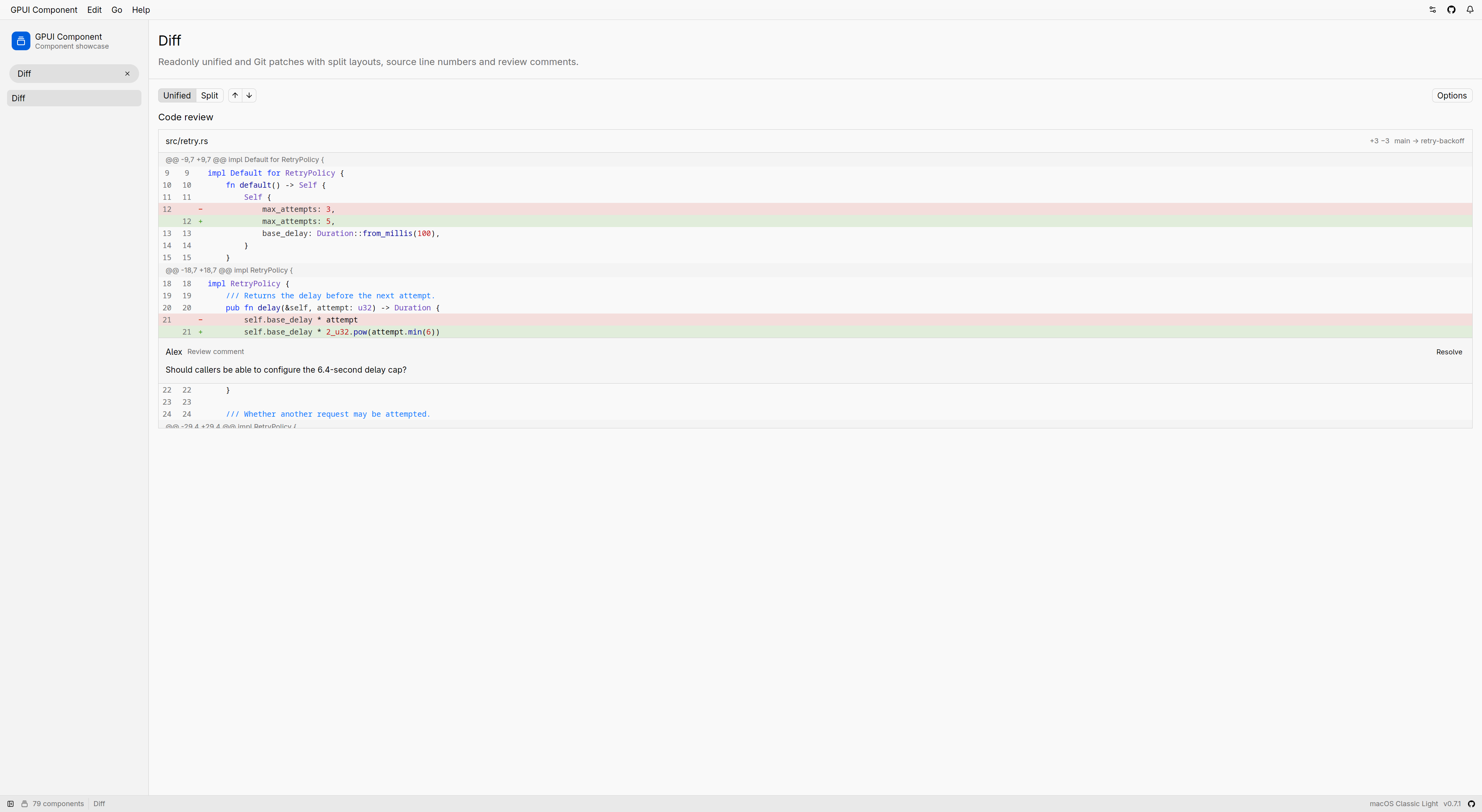 Native Story Gallery on Linux; external sparse hunks with an application-owned review comment. ## Validation Current API review fixes passed `cargo clippy -p gpui-component -p gpui-component-story -p gpui-kit --features test-support --tests --test diff -- --deny warnings`, `cargo fmt --all --check` and `git diff --check`. Regression and UI integration tests were compiled, not executed, per repository/user configuration. Coverage includes conflict source coordinates (including empty parts), clear-event delivery versus Shift extension, runtime emphasis invalidation and selection/viewport preservation. No new visual or cross-platform runtime verification was performed for these fixes. ## Public API All additions below are exposed through `gpui_kit::component::diff`. Method signatures use `Self` within the named type; imported GPUI types, `Range`, and traits have their usual meaning. Struct fields remain private. ### gpui-component `pub mod diff` is the public component seam. It re-exports `DiffConflict`, `DiffConflictResolution`, `DiffFile`, `DiffFileStatus`, `DiffLinePosition`, `DiffLineRange`, `DiffSide`, `DiffParseError`, `DiffInlineUnit`, `DiffEvent` and `DiffState`; presentation types below are declared directly in that module. #### DiffSide `pub enum DiffSide { Original, Modified }` — Identify the original or modified source side. #### DiffMode `pub enum DiffMode { Split, Unified }` — Choose split or unified layout (default Unified). #### DiffFileStatus `pub enum DiffFileStatus { Added, Deleted, Modified, Renamed, Copied, Unchanged, Conflicted }` — Describe patch changes, unchanged reference files or conflicted working files. #### DiffInlineUnit `pub enum DiffInlineUnit { Word, Character }` — Choose inline word or grapheme comparison (default Word). #### DiffHoverHighlight `pub enum DiffHoverHighlight { None, Line, LineNumber, Both }` — Choose pointer hover emphasis (default None). #### DiffHunkSeparator `pub enum DiffHunkSeparator { Metadata, LineInfo, Simple }` — Choose hunk heading presentation (default Metadata). #### DiffChangeIndicator `pub enum DiffChangeIndicator { Signs, Bars, None }` — Choose change markers (default Signs). #### DiffConflictResolution `pub enum DiffConflictResolution { Current, Incoming, Both }` — Choose the current, incoming or both conflict alternatives. #### DiffEvent `pub enum DiffEvent { SelectionStarted(DiffLineRange), SelectionChanged(Option<DiffLineRange>), SelectionEnded(DiffLineRange), FileExpanded(SharedString), FileCollapsed(SharedString), ConflictResolved(SharedString, usize) }` — Report user selection gestures, file disclosure and conflict resolutions. #### DiffParseError `pub struct DiffParseError; // private fields` — Report a malformed or unsupported patch with its patch line and diagnostic. | Signature | Purpose | | --- | --- | | `DiffParseError::line(&self) -> usize` | Read line. | | `DiffParseError::message(&self) -> &SharedString` | Read message. | #### DiffFile `pub struct DiffFile; // private fields` — Retain immutable file data parsed from a patch or working-file preview. | Signature | Purpose | | --- | --- | | `DiffFile::parse(patch: &str) -> Result<Vec<Self>, DiffParseError>` | Parses every file in a unified or Git diff, in patch order, without computing differences. | | `DiffFile::with_language(self, language: impl Into<SharedString>) -> Self` | Overrides the syntax language detected from the path, using a highlighter language name such as `rust` or `javascript`. | | `DiffFile::language(&self) -> SharedString` | The syntax language: the override, or the one detected from the path. | | `DiffFile::status(&self) -> DiffFileStatus` | How the file changed. | | `DiffFile::path(&self) -> &SharedString` | The path to show for this file: the modified path, or the original path of a deleted file. | | `DiffFile::original_path(&self) -> Option<&SharedString>` | The original path, or `None` for an added file. | | `DiffFile::modified_path(&self) -> Option<&SharedString>` | The modified path, or `None` for a deleted file. | | `DiffFile::extended_headers(&self) -> &[SharedString]` | Git extended header lines, such as file modes, similarity, renames and the binary marker, as they appear in the patch. | | `DiffFile::is_binary(&self) -> bool` | Whether the patch reports binary contents rather than textual hunks. | | `DiffFile::additions(&self) -> usize` | Read additions. | | `DiffFile::deletions(&self) -> usize` | Read deletions. | | `DiffFile::has_changes(&self) -> bool` | Whether the file changes, including an added or deleted empty file and metadata-only changes such as a mode change or pure rename. | | `DiffFile::conflicts(&self) -> &[DiffConflict]` | Merge conflicts in working-file order; slice indices identify resolutions. | | `DiffFile::unchanged(path: impl Into<SharedString>, text: &str) -> Self` | A file shown in full, for reference, without changes. | | `DiffFile::parse_conflicts(path: impl Into<SharedString>, text: &str) -> Result<Self, DiffParseError>` | Parses a working file containing Git conflict markers, including the `\|\|\|\|\|\|\|` base section of `diff3` style. | #### DiffConflict `pub struct DiffConflict; // private fields` — Inspect one parsed conflict; all ranges are one-based with an exclusive end and may be empty. | Signature | Purpose | | --- | --- | | `DiffConflict::lines(&self) -> Range<usize>` | One-based working-file lines, including markers, with an exclusive end. | | `DiffConflict::current_lines(&self) -> Range<usize>` | Current-side source lines, with an exclusive end; may be empty. | | `DiffConflict::base_lines(&self) -> Option<Range<usize>>` | Base source lines for diff3, with an exclusive end; may be empty. | | `DiffConflict::incoming_lines(&self) -> Range<usize>` | Incoming-side source lines, with an exclusive end; may be empty. | | `DiffConflict::current_label(&self) -> &SharedString` | The label from the opening marker. | | `DiffConflict::base_label(&self) -> Option<&SharedString>` | The base marker label, or None for a two-way conflict. | | `DiffConflict::incoming_label(&self) -> &SharedString` | The label from the closing marker. | #### DiffLinePosition `pub struct DiffLinePosition; // private fields` — Identify a one-based source line by file path and side. | Signature | Purpose | | --- | --- | | `DiffLinePosition::new(path: impl Into<SharedString>, side: DiffSide, line: usize) -> Self` | Creates a position, clamping the line to at least one. | | `DiffLinePosition::path(&self) -> &SharedString` | The `DiffFile::path` of the file. | | `DiffLinePosition::side(&self) -> DiffSide` | Read side. | | `DiffLinePosition::line(&self) -> usize` | Read line. | #### DiffLineRange `pub struct DiffLineRange; // private fields` — Describe an inclusive source-line range, optionally crossing sides in patch order. | Signature | Purpose | | --- | --- | | `DiffLineRange::new(path: impl Into<SharedString>, side: DiffSide, start: usize, end: usize) -> Self` | Creates a range on one side, clamping the lines to at least one. | | `DiffLineRange::with_end_side(self, side: DiffSide) -> Self` | Ends the range on `side`, keeping `end` as its line on that side. | | `DiffLineRange::path(&self) -> &SharedString` | The `DiffFile::path` of the file. | | `DiffLineRange::side(&self) -> DiffSide` | The side `start` is on. | | `DiffLineRange::start(&self) -> usize` | Read start. | | `DiffLineRange::end_side(&self) -> DiffSide` | The side `end` is on; the same as `Self::side` unless set. | | `DiffLineRange::end(&self) -> usize` | Read end. | #### DiffAnnotation `pub struct DiffAnnotation; // private fields` — Identify application-owned content attached to a line or file. | Signature | Purpose | | --- | --- | | `DiffAnnotation::line(id: impl Into<ElementId>, position: DiffLinePosition) -> Self` | Attaches content beneath a source line. | | `DiffAnnotation::file(id: impl Into<ElementId>, path: impl Into<SharedString>) -> Self` | Attaches content beneath the header of the file at `path`. | | `DiffAnnotation::id(&self) -> &ElementId` | Read id. | | `DiffAnnotation::path(&self) -> &SharedString` | The `DiffFile::path` of the annotated file. | | `DiffAnnotation::position(&self) -> Option<&DiffLinePosition>` | The annotated line, or `None` for a file annotation. | #### DiffState `pub struct DiffState; // private fields` — Retain focus, viewport, context, selection, resolutions and prepared emphasis. | Signature | Purpose | | --- | --- | | `DiffState::new(files: impl IntoIterator<Item = DiffFile>, cx: &mut Context<Self>) -> Self` | Creates a unified viewer with three unchanged lines around each change. | | `DiffState::with_mode(self, mode: DiffMode) -> Self` | Sets the initial display mode. | | `DiffState::with_context_lines(self, lines: Option<usize>) -> Self` | Sets the initial unchanged context around each change. | | `DiffState::with_expansion_lines(self, lines: usize) -> Self` | Sets how many lines an up or down disclosure reveals. | | `DiffState::with_min_collapsed_lines(self, lines: usize) -> Self` | Sets the shortest unchanged range that collapses; shorter ranges stay visible. | | `DiffState::with_inline_unit(self, unit: Option<DiffInlineUnit>) -> Self` | Sets the unit inline changes between paired lines are emphasized in, or `None` to emphasize whole lines only. | | `DiffState::with_inline_max_line_length(self, length: usize) -> Self` | Sets the longest line, in bytes, compared for inline changes. | | `DiffState::with_syntax_max_line_length(self, length: usize) -> Self` | Sets the longest line, in bytes, given syntax emphasis. | | `DiffState::set_expansion_lines(&mut self, lines: usize, cx: &mut Context<Self>)` | Changes the number of lines each disclosure reveals, preserving selection and scrolling. | | `DiffState::set_min_collapsed_lines(&mut self, lines: usize, cx: &mut Context<Self>)` | Changes the shortest unchanged range that collapses, preserving selection and scrolling. | | `DiffState::set_inline_unit(&mut self, unit: Option<DiffInlineUnit>, cx: &mut Context<Self>)` | Changes the inline comparison unit without resetting selection or scrolling. | | `DiffState::set_inline_max_line_length(&mut self, length: usize, cx: &mut Context<Self>)` | Changes the inline comparison line limit in bytes without resetting selection or scrolling. | | `DiffState::set_syntax_max_line_length(&mut self, length: usize, cx: &mut Context<Self>)` | Changes the syntax emphasis line limit in bytes without resetting selection or scrolling. | | `DiffState::files(&self) -> &[DiffFile]` | The files in patch order. | | `DiffState::mode(&self) -> DiffMode` | Read mode. | | `DiffState::context_lines(&self) -> Option<usize>` | Read context lines. | | `DiffState::expansion_lines(&self) -> usize` | Read expansion lines. | | `DiffState::min_collapsed_lines(&self) -> usize` | Read min collapsed lines. | | `DiffState::inline_unit(&self) -> Option<DiffInlineUnit>` | Read inline unit. | | `DiffState::inline_max_line_length(&self) -> usize` | Read inline max line length. | | `DiffState::syntax_max_line_length(&self) -> usize` | Read syntax max line length. | | `DiffState::selected_lines(&self) -> Option<DiffLineRange>` | Read selected lines. | | `DiffState::is_file_collapsed(&self, path: &str) -> bool` | Whether the file at `path` shows only its header. | | `DiffState::set_files(&mut self, files: impl IntoIterator<Item = DiffFile>, cx: &mut Context<Self>)` | Replaces the files and resets expansion, selection and viewport. | | `DiffState::set_mode(&mut self, mode: DiffMode, cx: &mut Context<Self>)` | Changes the display mode while preserving source-line selection and a nearby source row. | | `DiffState::set_context_lines(&mut self, lines: Option<usize>, cx: &mut Context<Self>)` | Sets surrounding context. | | `DiffState::expand_unchanged(&mut self, cx: &mut Context<Self>)` | Reveals all unchanged source while preserving the configured context count. | | `DiffState::collapse_unchanged(&mut self, cx: &mut Context<Self>)` | Restores the configured context disclosures. | | `DiffState::set_file_collapsed(&mut self, path: &str, collapsed: bool, cx: &mut Context<Self>)` | Collapses the file at `path` to its header, or expands it, without emitting a user event. | | `DiffState::conflict_resolution(&self, path: &str, ix: usize) -> Option<DiffConflictResolution>` | The resolution of conflict `ix` in the file at `path`, if any. | | `DiffState::resolve_conflict(&mut self, path: &str, ix: usize, resolution: Option<DiffConflictResolution>, cx: &mut Context<Self>)` | Resolves conflict `ix` (an index in `DiffFile::conflicts`) in the file at `path`, or clears its resolution with `None`, without emitting a user event. | | `DiffState::resolved_text(&self, path: &str) -> Option<String>` | The working file with every conflict replaced by its resolution, or `None` while a conflict is unresolved or `path` names no conflicted file. | | `DiffState::set_selected_lines(&mut self, range: Option<DiffLineRange>, cx: &mut Context<Self>)` | Synchronizes source-line selection without emitting a user event. | | `DiffState::selected_text(&self, cx: &App) -> String` | Returns selected source without gutters, diff markers or annotation content. | | `DiffState::scroll_to_line(&mut self, position: DiffLinePosition, cx: &mut Context<Self>)` | Reveals and scrolls to a source line, expanding its file and hidden context if needed. | | `DiffState::scroll_to_file(&mut self, path: &str, cx: &mut Context<Self>)` | Scrolls to the header of the file at `path`, a `DiffFile::path`. | | `DiffState::next_change(&mut self, cx: &mut Context<Self>)` | Moves to the next changed group after the current viewport, across files. | | `DiffState::previous_change(&mut self, cx: &mut Context<Self>)` | Moves to the previous changed group before the current viewport, across files. | #### Diff `pub struct Diff; // private fields` — Render a themed readonly viewer from retained state. | Signature | Purpose | | --- | --- | | `Diff::new(state: &Entity<DiffState>) -> Self` | Construct presentation for retained state. | | `Diff::line_number(self, value: bool) -> Self` | Shows the original and modified line-number lanes. | | `Diff::syntax_highlight(self, value: bool) -> Self` | Emphasizes syntax once the state has prepared it. | | `Diff::header_visible(self, visible: bool) -> Self` | Shows a header above each file. | | `Diff::hover_highlight(self, highlight: DiffHoverHighlight) -> Self` | Emphasizes the line, its number, or both under the pointer. | | `Diff::hunk_separator(self, separator: DiffHunkSeparator) -> Self` | Marks the start of each hunk. | | `Diff::change_indicator(self, indicator: DiffChangeIndicator) -> Self` | Marks changed lines beside the code. | | `Diff::change_background(self, value: bool) -> Self` | Tints changed lines. | | `Diff::soft_wrap(self, value: bool) -> Self` | Wraps long lines at the column width instead of scrolling horizontally. | | `Diff::annotations(self, annotations: impl IntoIterator<Item = DiffAnnotation>) -> Self` | Supplies annotations with stable identities and targets. | | `Diff::render_annotation<F, E>(self, render: F) -> Self where F: Fn(&DiffAnnotation, &mut Window, &mut App) -> E + 'static, E: IntoElement` | Renders each supplied annotation. | | `Diff::render_header<F, E>(self, render: F) -> Self where F: Fn(&DiffFile, &mut Window, &mut App) -> E + 'static, E: IntoElement` | Replaces the content of each file header, keeping its shell, separator and collapse control. | | `Diff::render_header_prefix<F, E>(self, render: F) -> Self where F: Fn(&DiffFile, &mut Window, &mut App) -> E + 'static, E: IntoElement` | Inserts content before the path in the default header. | | `Diff::render_header_title_suffix<F, E>(self, render: F) -> Self where F: Fn(&DiffFile, &mut Window, &mut App) -> E + 'static, E: IntoElement` | Inserts compact content immediately after the path in the default header. | | `Diff::render_header_suffix<F, E>(self, render: F) -> Self where F: Fn(&DiffFile, &mut Window, &mut App) -> E + 'static, E: IntoElement` | Inserts trailing content after the change statistics in the default header. | | `Diff::on_add_annotation<F>(self, handler: F) -> Self where F: Fn(&DiffLineRange, &mut Window, &mut App) + 'static` | Shows an add button beside the hovered line and at the end of the selected lines. | | `Diff::on_line_click<F>(self, handler: F) -> Self where F: Fn(&DiffLinePosition, &ClickEvent, &mut Window, &mut App) + 'static` | Handles a click on a line's code, outside a text-selection drag. | | `Diff::on_line_hover<F>(self, handler: F) -> Self where F: Fn(Option<&DiffLinePosition>, &mut Window, &mut App) + 'static` | Reports the line under the pointer, or `None` when the pointer leaves it. | Public trait implementations: `DiffState: EventEmitter<DiffEvent> + Focusable`; `Diff: Styled + RenderOnce + IntoElement`; `DiffParseError: std::fmt::Display + std::error::Error`. The extensible enums other than `DiffSide` are `#[non_exhaustive]`. Data types implement the Clone/Debug/equality/hash traits shown in source; `DiffMode`, `DiffInlineUnit`, `DiffHoverHighlight`, `DiffHunkSeparator` and `DiffChangeIndicator` also implement `Default`. Navigation action structs are private; Copy and Select All reuse Input's action identities without adding public re-exports. ### gpui-component-story | Signature | Purpose | | --- | --- | | `pub struct DiffStory; // private fields` | Registered viewer showcase and review example. | | `DiffStory::view(window: &mut Window, cx: &mut App) -> Entity<Self>` | Construct the retained showcase. | | `pub use diff_story::DiffStory` in `stories` | Expose the registered showcase. | | `impl Story for DiffStory` | Register the showcase title, description and construction. | | `impl Render for DiffStory` | Render the showcase. | ### gpui-component-shell / JavaScript and generated TypeScript The host registers `Diff` and `DiffState` under `gpui-component`. `Diff` accepts no children and honors Shell layout styling. State methods are not registered in JavaScript. | Signature | Purpose | | --- | --- | | `export interface DiffState { readonly __gpuiComponentState: unique symbol }` | Opaque retained patch state. | | `export function DiffState(patch: string, mode?: "unified" \| "split"): DiffState;` | Parse supplied patch text and create state. | | `export const Diff: { new(state: DiffState): DiffElement };` | Construct the viewer builder. | | `DiffElement.line_number(line_number: boolean): DiffElement` | Toggle line numbers. | | `DiffElement.syntax_highlight(syntax_highlight: boolean): DiffElement` | Toggle syntax emphasis. | | `DiffElement.header_visible(header_visible: boolean): DiffElement` | Toggle file headers. | | `DiffElement.change_background(change_background: boolean): DiffElement` | Toggle changed-line background. | | `DiffElement.soft_wrap(soft_wrap: boolean): DiffElement` | Toggle wrapping. | | `DiffElement.hunk_separator(hunk_separator: "metadata" \| "line_info" \| "simple"): DiffElement` | Choose hunk heading presentation. | | `DiffElement.change_indicator(change_indicator: "signs" \| "bars" \| "none"): DiffElement` | Choose change markers. | Generated `DiffElement` declaration (native methods omitted here are explicitly unavailable, rather than inherited): ```typescript export type DiffElement = Omit<NativeElement, "line_number" | "syntax_highlight" | "header_visible" | "change_background" | "soft_wrap" | "hunk_separator" | "change_indicator" | "disabled" | "selected" | "on_click" | "role" | "transition"> & { line_number(line_number: boolean): DiffElement; syntax_highlight(syntax_highlight: boolean): DiffElement; header_visible(header_visible: boolean): DiffElement; change_background(change_background: boolean): DiffElement; soft_wrap(soft_wrap: boolean): DiffElement; hunk_separator(hunk_separator: "metadata" | "line_info" | "simple"): DiffElement; change_indicator(change_indicator: "signs" | "bars" | "none"): DiffElement; disabled(unavailable: never): never; selected(unavailable: never): never; on_click(unavailable: never): never; role(unavailable: never): never; transition(unavailable: never): never; }; ``` ### gpui-kit No new root API. All Rust Diff APIs are reachable through the existing `gpui_kit::component` re-export. ## Scope and limitations No repository loading, full-file comparison, source editing, context hydration or combined merge diffs. Missing patch source remains unavailable; selection/copy cannot reconstruct a whole file. Binary payloads are skipped and shown as metadata. Syntax context is limited to supplied hunks; injected languages are not highlighted. Visible long lines are chunked but not horizontally virtualized. Conflict indices belong to the parsed file revision; replacing files clears resolutions. ## AI assistance Implementation, Story, documentation, regression/UI integration coverage and API review fixes were developed with Codex assistance. --------- Co-authored-by: Claude Opus 5.5 <noreply@anthropic.com> | 14 天前 | |
shell: Ship gpui-shell as an installable runtime with run, new and packaging (#3464) Makes `gpui-shell` a runtime you install and ship applications with, rather than only a development host run through `cargo run`. Releases now publish a prebuilt `gpui-shell` binary, installed applications live under `~/.gpui-shell/apps`, and an application can be packaged as the binary plus its script directory. ## What changes **One package, one command.** `gpui-component-shell` is merged into `gpui-shell` as the default `components` feature (`gpui_shell::components`). Cargo forbids the cycle a feature on a separate crate would need, so the catalog moved in. Without the feature, the runtime still does not depend on `gpui-component`, and CI checks that build. **Command line.** It runs one application per process and has no interface of its own: ```text gpui-shell run <name> | -d <dir> [--watch] [--dev] # ~/.gpui-shell/apps/<name>, or a directory gpui-shell # the application packaged beside the executable gpui-shell new <dir> # scaffold a blank application gpui-shell # with nothing packaged beside it: the help gpui-shell list # installed applications and their requested capabilities gpui-shell check | types | agents ... ``` - An installed or packaged application keeps its storage under its manifest `id`; a directory run with `-d` stays keyed by its path. - With no arguments the binary runs `Contents/Resources/app` inside a macOS bundle, or `app/` beside itself. This is what lets a `.app` or a Linux package be the binary plus a directory of scripts. - `GPUI_SHELL_HOME` replaces `~/.gpui-shell`, both for applications and for the Git dependency cache. - `agents` prints, or writes as `AGENTS.md`, development instructions for coding agents. They are generated from the running binary, including its module and component list. - The window is brought forward on launch, and Cmd-Q / Alt-F4 quits. - The manifest gains an optional `window` field: `{ "width": 360, "height": 520 }` sets the opening size. **Release and install.** `release.yml` builds `gpui-shell` for aarch64/x86_64 macOS, x86_64 Linux and x86_64 Windows. Asset names carry no version, e.g. `gpui-shell-aarch64-apple-darwin.tar.gz` plus `.sha256`, so `releases/latest/download/<asset>` always resolves. `curl -fsSL https://gpui-kit.com/shell/install.sh | sh` installs it to `~/.local/bin`; the script source is `website/public/shell/install.sh`. **Catalog.** - New `TitleBar` binding. - Catalog windows use `TitleBar::window_options()`, so Sheets and notifications line up with the title bar. - `js_story`, `js_todolist` and `js_dock` now render a `TitleBar`. **Fixes.** - `localStorage.getItem` / `key` return `null` rather than `undefined` for a missing entry. This is what made `js_todolist` warn "storage unavailable". - OtpInput repaints on every keystroke. Its state was a plain entity, so its notify dirtied no view, and the cached content replayed until the pointer moved. - Importing `gpui-component` without a catalog now explains how to get one, instead of listing it as a built-in module. - The load-failure page's copy action is an icon button (copy, then check), so it can no longer overflow the panel. **Docs.** - Getting Started, en + zh-CN: installing, `run` / `new` / `list` / `agents`, and installed and packaged applications. - New Packaging page, en + zh-CN: macOS `.app` with `Info.plist`, `lipo`, signing and notarization; a Linux archive and `.desktop` entry; a Windows folder. ## Public API ### gpui-shell - Feature `components` (default): the `gpui-component` catalog. Optional dependency on `gpui-component`. - `pub mod components` (with `components`): - `pub fn init(cx: &mut App)`: initializes `gpui-component` and the runtime (was `gpui_component_shell::init`). - `pub fn components() -> Result<FrozenComponentRegistry, RegistryError>`: the frozen catalog (was `gpui_component_shell::components`). - `pub fn new_isolated_runtime() -> anyhow::Result<Rc<ShellRuntime>>`: an isolated runtime with the catalog (was `gpui_component_shell::new_isolated_runtime`). - `pub struct plugin::WindowSize` with `width(&self) -> f32` and `height(&self) -> f32`: a manifest's opening window size. - `PluginManifest::window(&self) -> Option<WindowSize>`: the manifest's `window`, if any. - `ManifestProblem::Window(String)`: an invalid `window` field. - `host::InvocationKind::{List, Agents, New}`: classifications for the new commands. - Manifest field `window: { width: number, height: number }`: logical pixels, positive, no other keys. - JavaScript: `window.start_window_move(): void` (GPUI `Window::start_window_move`), so a script-drawn title bar can drag the window. - JavaScript, `"gpui-component"`: `TitleBar` (`new TitleBar()`, with styles, `child`/`children` and `on_close_window(callback: (cx) => void)`). It is declared in the generated `gpui-kit.d.ts`. ## Validation - `cargo test -p gpui-shell --no-fail-fast`: 34 test binaries, 990 tests, no failures. - `cargo clippy -p gpui-shell --all-targets -- -D warnings`, `cargo fmt --check -p gpui-shell`, `cargo machete`, `typos`: clean. - `cargo check -p gpui-shell --no-default-features --features quickjs`: the runtime builds without the catalog. - `gpui-shell check -d` passes for `examples/js_todolist`, `examples/js_dock` and `examples/js_story`. - `npm --prefix crates/shell/tests/types test` and `node examples/js_story/fixtures/verify-coverage.mjs` pass. - Manually: `new` → `check` on a scaffolded application; a hand-built `Demo.app/Contents/{MacOS,Resources/app}` starts its bundled application with no arguments; OtpInput repainting on every keystroke was confirmed by eye in the running gallery. Not verified: - The release job and the install script have not run against a real release. - Bringing the window forward could not be confirmed from a background shell; macOS will not let it take focus from another app. It needs a check from a terminal launch. - Cmd-Q / Alt-F4 was not pressed in testing. - The manifest `window` size was unit-tested only, not opened end to end. - The TitleBar in `js_story`, `js_todolist` and `js_dock`, and whether a Sheet now opens flush under it, has not been looked at in a running window. ## AI-generated This change was written with Claude Code (one main session, two sub-agents for TitleBar and OtpInput, and a separate session for the manifest `window` field), reviewed and directed by the author. 🤖 Generated with [Claude Code](https://claude.com/claude-code) --------- Co-authored-by: Claude Opus 5.5 <noreply@anthropic.com> | 8 天前 | |
input: report inline token hover for tooltips and previews (#3346) Closes #3335 ## Description Adds `on_token_hover` for the atomic inline tokens rendered in `Input` and `Textarea`, so hovering over a token can render a tooltip, preview, or run custom logic. The change follows the existing `on_token_click` seam: `gpui-base` owns hover hit-testing, token geometry, and the hover snapshot event, while `gpui-component` only forwards the builder and the application owns the tooltip itself. Hover never selects or edits the document. Disabled tokens never report hover entry, matching click; readonly tokens do. Works for both `Input`/`InputState` and `Textarea`/`TextareaState`, plus the JavaScript bindings. Hover exit is delivered even when the hovered token is removed or replaced programmatically (even at the same offset), scrolled out of the laid-out rows, masked, or disabled: the state retains the last hovered token snapshot and reconciles it on every `prepaint_tokens` pass, comparing the retained span against the current token and emitting `is_hovered: false` without needing the token (or its geometry) to still exist. An older token's exit never clears a newer token's snapshot, matching GPUI's enter-before-exit dispatch order. Bounds in the hover event come from the actually placed token element, so they are correct at soft-wrap boundaries. Exit events carry the UTF-16 coordinates captured at entry, so JavaScript exits after a text change report the original range instead of the new text clamped. Hover callbacks registered through the shell keep only a weak handle to the input state, avoiding an `Entity -> Rc callback -> Entity` cycle. All existing public signatures keep compiling: hover uses additive builders throughout. ## Screenshot No visual change: this is a behavior-only addition. Tokens render exactly as before; only the new hover callback fires on pointer entry/exit. | Before | After | | ---------------------------- | --------------------------- | | Tokens report clicks only | Tokens also report hover entry/exit via `on_token_hover` | ## Public API ### `gpui-base` (`gpui_base::input`) - `InlineTokenHoverEvent` — hover snapshot for one atomic inline token; carries the token, its byte range, measured bounds, entry/exit state, and entry-time UTF-16 coordinates. - `InlineTokenHoverEvent::token(&self) -> &InlineToken` — the hovered reference. - `InlineTokenHoverEvent::range(&self) -> Range<usize>` — the token's half-open UTF-8 byte range. - `InlineTokenHoverEvent::bounds(&self) -> Bounds<Pixels>` — the token's measured bounds, for anchoring a tooltip. - `InlineTokenHoverEvent::is_hovered(&self) -> bool` — `true` on pointer entry, `false` on exit. - `InlineTokenHoverEvent::range_utf16(&self) -> (usize, usize)` — the token range in UTF-16 code units as of entry; exits after a text change report these. - `InlineTokenHoverListener` — hover listener installed by a styled control (`#[doc(hidden)]`, not part of the supported API). - `Input::on_token_hover(listener) -> Self` — reports pointer presence over a token in the unstyled single-line input. - `Textarea::on_token_hover(listener) -> Self` — same, for the unstyled multi-line textarea. - `InputBaseState::install_token_hover_presentation(hover_listener) -> ()` — installs a styled control's token hover listener (`#[doc(hidden)]`, not part of the supported API). ### `gpui-component` (`gpui_component::input`) - `InlineTokenHoverEvent` — re-export of the base hover snapshot. - `Input::on_token_hover(listener) -> Self` — reports token hover from the styled single-line input. - `Textarea::on_token_hover(listener) -> Self` — same, for the styled textarea. ### `gpui-shell` (Rust adapters and JavaScript) - `InlineTokenCallbacks::with_hover(state, hover_listener) -> Self` — attach a hover listener to an existing callbacks adapter without changing `new`/`apply`. - `InlineTokenCallbacks::apply_hover(element, on_token_hover) -> E` — install the hover listener through the element's own builder. - `gpui_shell::inline_token_hover_data(event: &InlineTokenHoverEvent, text: &Rope) -> Data` — converts a hover snapshot to the plain JS payload; exits reuse the entry-time UTF-16 coordinates. - `on_token_hover(listener)` (JavaScript, `gpui-base` NativeElement and `gpui-component` Input/Textarea) — receives `(event: InlineTokenHoverEvent, cx: Context)` on token entry/exit. - `InlineTokenHoverEvent` (TypeScript, `gpui-base` and `gpui-component` modules) — `{ token, range, hovered, bounds }` with UTF-16 ranges. ## How to Test - `cargo test -p gpui-base inline_token` — 10 passed, including `test_inline_token_hover_reports_presence_without_selecting` (enter/exit payload, hover never selects, disabled suppresses entry, readonly allows, no listener means no activation), `test_inline_token_hover_exit_delivered_when_token_removed` (exit fires after programmatic token removal through the real hover path), `test_inline_token_hover_same_offset_replacement_exits_predecessor` (replacement at the same offset exits the old token), `test_inline_token_hover_older_exit_keeps_newer_snapshot` (enter-B-before-exit-A ordering, then B's removal exits B), and `test_inline_token_hover_bounds_stay_single_row_at_wrap_boundary` (hover bounds are the laid-out element rect, not the range-extent guess). - `cargo test -p gpui-component test_on_token_hover_builder` — 2 passed (`Input` and `Textarea` builder coverage). - `cargo test -p gpui-component-shell --test inline_tokens_host` — passed, including hover entry/exit through the real mouse path with exit coordinates (`false:3-5:a`) preserved after the click removed the token. - `cargo test -p gpui-shell typings` — passed, including `every_element_method_is_accounted_for`. - `cargo check` clean for `gpui-base`, `gpui-component`, `gpui-shell`, `gpui-component-shell`; `cargo fmt --check` and Clippy report nothing in the touched files. ## Checklist - [x] I have read the [CONTRIBUTING](../CONTRIBUTING.md) document and followed the guidelines. - [x] Reviewed the changes in this PR and confirmed AI generated code (If any) is accurate. - [ ] Passed `cargo run` for story tests related to the changes. - [ ] Tested macOS, Windows and Linux platforms performance (if the change is platform-specific) ## Maintainer follow-up AI-assisted repair of the repeated P2 hover lifecycle finding: - Key each token occurrence by its complete identity and hover eligibility, so same-offset replacement and disabling/re-enabling correctly produce a fresh enter. - Keep pending predecessor snapshots through GPUI enter-before-exit dispatch and callback edits; match exits by the complete token identity. - All exit paths preserve entry-time geometry and UTF-16 ranges, including equal-byte-length edits before the token. - Replace the synthetic replacement test with actual VisualTestContext pointer dispatch; cover re-enabling, late predecessor exits, callback removal, and UTF-16 edits. - Fix Clippy manual_contains and synchronize Textarea hover wording in English and Chinese. Local verification: eight targeted Base hover tests, the component-shell inline_tokens_host integration test, Base Clippy with warnings denied, touched-file rustfmt, and git diff --check. CI for the resulting remote head remains required. --------- Co-authored-by: Jason Lee <huacnlee@gmail.com> | 17 天前 | |
docs: separate Component API docs from shared Kit guides (#3006) ## Summary Component API pages currently live inside the shared Kit documentation. Move their English and Chinese sources and canonical URLs to `/component/*` and `/zh-CN/component/*`, with independent collections, sidebars and Markdown endpoints. Keep shared design, coding and future GPUI guides under `/docs`. Set the primary navigation to Docs → Component → Base → Shell → App Stories, with the corresponding Chinese navigation. Update homepage links, component demo routing, cross-references, sitemap and LLM indexes. Old component HTML addresses redirect to the new pages; old Markdown endpoints remain readable and advertise the canonical URLs. Most changed files are unchanged component documents moved to the new directory. ## Test Plan - [x] Website production build with Pagefind completes. - [x] `bun run test:seo`: all 11 checks pass, including every component page's canonical/legacy HTML and Markdown URLs, shared guide locations, separate sidebars, cross-links and navigation order. - [x] `git diff --check`. Browser automation could not initialize in the local runtime; validation covers the built pages and routes. Deployment is not part of this PR. --------- Co-authored-by: Codex <codex@openai.com> | 1 个月前 | |
docs: separate Component API docs from shared Kit guides (#3006) ## Summary Component API pages currently live inside the shared Kit documentation. Move their English and Chinese sources and canonical URLs to `/component/*` and `/zh-CN/component/*`, with independent collections, sidebars and Markdown endpoints. Keep shared design, coding and future GPUI guides under `/docs`. Set the primary navigation to Docs → Component → Base → Shell → App Stories, with the corresponding Chinese navigation. Update homepage links, component demo routing, cross-references, sitemap and LLM indexes. Old component HTML addresses redirect to the new pages; old Markdown endpoints remain readable and advertise the canonical URLs. Most changed files are unchanged component documents moved to the new directory. ## Test Plan - [x] Website production build with Pagefind completes. - [x] `bun run test:seo`: all 11 checks pass, including every component page's canonical/legacy HTML and Markdown URLs, shared guide locations, separate sidebars, cross-links and navigation order. - [x] `git diff --check`. Browser automation could not initialize in the local runtime; validation covers the built pages and routes. Deployment is not part of this PR. --------- Co-authored-by: Codex <codex@openai.com> | 1 个月前 | |
scroll: Bounce scrollable content like NSScrollView, by default on macOS (#3500) ## Description Scrollable content now bounces at its ends the way `NSScrollView` does, and on macOS it does so by default, as native scroll views do. Bounce comes from one shared overscroll engine and one wrapper, `ScrollBounce`. It covers multiline inputs, List, DataTable, Tree, Scrollable, Select, Command, Sidebar, Diff, MessageScroller, the settings page and scrollable TextView. Logical scroll positions stay clamped. Content moves inside its clip, while input frames, table headers, search fields, footers and scrollbars stay fixed. Bounce depends on how precise the scroll input is, not on the device name: - Trackpads and Magic Mouse send precise pixel scrolling (`ScrollDelta::Pixels`). It bounces. - Ordinary mouse wheels send line scrolling (`ScrollDelta::Lines`). It only scrolls, and cancels any bounce in progress. ### One default, one rule for nested areas - **Default.** `ScrollBounce::enabled_by_default()` is the only place the default is decided. It is on for iOS, Android and macOS, the platforms whose own scroll views bounce, and off elsewhere. Components keep their `scroll_bounce(bool)` builder as an override; when it is not set, they defer to `ScrollBounce`. Inputs use the same default. - **Nested areas.** These follow the platform. The innermost area under the pointer takes the whole gesture, including at its ends: it bounces there rather than handing the rest of the gesture to the area around it. - **How it works.** Each area claims the wheel event in the capture phase, before its children paint, so the innermost claim is the one that stands. Only that area then acts. Text inputs take part through the same claim. - **Disabled areas.** An area whose bounce is disabled still scrolls its own child and keeps the gesture; it just stops at its ends. - **Effect on GPUI divs.** Until now, nested GPUI scroll divs scrolled together. - **Popup menus.** These do not bounce, matching macOS menus. ### Matching NSScrollView The desktop motion is fitted to a native `NSScrollView`, measured on macOS by driving it with synthesized trackpad events, and cross-checked against AppKit's own rubber-band functions: | | NSScrollView | This PR | | --- | --- | --- | | Stretch for 100 px of travel past the end (300 px viewport) | 7 px | 7 px | | Largest stretch, by drag or fling | 36 px in Finder | 36 px, eased into | | Release held still: time to halve | 55 ms, moving at once | 55 ms | | Fling into the edge at 1500 px/s: peak | ≈14 px, ≈80 ms after impact | ≈14 px, ≈80 ms | - **Stretch.** It follows AppKit's hyperbolic curve (coefficient 0.075). AppKit stretches by unaccelerated travel, which GPUI does not report, so a hard swipe would run far past native. `ScrollBounceMotion` therefore gains a maximum stretch, 36 px by default on desktop. The stretch eases into it, and a fling never throws the edge past it. - **Return.** A released or struck edge follows `(x + 0.31·v·t)·e^(-12.5t)`, using the same constants as AppKit's `_NSElasticDeltaForTimeDelta`. A fling throws the edge once per gesture, and momentum back into the content scrolls it while the edge returns. - **Fling speed.** It is read over the last 50 ms. Scroll packets carry no timestamp, so a slow frame hands over several at once. Read one by one, a fling through a long list hit the top about 4× too hard. - **Touch and lift.** GPUI reports `MayBegin` as `Started`, and a cancelled touch as a `Moved` of nothing. A touch that lifts without moving now lets go of a held edge. iOS and Android keep the UIScrollView tuning (`0.55`, 524 ms, no maximum). Reduced motion disables displacement. Component documentation is synchronized in English and Chinese. ## Public API ### gpui-base - `pub const fn ScrollBounce::enabled_by_default() -> bool`: whether scroll areas bounce unless told otherwise. True on iOS, Android and macOS. - `pub fn ScrollBounce::scroll_wheel(self, enabled: bool) -> Self`: chooses whether the wrapper owns vertical wheel scrolling through the shared engine. Defaults to true. Pass false for the child-owned touch mode. - `pub fn ScrollBounceMotion::with_max_stretch(self, max_stretch: f32) -> Self`: the farthest the edge goes past its end, whether stretched or thrown. - `pub fn ScrollBounceMotion::max_stretch(&self) -> Option<f32>`: reads it back. - `impl Default for ScrollBounceMotion`: now depends on the platform. Unchanged on iOS and Android. Elsewhere it is fitted to NSScrollView: `tracking` 0.075, `response` ≈503 ms, `max_stretch` 36 px. - `pub fn InputBaseState<M: MultiLineMode>::scroll_bounce(self, scroll_bounce: bool) -> Self`: precise-scroll boundary bounce for TextareaState and EditorState. - `pub fn InputBaseState<M: MultiLineMode>::set_scroll_bounce(&mut self, scroll_bounce: bool, cx: &mut Context<Self>)`: changes the setting at runtime. ### gpui-component Each of these overrides the platform default for that component: - `pub fn List<D: ListDelegate>::scroll_bounce(self, enabled: bool) -> Self` - `pub fn DataTable<D: TableDelegate>::scroll_bounce(self, enabled: bool) -> Self`: headers and scrollbars stay fixed. - `pub fn Tree::scroll_bounce(self, enabled: bool) -> Self` - `pub fn Scrollable<E>::scroll_bounce(self, enabled: bool) -> Self` - `pub fn Select<D>::scroll_bounce(self, enabled: bool) -> Self` - `pub fn Command::scroll_bounce(self, enabled: bool) -> Self`: the search field and footer stay fixed. ## Breaking Changes No existing signature changes. Every existing call still compiles. Four defaults change behavior, compared with `main`: **1. `ScrollBounce` is enabled by default on macOS.** On `main` it was enabled only on iOS and Android. A `ScrollBounce` created without `.enabled(..)` now bounces on macOS too. To keep it still: ```diff - ScrollBounce::new(id, &handle, child) + ScrollBounce::new(id, &handle, child).enabled(false) ``` **2. `ScrollBounce` owns vertical wheel scrolling by default.** On `main`, the child scrolled itself and the wrapper only stretched the deltas the child left unused. Now the wrapper scrolls the handle itself, through the shared engine. Code that relied on the child-owned mode, such as touch emulation or synthesized drags, must ask for it: ```diff - ScrollBounce::new(id, &handle, child).enabled(true) + ScrollBounce::new(id, &handle, child).enabled(true).scroll_wheel(false) ``` **3. `ScrollBounceMotion::default()` changes on macOS, Windows and Linux.** The defaults are now tuned to match NSScrollView, replacing the UIScrollView tuning: - `tracking` goes from 0.55 to 0.075. - `response` goes from 524 ms to ≈503 ms. - The stretch is capped at 36 px. iOS and Android are unchanged. To keep the previous feel: ```diff - ScrollBounce::new(id, &handle, child) + ScrollBounce::new(id, &handle, child).motion( + ScrollBounceMotion::default() + .with_tracking(0.55) + .with_response(Duration::from_millis(524)), + ) ``` **4. Scrollable components scroll differently.** - **They bounce on macOS.** Scrollable (`overflow_y_scrollbar()`), List, DataTable, Tree, Select, Command, Textarea, Editor, Sidebar, Diff, MessageScroller, the settings page and scrollable TextView now bounce on precise scrolling. On `main` none of them did. Each one that has a builder can turn it off: ```diff - List::new(&state) + List::new(&state).scroll_bounce(false) ``` - **Nested areas no longer scroll together, on every platform.** The innermost area under the pointer takes the whole gesture, including at its ends. On `main`: - Nested GPUI scroll divs scrolled together. - MessageScroller handed the wheel to an ancestor scroller once it reached an end. Neither happens now. Sidebar, Diff, MessageScroller, the settings page and TextView have no `scroll_bounce` builder; they always follow the platform default. Everything else listed under Public API is new in this PR, and so additive. ## Validation - `cargo test -p gpui-base -p gpui-component --lib` passes (1361 + 670). The tests include: - Tests pinned to the NSScrollView measurements: stretch, the 36 px limit, still release, fling peak and single throw, reverse momentum without a jump. - A fling whose packets arrive in a burst after slow frames. - A touch that lifts without moving. - Nested areas, where the inner one takes the gesture whether it is enabled or disabled, and a textarea inside a bouncing area. - Bounce interruption, ordinary-wheel exclusion, fixed input/scrollbar geometry, real List/DataTable scrolling and fixed table headers. - The CI test command (`cargo test --workspace --exclude gpui-shell --features gpui-component-story/test-support` with the example crates excluded), `cargo test -p gpui-base-examples`, `cargo clippy` with `--deny warnings`, `cargo fmt --check`, `typos` and `script/check-ai` pass. - The stretch and return match AppKit's `_NSHyperbolicElasticDeltaForReboundDelta` and `_NSElasticDeltaForTimeDelta`, called directly. The maximum stretch follows a measurement in Finder. - Checked in the Story Gallery with a physical trackpad: list and command palette edges, top and bottom. ## AI assistance The original Input bounce implementation was AI-assisted with Claude Code. Codex assisted with the shared engine, review corrections, component integration, regression tests, and synchronized feature documentation. Claude Code measured NSScrollView, refitted the motion, fixed the momentum and release behavior, made bounce the macOS default with one nesting rule, and added Select, Command, Sidebar, Diff, MessageScroller, settings page and TextView support. 🤖 Generated with [Claude Code](https://claude.com/claude-code) --------- Co-authored-by: Jason Lee <huacnlee@gmail.com> Co-authored-by: Claude Opus 5.5 <noreply@anthropic.com> | 6 天前 | |
marker: Add `alignment` for centered and trailing rows (#3151) `Marker` was the only chat component that baked horizontal placement into its variant: `Separator` always centered its label, `Plain` and `Border` always started at the leading edge. `Bubble` and `Message` already expose `alignment(...)`. Transcript system rows (a stopped answer, a failed request with a retry action, a delivery state under an outgoing message) need a centered or trailing marker without divider lines, and the only way to get one was a `Styled` refinement on every call site. This adds `Marker::alignment(MarkerAlignment)`: - Unset, nothing changes: `Separator` centers, other variants start. - An explicit alignment applies to any variant and also aligns wrapped text lines inside `MarkerContent`. - A `Separator` with an explicit alignment keeps only the line on the far side of its label, so `Start` draws the trailing line and `End` the leading one. The story gains an "Alignment" section; the `Marker` page is updated in both `en` and `zh-CN`. ## Public API - `pub enum MarkerAlignment { Start, Center, End }` — horizontal placement of a `Marker`'s children inside its full-width row. - `Marker::alignment(self, alignment: MarkerAlignment) -> Self` — sets that placement; unset keeps the variant default (`Separator` centers, others start). ## Validation - `cargo test -p gpui-component marker` (builder test extended, new `test_marker_resolved_alignment`) - `cargo clippy -p gpui-component -p gpui-component-story -- -D warnings` - `cargo fmt --all` Co-authored-by: Claude Fable 5.1 <noreply@anthropic.com> | 30 天前 | |
input: Preserve selection, focus ring and context menu actions (#3382) Fixes #3336 ## Description Opening an input's framework-rendered context menu used to hide the selected text and focus ring. The input now retains both while its associated menu or submenu holds keyboard focus. Submenu editing actions also use the nearest parent menu's explicit action target, so commands such as Select All operate on the source Textarea. - The shared input engine associates selection visibility with a weak popup focus handle, without retaining the popup or showing the caret while the menu has focus. - Input publishes its state during right-button pointer dispatch. ContextMenu resolves ownership during deferred menu construction, after the clicked input has taken focus. This also handles right-clicking a previously unfocused input and preserves ownership when replacing an open menu. - Input, Textarea, Editor and InputGroup use the same association for their focus appearance. Unrelated menus and focus in another input do not retain the source's focus appearance. - PopupMenu resolves actions and shortcut hints against the nearest explicit action context in its parent chain. A submenu's own explicit target takes precedence. - English and Chinese Menu documentation describe focus appearance and submenu action-target inheritance. This targets framework-rendered context menus. Completion and code-action overlays remain outside this change. AI-assisted implementation and validation: Claude Code and OpenAI Codex. ## Public API ### `gpui-base` Added to `gpui_base::input::InputBaseState<M>`, shared by InputState, TextareaState and EditorState: - `pub fn set_selection_focus(&mut self, focus: Option<FocusHandle>, cx: &mut Context<Self>)`: associates a popup with selection visibility using a weak focus handle; `None` clears it. - `pub fn has_selection_focus(&self, window: &Window, cx: &App) -> bool`: reports whether the input or its associated popup/submenu currently has focus. ### `gpui-component` - Existing `PopupMenu::action_context(self, handle: FocusHandle) -> Self`: sets the action target; descendant submenus without their own explicit target now use the nearest parent's target for action dispatch and shortcut hints. ## Breaking Changes Public signatures remain compatible. The behavior of `PopupMenu::action_context` extends to descendant submenus that do not specify their own target. Existing explicit submenu targets retain precedence. Applications no longer need to repeat the parent's target on each submenu: ```diff menu.action_context(target.clone()) .submenu("More", window, cx, move |submenu, _, _| { - submenu.action_context(target.clone()) - .menu("Select all", Box::new(SelectAll)) + submenu.menu("Select all", Box::new(SelectAll)) }) ``` ## Validation Latest validation on Linux: ```bash cargo test -p gpui-kit --features test-support --test menu --locked cargo clippy -p gpui-component --lib --no-deps --locked -- -D warnings cargo clippy -p gpui-kit --features test-support --test menu --no-deps --locked -- -D warnings git diff --check ``` All 6 menu tests pass. Regression coverage includes right-clicking an unfocused input, automatic/explicit menu ownership, menu replacement, keyboard submenus, dismissal, clipboard Copy, typing in another input, and clicking submenu Select All. The Select All regression verifies the complete source selection, source keyboard focus after dismissal, and unchanged destination content. Pointer down/up events use separate app updates to match native event ordering. Formatting checks pass for the affected Rust files. A native Linux preview with the default Input menu, custom Textarea submenu and a destination Input was launched for interactive testing. macOS and Windows remain for CI. --------- Co-authored-by: Jason Lee <huacnlee@gmail.com> | 14 天前 | |
docs: separate Component API docs from shared Kit guides (#3006) ## Summary Component API pages currently live inside the shared Kit documentation. Move their English and Chinese sources and canonical URLs to `/component/*` and `/zh-CN/component/*`, with independent collections, sidebars and Markdown endpoints. Keep shared design, coding and future GPUI guides under `/docs`. Set the primary navigation to Docs → Component → Base → Shell → App Stories, with the corresponding Chinese navigation. Update homepage links, component demo routing, cross-references, sitemap and LLM indexes. Old component HTML addresses redirect to the new pages; old Markdown endpoints remain readable and advertise the canonical URLs. Most changed files are unchanged component documents moved to the new directory. ## Test Plan - [x] Website production build with Pagefind completes. - [x] `bun run test:seo`: all 11 checks pass, including every component page's canonical/legacy HTML and Markdown URLs, shared guide locations, separate sidebars, cross-links and navigation order. - [x] `git diff --check`. Browser automation could not initialize in the local runtime; validation covers the built pages and routes. Deployment is not part of this PR. --------- Co-authored-by: Codex <codex@openai.com> | 1 个月前 | |
message: Add `id` and `role`, stop setting the row's typography (#3171) `Message` was the one chat row that could not enter the accessibility tree or keep element state: unlike `Marker`, it had no `id` or `role`. Its root also set `text_sm` and a 1.25 line height on the whole row, although `MessageHeader` and `MessageFooter` already set their own typography and a bubble owns its content typography; the only effect was to leak a header-sized line height into rich content placed directly in a `Ghost` bubble (Markdown paragraphs rendered at 1.25 instead of the renderer's own line height). This PR: - adds `Message::id(...)` and `Message::role(...)`, plumbed exactly like `Marker`'s: the role is bound only together with an id, because accessibility nodes need a stable identity; - removes the row-level `text_sm` / `line_height(1.25)`. Header and footer are unchanged (they set their own); content typography now comes from the bubble or the caller. Docs updated in `en` and `zh-CN` (defaults table, custom styling, accessibility, API table). ## Public API ### gpui-component - `Message::id(self, id: impl Into<ElementId>) -> Self` — stable identity for element state and the accessibility tree. - `Message::role(self, role: impl Into<RoleOverride>) -> Self` — accessibility role announced for the row, e.g. `Role::ListItem`; takes effect only with `id(...)`. ## Breaking Changes None in signature. Behavior: a `Message` no longer applies `text_sm` and `line_height(1.25)` to its subtree. Header and footer look the same; bare text placed directly in `MessageContent` (not in a bubble) now inherits the surrounding text style instead of the header-sized one. ```diff - Message::new().content(MessageContent::new().child("plain text")) // rendered text_sm / 1.25 + Message::new().content(MessageContent::new().child("plain text")) // inherits the caller's text style ``` ## Validation - `cargo test -p gpui-component message::` (builder test extended with id/role) - `cargo clippy -p gpui-component -p gpui-component-story -- -D warnings` - `cargo fmt --all` Co-authored-by: Claude Fable 5.1 <noreply@anthropic.com> | 29 天前 | |
root: Add Base window hosting and a single Kit startup entry point (#3152) ## Summary Window startup now always mounts a `gpui_base::Root`, regardless of Cargo feature unification. Base owns application content, overlay hosting, keyboard traversal, and text-selection copying. Component initialization registers its per-window presentation state as a Root plugin, so dialogs, sheets, notifications, menus, tooltips, touch selection, and window chrome remain automatic without making Base depend on Component. - Add `gpui_kit::open_window` as the standard Kit application entry point. It always mounts Base Root and returns both the window handle and content entity. - Move Root ownership and unconditional overlay hosting into `gpui-base`; `gpui_component::Root` is now a re-export. Root now renders sheet, dialog, and notification layers automatically. - Add the typed `RootPlugin` interface. Plugins are registered before window creation, instantiated independently per window, rendered in registration order, and can prepare, style, and decorate the root surface. - Keep Component presentation in a `WindowState` Root plugin while application-facing operations remain on `WindowExt`. - Make `window_border()` solely responsible for client-side window chrome. Server-decorated windows pass content through unchanged; client-decorated windows receive borders, shadow inset, rounded corners, and resize hit zones. - Remove `Root::bordered` and `Root::window_shadow_size`, plus the obsolete `root_borderless` example. - Migrate Kit examples, stories, tests, documentation, and pending 0.7.0 release notes to the new startup and Root APIs. ## Public API ### gpui-base ```rust pub trait RootPlugin: Render + Sized { fn prepare(&mut self, window: &mut Window, cx: &mut Context<Self>) {} fn style(&self, surface: &mut Stateful<Div>, window: &mut Window, cx: &mut App) {} fn decorate( &self, surface: AnyElement, root: &Root, window: &mut Window, cx: &mut App, ) -> impl IntoElement { surface } } impl Root { pub fn new( view: impl Into<AnyView>, window: &mut Window, cx: &mut Context<Self>, ) -> Self; pub fn register_plugin<V: RootPlugin>( cx: &mut App, build: fn(&mut Window, &mut Context<V>) -> V, ); pub fn plugin<V: RootPlugin>(&self) -> Option<Entity<V>>; pub fn view(&self) -> &AnyView; pub fn read<'a>(window: &'a Window, cx: &'a App) -> &'a Self; pub fn update<R>( window: &mut Window, cx: &mut App, f: impl FnOnce(&mut Self, &mut Window, &mut Context<Self>) -> R, ) -> R; } ``` `Root` also implements `Styled`. Instance style refinements are applied after plugin defaults and therefore take precedence: ```rust impl Styled for Root { fn style(&mut self) -> &mut StyleRefinement; } ``` Register plugins during explicit application initialization, before creating windows. Re-registering a plugin type replaces its factory for future windows rather than mounting it twice. Registration does not retrofit existing roots. ### gpui-kit ```rust pub fn open_window<V: Render>( options: WindowOptions, cx: &mut App, build: impl FnOnce(&mut Window, &mut App) -> Entity<V>, ) -> Result<(AnyWindowHandle, Entity<V>)>; ``` The builder returns application content, not a Root. Kit mounts Base Root around it. ### gpui-component `pub use gpui_base::Root;` replaces the former Component-owned Root. `gpui_component::init(cx)` registers Component `WindowState` as a Root plugin. Manual layer-rendering and Root-owned dialog, sheet, and notification operations are removed. In particular, `Root::render_sheet_layer`, `Root::render_dialog_layer`, and `Root::render_notification_layer` no longer exist because Root hosts those layers automatically. Use the existing `WindowExt` operations to open and update them. ## Breaking Changes Targeted for 0.7.0; package versions remain unchanged. Use the Kit window entry point and return application content instead of constructing `Root` manually. Retain the returned content entity when direct content access is needed, because the window root is now `gpui_base::Root`: ```diff - cx.open_window(options, |window, cx| { - let content = build_content(window, cx); - cx.new(|cx| Root::new(content, window, cx)) - }) + let (window_handle, content) = + gpui_kit::open_window(options, cx, |window, cx| { + build_content(window, cx) + })?; ``` Delete manual overlay placement. `Root::render_sheet_layer`, `Root::render_dialog_layer`, and `Root::render_notification_layer` are removed because `Root` now hosts these layers automatically: ```diff - let sheet_layer = Root::render_sheet_layer(window, cx); - let dialog_layer = Root::render_dialog_layer(window, cx); - let notification_layer = Root::render_notification_layer(window, cx); - div() .child(content) - .children(sheet_layer) - .children(dialog_layer.map(|layer| deferred(layer).with_priority(1))) - .children(notification_layer) ``` Root window-chrome configuration is removed. Decoration policy comes from GPUI `WindowOptions`; `window_border()` applies client chrome only for `Decorations::Client`: ```diff - Root::bordered - Root::window_shadow_size + window_border() ``` The Root- and WindowExt-owned text-selection methods are removed in favor of `gpui_base::TextSelection`: ```diff - window.selected_text(cx) + TextSelection::selected_text(window, cx) - window.has_text_selection(cx) + TextSelection::has_selection(window, cx) - root.clear_text_selection(window, cx) - window.clear_text_selection(cx) + TextSelection::clear(window, cx) - window.end_text_selection(cx) + TextSelection::end(window, cx) ``` The remaining Component-owned Root operations are removed in favor of the corresponding `WindowExt` methods: ```diff - root.open_dialog(build, window, cx) + window.open_dialog(cx, build) - root.close_dialog(window, cx) + window.close_dialog(cx) - root.close_all_dialogs(window, cx) + window.close_all_dialogs(cx) - root.open_sheet_at(placement, build, window, cx) + window.open_sheet_at(placement, cx, build) - root.close_sheet(window, cx) + window.close_sheet(cx) - root.push_notification(notification, window, cx) + window.push_notification(notification, cx) - root.remove_notification::<T>(window, cx) + window.remove_notification::<T>(cx) - root.remove_notification1::<T>(key, window, cx) + window.remove_notification1::<T>(key, cx) - root.clear_notifications(window, cx) + window.clear_notifications(cx) ``` ## Test Plan - `cargo test -p gpui-base --lib` — 993 passed. - `cargo test -p gpui-component --lib` — 559 passed. - `cargo test -p gpui-kit --features test-support,component,assets --test root` — 6 passed. - `cargo test -p gpui-kit --features test-support,component,assets --tests` — 114 passed during the window-startup migration. - `cargo test -p gpui-kit --features test-support,component,assets --test rendering` — 2 Metal pixel checks passed. - `cargo clippy -p gpui-base -p gpui-component -p gpui-kit --all-targets --features gpui-kit/test-support -- --deny warnings` — passed. - `cargo check -p gpui-kit --no-default-features` — passed. - `cargo fmt --all --check` — passed. - `git diff --check` — passed. - `script/check-ai-recipes` — 9 published recipe fragments passed. AI-assisted changes prepared with Codex. --------- Co-authored-by: Claude Fable 5.1 <noreply@anthropic.com> Co-authored-by: Codex <codex@openai.com> | 28 天前 | |
setting: Name dropdown, number and text fields after their setting's title (#3582) | 3 天前 | |
docs: separate Component API docs from shared Kit guides (#3006) ## Summary Component API pages currently live inside the shared Kit documentation. Move their English and Chinese sources and canonical URLs to `/component/*` and `/zh-CN/component/*`, with independent collections, sidebars and Markdown endpoints. Keep shared design, coding and future GPUI guides under `/docs`. Set the primary navigation to Docs → Component → Base → Shell → App Stories, with the corresponding Chinese navigation. Update homepage links, component demo routing, cross-references, sitemap and LLM indexes. Old component HTML addresses redirect to the new pages; old Markdown endpoints remain readable and advertise the canonical URLs. Most changed files are unchanged component documents moved to the new directory. ## Test Plan - [x] Website production build with Pagefind completes. - [x] `bun run test:seo`: all 11 checks pass, including every component page's canonical/legacy HTML and Markdown URLs, shared guide locations, separate sidebars, cross-links and navigation order. - [x] `git diff --check`. Browser automation could not initialize in the local runtime; validation covers the built pages and routes. Deployment is not part of this PR. --------- Co-authored-by: Codex <codex@openai.com> | 1 个月前 | |
docs: separate Component API docs from shared Kit guides (#3006) ## Summary Component API pages currently live inside the shared Kit documentation. Move their English and Chinese sources and canonical URLs to `/component/*` and `/zh-CN/component/*`, with independent collections, sidebars and Markdown endpoints. Keep shared design, coding and future GPUI guides under `/docs`. Set the primary navigation to Docs → Component → Base → Shell → App Stories, with the corresponding Chinese navigation. Update homepage links, component demo routing, cross-references, sitemap and LLM indexes. Old component HTML addresses redirect to the new pages; old Markdown endpoints remain readable and advertise the canonical URLs. Most changed files are unchanged component documents moved to the new directory. ## Test Plan - [x] Website production build with Pagefind completes. - [x] `bun run test:seo`: all 11 checks pass, including every component page's canonical/legacy HTML and Markdown URLs, shared guide locations, separate sidebars, cross-links and navigation order. - [x] `git diff --check`. Browser automation could not initialize in the local runtime; validation covers the built pages and routes. Deployment is not part of this PR. --------- Co-authored-by: Codex <codex@openai.com> | 1 个月前 | |
plot: Move plot primitives to gpui-base (#3258) ## Summary This PR moves the chart primitives from `gpui-component` into `gpui-base` as `gpui_base::plot`: - Scales (`ScaleLinear`, `ScaleBand`, `ScalePoint`, `ScaleOrdinal`), shapes (`Bar`, `Line`, `Area`, `Arc`, `Pie`, `Stack`, `RadialLine`, Sankey layout), `PlotAxis`, `Grid`, `PlotLabel`, `PathCaches`, and the `Plot` trait. - The element behind every plot, previously generated by `#[derive(IntoPlot)]`, is now written once as `gpui_base::plot::PlotElement<P>`. - Hover tracking (`TooltipState`, `PlotHover`, the focus fade and pointer glide) moves with it. Its timing comes from a new `PlotMotion` on `gpui_base::Theme::plot`, which is motionless by default like `ScrollbarMotion`. `gpui-component` keeps the presentation: `plot::tooltip::{Tooltip, CrossLine, Dot}`, the charts, and `#[derive(IntoPlot)]`. It re-exports `gpui_base::plot` unchanged, and its theme projects its motion tokens onto `gpui_base::Theme::plot`. Existing imports and chart behavior are unchanged. ## Motivation Plotting geometry and hover behavior are not design decisions; only colors, the tooltip box and timing are. With them inside `gpui-component`, a design system built on `gpui-base` alone — such as [gpui-omarchy](https://github.com/huacnlee/gpui-omarchy), which deliberately does not depend on the component facade — has to copy about 5,000 lines of scales, shapes and hover code to offer charts. After this change it depends on `gpui_kit::base::plot`, projects its own `PlotMotion`, and writes only its styled charts and tooltip. ## API review for 0.7.0 Moving plot into gpui-base puts it under the Base seam rules, so this PR also tidies the API before 0.7.0: - **No presentation in Base.** `ScaleBand` no longer caps bands at 30px (the cap moves to `BarChart`/`CandlestickChart::max_band_width`, 30px by default), and the x-axis gutter is `axis_gutter(font_size)` instead of a fixed `AXIS_GAP`. - **Order-independent builders.** `PlotAxis` labels were placed when `x_label` was called, so calling it before `x`/`x_label_side` dropped or misplaced them; labels are now placed at paint time. - **Vocabulary.** Hover fade is `progress`, not `focus` (focus means keyboard focus); `StrokeStyle` (a curve, not a dash style) is `Curve`. - **Evolvable records.** Types with public fields are `#[non_exhaustive]`. - **A named value bound.** `PlotValue` (`f32`, `f64`, `Decimal`) replaces the hidden `Sealed`, so charts now accept `f32`. - **Consistent shapes.** `stroke`/`fill`/`dot_fill` take `impl Into<Background>`; `Arc` paints without per-call radius overrides. `TooltipState` keeps its name, fields and `Plot::tooltip_state`. ## Public API ### gpui-base - `pub mod plot` — the primitives moved from `gpui_component::plot`. - `plot::PlotElement<P: Plot + 'static>`, `PlotElement::new(plot: P) -> Self` — the element a `Plot` renders through. - `plot::hover_progress(window: &mut Window, cx: &mut App) -> f32` — how far the enclosing plot's hover has faded in (`1` outside a plot). - `plot::is_hover_entering(window: &mut Window, cx: &mut App) -> bool` — first hovered frame (`false` outside a plot). - `plot::pointer_spring(cx: &App) -> Spring` — the spring a crosshair, band or dot follows the hovered datum with. - `PlotHover::progress(&self) -> f32` — hover fade from 0 to 1. - `PlotMotion` — `with_pointer(Spring)`, `with_enter(Transition)`, `with_exit(Transition)`, `pointer()`, `enter()`, `exit()`; motionless by default. - `PlotTheme` — `new()`, `with_motion(PlotMotion)`, `motion()`; `gpui_base::Theme::plot: PlotTheme`. - `plot::PlotValue` — sealed value trait for scales and charts: `f32`, `f64`, `rust_decimal::Decimal` (feature `decimal`). - `ScaleLinear::new(domain: impl IntoIterator<Item = T>, range: [f32; 2])`, same shape for `ScalePoint::new` and `ScaleBand::new`. - `Scale::nearest_index(&self, tick: f32) -> usize`. - `ScaleBand::max_band_width(self, width: f32) -> Self` (unset by default); `ScaleBand::band_count(self, count: usize) -> Self` is now public. - `plot::axis_gutter(font_size: Pixels) -> f32` — the height an x-axis with labels of that size needs (18 at the default 10px). - `PlotAxis::stroke` and `Grid::stroke` take `impl Into<Background>`; `Grid::x`/`y` take `impl IntoIterator<Item = impl Into<Pixels>>`; `Grid: Default`. - `plot::Curve { Natural, Linear, StepAfter }`; `Line::curve(Curve)`, `Area::curve(Curve)`. - `dot_fill(impl Into<Background>)`, `dot_stroke(impl Into<Hsla>)`. - `Arc::paint(arc, fill: impl Into<Background>, bounds, window)`, `Arc::paint_cached(arc, fill, bounds, cache, window)`, `Arc::contains(arc, position, bounds)`. - `ArcData::new(data, index, value, start_angle, end_angle) -> Self`. - `decimal` feature. ### gpui-component - `plot` re-exports `gpui_base::plot::*`; `plot::tooltip` keeps `Tooltip`, `CrossLine`, `CrossLineAxis`, `Dot` and re-exports `TooltipState`, `PlotHover`. - `Tooltip::progress(self, progress: f32) -> Self` — override the overlay fade. - `BarChart::max_band_width(self, width: impl Into<Pixels>) -> Self`, `CandlestickChart::max_band_width(...)` — default 30px. - Charts accept `f32` values (bound is `PlotValue`). - `decimal` forwards to `gpui-base/decimal`; the theme projects its motion tokens onto `gpui_base::Theme::plot`. ### gpui-component-macros - `#[derive(IntoPlot)]` generates `impl IntoElement for T { type Element = PlotElement<T>; … }`. ## Breaking Changes Charts (`LineChart`, `BarChart`, …) keep their API. These affect custom plots built on the primitives. ### `StrokeStyle` is renamed `Curve` `StrokeStyle` chose how a `Line` or `Area` connects its points — a curve interpolation (d3's `curveNatural` / `curveLinear` / `curveStepAfter`), not a dash or solid stroke style, which is what "stroke style" usually means. It is now `plot::Curve` with the same variants, and the shape builder `stroke_style(..)` is `curve(..)`. `StrokeStyle` and `stroke_style` are removed without deprecated aliases. ```diff - use gpui_kit::base::plot::StrokeStyle; + use gpui_kit::base::plot::Curve; - Line::new().stroke_style(StrokeStyle::StepAfter) + Line::new().curve(Curve::StepAfter) - Area::new().stroke_style(StrokeStyle::Linear) + Area::new().curve(Curve::Linear) ``` `LineChart`/`AreaChart`'s `.natural()`, `.linear()` and `.step_after()` are unchanged. ### Other changes Deprecated aliases for this release: `AXIS_GAP` (→ `axis_gutter`), `dot_fill_color`, `dot_stroke_color`, `PlotHover::focus`, `Tooltip::focus`. ```diff - let y = ScaleLinear::new(values.collect(), vec![height, 0.]); + let y = ScaleLinear::new(values, [height, 0.]); - where Y: Copy + PartialOrd + Num + ToPrimitive + Sealed + where Y: PlotValue - let ix = scale.least_index(tick); + let ix = scale.nearest_index(tick); - arc.paint(&data, color, None, Some(radius), &bounds, window); + Arc::new().outer_radius(radius).paint(&data, color, &bounds, window); - Grid::new().y(ticks.collect()) + Grid::new().y(ticks) ``` - `ScaleBand::band_width` no longer caps at 30px; set `max_band_width` for the old width. - `least_index_with_domain` and the hidden `Sealed` are removed. - `TooltipState`, `AxisText`, `label::Text`, `ArcData`, `StackPoint`, `StackSeries`, `SankeyLink`, `SankeyNodeLayout`, `SankeyLinkLayout`, `SankeyGraph` are `#[non_exhaustive]`: build them with their constructors. - `PlotAxis::default()` now equals `new()` (x-axis line shown). - `#[derive(IntoPlot)]` sets `type Element = PlotElement<Self>` instead of implementing `Element` on the plot. - `gpui_component::plot::tooltip::track_hover` (hidden) is removed. - `gpui_base::Theme` gains a `plot` field: ```diff gpui_base::Theme { appearance, tokens, scrollbar, resizable, + plot: gpui_base::PlotTheme::default(), } ``` ## Test Plan - [x] `cargo build --all` - [x] `cargo clippy -p gpui-base -p gpui-component -p gpui-component-macros -p gpui-kit -p gpui-component-story --all-targets -- --deny warnings` - [x] `cargo test -p gpui-base plot` (55 passed), `cargo test -p gpui-component --lib -- chart plot progress theme` (87 passed), including new tests for builder-order-independent axis labels, `max_band_width`, `f32` scales and charts, reversed ranges and band range start - [x] `cargo check -p gpui-component --features decimal` - [x] `typos` on changed paths - [x] gpui-omarchy builds its charts on `gpui_base::plot` alone (no `gpui-component`) via a path patch to this branch (before the API cleanup; to be re-checked) - [ ] Story gallery: line, bar, area, pie, radar, candlestick and sankey charts render as before; hover fades in and out and the crosshair glides between data - [ ] Website: `/base/plot` and `/zh-CN/base/plot` render and link from the Base index `cargo fmt --check` reports only `crates/component/src/form/tests.rs`, which is already unformatted on `main` and untouched here. The code moves and the new `PlotElement`, hover and `PlotMotion` code were written with Claude Code. 🤖 Generated with [Claude Code](https://claude.com/claude-code) --------- Co-authored-by: Claude Opus 5.5 (1M context) <noreply@anthropic.com> | 23 天前 | |
popover: Add offset and optional anchor-aligned arrows (#3145) ## Description Popover now supports `anchor + offset + arrow`: callers can adjust the trigger gap and enable an arrow aligned to any of the eight existing anchors, including `TopCenter` and `BottomCenter`. The arrow follows the anchor's edge and leading/center/trailing alignment, with an inset to avoid rounded corners. `arrow` defaults to false; spacing and arrows preserve the selected anchor and its window-clamping behavior. ```rust Popover::new("details") .anchor(Anchor::TopCenter) .offset(px(8.)) .arrow(true) .trigger(Button::new("details-trigger").label("Details")) .child("Popover content") ``` Correct the documentation: `Anchor::TopLeft` names the popup's own anchor and opens below the trigger. Positioning measures the actual trigger rectangle and uses current-frame bounds when the trigger moves. The compact Anchor story demonstrates all eight anchors with small trigger buttons and a shared Arrow checkbox, unchecked by default. English and Chinese docs are updated. ## Public API ### gpui-component - `popover::Popover::offset(self, offset: impl Into<Pixels>) -> Self` — set the trigger-to-surface gap, or trigger-to-arrow-tip gap; defaults to 0.25rem. - `popover::Popover::arrow(self, arrow: bool) -> Self` — show the themed arrow aligned to the existing anchor; defaults to false. ### gpui-base - `Popover::offset(self, offset: Pixels) -> Self` and `Popup::offset(self, offset: Pixels) -> Self` — set the outward gap for the selected anchor; defaults to zero. - `Popover::on_position(self, callback: impl Fn(ResolvedPosition, Bounds<Pixels>) + 'static) -> Self` and `Popup::on_position(self, callback: impl Fn(ResolvedPosition, Bounds<Pixels>) + 'static) -> Self` — observe resolved popup and trigger geometry before content prepaint for custom presentation. - `Positioner::on_position(self, callback: impl Fn(ResolvedPosition) + 'static) -> Self` — observe resolved geometry before children prepaint. No new Popover placement/alignment API, enum re-exports, JavaScript methods, or TypeScript declarations. Base supplies geometry; Component draws the arrow. ## Breaking Changes The existing horizontal-center anchors now attach to the corresponding trigger edge instead of using the old top-left fallback: ```diff - .anchor(Anchor::LeftCenter) // Legacy top-left fallback + .anchor(Anchor::LeftCenter) // Right of the trigger, vertically centered - .anchor(Anchor::RightCenter) // Legacy top-left fallback + .anchor(Anchor::RightCenter) // Left of the trigger, vertically centered ``` The six top/bottom anchors retain their default positioning. Anchors clamp into the window without flipping. ## How to Test - `cargo test -p gpui-base -p gpui-component --lib --locked` — 1,548 tests passed. - `cargo clippy -p gpui-base -p gpui-component --lib --locked` - `cargo build -p gpui-component-story -p gpui-base-examples --bins --locked` - `cargo run -p gpui-component-story -- Popover`: in the final Anchor section, toggle the Arrow checkbox and click each anchor button. Check leading, center, and trailing arrow alignment and spacing, with and without arrows. - `cargo run -p gpui-base-examples -- popover`: exercise the unstyled popover lifecycle. Regression coverage includes eight anchor positions, explicit gaps, moving triggers, no implicit flipping, arrow anchor alignment, joins, and default positioning. Native testing was on Linux; macOS and Windows were not tested locally. ## Checklist - [x] Read and followed CONTRIBUTING.md. - [x] Reviewed the changes, including AI-generated code. - [x] Built and ran the affected Popover story on Linux. | 30 天前 | |
docs: separate Component API docs from shared Kit guides (#3006) ## Summary Component API pages currently live inside the shared Kit documentation. Move their English and Chinese sources and canonical URLs to `/component/*` and `/zh-CN/component/*`, with independent collections, sidebars and Markdown endpoints. Keep shared design, coding and future GPUI guides under `/docs`. Set the primary navigation to Docs → Component → Base → Shell → App Stories, with the corresponding Chinese navigation. Update homepage links, component demo routing, cross-references, sitemap and LLM indexes. Old component HTML addresses redirect to the new pages; old Markdown endpoints remain readable and advertise the canonical URLs. Most changed files are unchanged component documents moved to the new directory. ## Test Plan - [x] Website production build with Pagefind completes. - [x] `bun run test:seo`: all 11 checks pass, including every component page's canonical/legacy HTML and Markdown URLs, shared guide locations, separate sidebars, cross-links and navigation order. - [x] `git diff --check`. Browser automation could not initialize in the local runtime; validation covers the built pages and routes. Deployment is not part of this PR. --------- Co-authored-by: Codex <codex@openai.com> | 1 个月前 | |
questionnaire: Confirm a single-choice item when a choice is chosen (#3350) ## Summary In a `Questionnaire`, choosing an answer for a single-choice item now confirms that item. Before this change, the user had to select a choice and then press `Next` or Enter. A click on a choice that was already selected, for example after going back with `Previous`, did nothing, because a checked `Radio` ignores activation. ## Behaviour change This is now the default. There is no option to turn it off. - **Single-choice item.** Activating a choice runs the `confirm_current` logic: the questionnaire moves to the next enabled item, or submits on the last one and emits `Completed` / `Submit` as it already does. Activation means any of these: - a pointer click on the choice; - its letter or number shortcut; - Space or Enter on the focused choice. - **Feedback before moving.** When the activation changes the answer, the choice stays selected on screen for 150 ms before the item changes, so the user sees what they picked. This is a still pause, not an animation, and it matches the other short interaction delays in `gpui-base`. With reduced motion there is no pause. The confirm still waits for the next turn of the event loop, so `AnswerChanged` subscribers (for example a host that enables a follow-up item) react before the questionnaire moves. - **Choosing the selected answer again** confirms at once. Nothing needs repainting first. - **Arrow keys do not advance.** Moving within a radio group still moves focus and selection only. - **Multiple-choice items** still only toggle. `Next` continues. - **Freeform input** is unchanged: typing never advances, and Enter confirms a filled answer as before. - **Validation** still blocks the move. An invalid answer stays on its item, shows its error and keeps focus. - **Disabled items and choices** ignore activation, as before. - **No double submit.** Any answer change, navigation, reset or other confirm drops a pending confirm. A pending confirm also does nothing if another item has become current. A rapid double activation therefore confirms or submits once. Once the questionnaire settles, no timer is left running. The component docs (en and zh-CN) and the release notes describe the new behaviour. ## Public API ### `gpui-base` ```rust impl QuestionnaireState { pub fn choose( &mut self, item: &str, value: &str, window: &mut Window, cx: &mut Context<Self>, ) -> Result<(), QuestionnaireSchemaError> } ``` Applies a user's activation of a choice. It toggles a choice on a multiple-choice item, and selects a choice and then confirms on a single-choice item. `QuestionnaireChoiceControl` and the shortcut handler now go through it. `activate_choice` keeps its signature and its behaviour (it changes the answer without confirming), and its docs now say so. `QuestionnaireChoiceControl`'s `Radio` now handles activation with `on_click` instead of `on_change`, so that a checked radio still responds. ## Testing - `cargo test -p gpui-base --lib questionnaire` (10 passed). New state-level tests cover: - the hold and then the advance; - re-choosing the selected answer; - a single submit on the last item under double activation; - a second answer replacing the pending confirm; - arrows, multiple-choice toggles, typing and disabled choices never confirming; - validation failure staying on the item; - the reduced-motion path. - `cargo test -p gpui-component --lib questionnaire` (12 passed). New window tests use real input: a pointer click on a radio, a double click on the last item, a click on a checkbox, typing in the input, Down arrow, number shortcuts and Space. - `cargo test -p gpui-base --lib radio`, `cargo test -p gpui-component-shell --test questionnaire_host` - `cargo clippy -p gpui-base -p gpui-component --lib --tests -- --deny warnings`, `cargo fmt --check` on the changed files, `typos` - Manual: in the story gallery (`cargo run -- questionnaire`), clicking a choice in "Complete flow" moves to question 2. Co-authored-by: Claude Opus 5.5 <noreply@anthropic.com> | 19 天前 | |
docs: separate Component API docs from shared Kit guides (#3006) ## Summary Component API pages currently live inside the shared Kit documentation. Move their English and Chinese sources and canonical URLs to `/component/*` and `/zh-CN/component/*`, with independent collections, sidebars and Markdown endpoints. Keep shared design, coding and future GPUI guides under `/docs`. Set the primary navigation to Docs → Component → Base → Shell → App Stories, with the corresponding Chinese navigation. Update homepage links, component demo routing, cross-references, sitemap and LLM indexes. Old component HTML addresses redirect to the new pages; old Markdown endpoints remain readable and advertise the canonical URLs. Most changed files are unchanged component documents moved to the new directory. ## Test Plan - [x] Website production build with Pagefind completes. - [x] `bun run test:seo`: all 11 checks pass, including every component page's canonical/legacy HTML and Markdown URLs, shared guide locations, separate sidebars, cross-links and navigation order. - [x] `git diff --check`. Browser automation could not initialize in the local runtime; validation covers the built pages and routes. Deployment is not part of this PR. --------- Co-authored-by: Codex <codex@openai.com> | 1 个月前 | |
docs: separate Component API docs from shared Kit guides (#3006) ## Summary Component API pages currently live inside the shared Kit documentation. Move their English and Chinese sources and canonical URLs to `/component/*` and `/zh-CN/component/*`, with independent collections, sidebars and Markdown endpoints. Keep shared design, coding and future GPUI guides under `/docs`. Set the primary navigation to Docs → Component → Base → Shell → App Stories, with the corresponding Chinese navigation. Update homepage links, component demo routing, cross-references, sitemap and LLM indexes. Old component HTML addresses redirect to the new pages; old Markdown endpoints remain readable and advertise the canonical URLs. Most changed files are unchanged component documents moved to the new directory. ## Test Plan - [x] Website production build with Pagefind completes. - [x] `bun run test:seo`: all 11 checks pass, including every component page's canonical/legacy HTML and Markdown URLs, shared guide locations, separate sidebars, cross-links and navigation order. - [x] `git diff --check`. Browser automation could not initialize in the local runtime; validation covers the built pages and routes. Deployment is not part of this PR. --------- Co-authored-by: Codex <codex@openai.com> | 1 个月前 | |
resizable: Add `ResizablePanel::fixed` to keep a panel's size on container resizes (#3478) ## Description When a resizable group's container resizes, every panel is rescaled in proportion, so a sidebar the user dragged to 240px grows and shrinks with the window. There is no way to keep a sidebar or inspector at the width the user chose. (#3302 notes the same gap: `h_resizable` "keeps panels proportional as the container resizes".) A panel marked `fixed()` keeps its size when the container resizes, and the other panels share the difference in their own proportions. A handle on either edge of it still resizes it; a drag on another handle no longer takes space from it. If the container becomes too small for the fixed panels, sizes are left alone, so the other panels' proportions return when it grows. A fixed panel needs a `size`; without one it lays out as usual. Groups without a fixed panel behave as before. The Resizable docs (component and base, English and Chinese) describe fixed panels. ## Public API ### gpui-base (re-exported by gpui-component) - `ResizablePanel::fixed(self) -> Self`: keeps this panel's size when the group's container resizes. ## How to Test ```sh cargo test -p gpui-base --lib resizable::tests ``` - `fixed_panel_keeps_its_size_across_a_container_resize`: a fixed 240px sidebar beside two panels at 2:1, resized 840 → 1140 → 200 → 600px. The sidebar stays 240px at every step, including 200px, and the others stay 2:1; dragging the middle panel below its minimum still leaves the sidebar alone. Its own handle then resizes it to 300px, which it keeps when the container resizes to 900px. - `panel_made_fixed_in_place_keeps_its_size_across_a_container_resize`: a panel made fixed after its first frame keeps its size on the next resize. AI-assisted: written with Claude Code and reviewed by me before submission. ## Checklist - [x] I have read the [CONTRIBUTING](../CONTRIBUTING.md) document and followed the guidelines. - [x] Reviewed the changes in this PR and confirmed AI generated code (If any) is accurate. - [ ] Passed `cargo run` for story tests related to the changes. (Covered by the headless tests above.) - [x] Tested macOS, Windows and Linux platforms performance (if the change is platform-specific). (Not platform-specific; these commits passed CI on all three: [run 38352692828](https://github.com/shreeve/gpui-kit/actions/runs/38352692828).) | 8 天前 | |
root: Add Base window hosting and a single Kit startup entry point (#3152) ## Summary Window startup now always mounts a `gpui_base::Root`, regardless of Cargo feature unification. Base owns application content, overlay hosting, keyboard traversal, and text-selection copying. Component initialization registers its per-window presentation state as a Root plugin, so dialogs, sheets, notifications, menus, tooltips, touch selection, and window chrome remain automatic without making Base depend on Component. - Add `gpui_kit::open_window` as the standard Kit application entry point. It always mounts Base Root and returns both the window handle and content entity. - Move Root ownership and unconditional overlay hosting into `gpui-base`; `gpui_component::Root` is now a re-export. Root now renders sheet, dialog, and notification layers automatically. - Add the typed `RootPlugin` interface. Plugins are registered before window creation, instantiated independently per window, rendered in registration order, and can prepare, style, and decorate the root surface. - Keep Component presentation in a `WindowState` Root plugin while application-facing operations remain on `WindowExt`. - Make `window_border()` solely responsible for client-side window chrome. Server-decorated windows pass content through unchanged; client-decorated windows receive borders, shadow inset, rounded corners, and resize hit zones. - Remove `Root::bordered` and `Root::window_shadow_size`, plus the obsolete `root_borderless` example. - Migrate Kit examples, stories, tests, documentation, and pending 0.7.0 release notes to the new startup and Root APIs. ## Public API ### gpui-base ```rust pub trait RootPlugin: Render + Sized { fn prepare(&mut self, window: &mut Window, cx: &mut Context<Self>) {} fn style(&self, surface: &mut Stateful<Div>, window: &mut Window, cx: &mut App) {} fn decorate( &self, surface: AnyElement, root: &Root, window: &mut Window, cx: &mut App, ) -> impl IntoElement { surface } } impl Root { pub fn new( view: impl Into<AnyView>, window: &mut Window, cx: &mut Context<Self>, ) -> Self; pub fn register_plugin<V: RootPlugin>( cx: &mut App, build: fn(&mut Window, &mut Context<V>) -> V, ); pub fn plugin<V: RootPlugin>(&self) -> Option<Entity<V>>; pub fn view(&self) -> &AnyView; pub fn read<'a>(window: &'a Window, cx: &'a App) -> &'a Self; pub fn update<R>( window: &mut Window, cx: &mut App, f: impl FnOnce(&mut Self, &mut Window, &mut Context<Self>) -> R, ) -> R; } ``` `Root` also implements `Styled`. Instance style refinements are applied after plugin defaults and therefore take precedence: ```rust impl Styled for Root { fn style(&mut self) -> &mut StyleRefinement; } ``` Register plugins during explicit application initialization, before creating windows. Re-registering a plugin type replaces its factory for future windows rather than mounting it twice. Registration does not retrofit existing roots. ### gpui-kit ```rust pub fn open_window<V: Render>( options: WindowOptions, cx: &mut App, build: impl FnOnce(&mut Window, &mut App) -> Entity<V>, ) -> Result<(AnyWindowHandle, Entity<V>)>; ``` The builder returns application content, not a Root. Kit mounts Base Root around it. ### gpui-component `pub use gpui_base::Root;` replaces the former Component-owned Root. `gpui_component::init(cx)` registers Component `WindowState` as a Root plugin. Manual layer-rendering and Root-owned dialog, sheet, and notification operations are removed. In particular, `Root::render_sheet_layer`, `Root::render_dialog_layer`, and `Root::render_notification_layer` no longer exist because Root hosts those layers automatically. Use the existing `WindowExt` operations to open and update them. ## Breaking Changes Targeted for 0.7.0; package versions remain unchanged. Use the Kit window entry point and return application content instead of constructing `Root` manually. Retain the returned content entity when direct content access is needed, because the window root is now `gpui_base::Root`: ```diff - cx.open_window(options, |window, cx| { - let content = build_content(window, cx); - cx.new(|cx| Root::new(content, window, cx)) - }) + let (window_handle, content) = + gpui_kit::open_window(options, cx, |window, cx| { + build_content(window, cx) + })?; ``` Delete manual overlay placement. `Root::render_sheet_layer`, `Root::render_dialog_layer`, and `Root::render_notification_layer` are removed because `Root` now hosts these layers automatically: ```diff - let sheet_layer = Root::render_sheet_layer(window, cx); - let dialog_layer = Root::render_dialog_layer(window, cx); - let notification_layer = Root::render_notification_layer(window, cx); - div() .child(content) - .children(sheet_layer) - .children(dialog_layer.map(|layer| deferred(layer).with_priority(1))) - .children(notification_layer) ``` Root window-chrome configuration is removed. Decoration policy comes from GPUI `WindowOptions`; `window_border()` applies client chrome only for `Decorations::Client`: ```diff - Root::bordered - Root::window_shadow_size + window_border() ``` The Root- and WindowExt-owned text-selection methods are removed in favor of `gpui_base::TextSelection`: ```diff - window.selected_text(cx) + TextSelection::selected_text(window, cx) - window.has_text_selection(cx) + TextSelection::has_selection(window, cx) - root.clear_text_selection(window, cx) - window.clear_text_selection(cx) + TextSelection::clear(window, cx) - window.end_text_selection(cx) + TextSelection::end(window, cx) ``` The remaining Component-owned Root operations are removed in favor of the corresponding `WindowExt` methods: ```diff - root.open_dialog(build, window, cx) + window.open_dialog(cx, build) - root.close_dialog(window, cx) + window.close_dialog(cx) - root.close_all_dialogs(window, cx) + window.close_all_dialogs(cx) - root.open_sheet_at(placement, build, window, cx) + window.open_sheet_at(placement, cx, build) - root.close_sheet(window, cx) + window.close_sheet(cx) - root.push_notification(notification, window, cx) + window.push_notification(notification, cx) - root.remove_notification::<T>(window, cx) + window.remove_notification::<T>(cx) - root.remove_notification1::<T>(key, window, cx) + window.remove_notification1::<T>(key, cx) - root.clear_notifications(window, cx) + window.clear_notifications(cx) ``` ## Test Plan - `cargo test -p gpui-base --lib` — 993 passed. - `cargo test -p gpui-component --lib` — 559 passed. - `cargo test -p gpui-kit --features test-support,component,assets --test root` — 6 passed. - `cargo test -p gpui-kit --features test-support,component,assets --tests` — 114 passed during the window-startup migration. - `cargo test -p gpui-kit --features test-support,component,assets --test rendering` — 2 Metal pixel checks passed. - `cargo clippy -p gpui-base -p gpui-component -p gpui-kit --all-targets --features gpui-kit/test-support -- --deny warnings` — passed. - `cargo check -p gpui-kit --no-default-features` — passed. - `cargo fmt --all --check` — passed. - `git diff --check` — passed. - `script/check-ai-recipes` — 9 published recipe fragments passed. AI-assisted changes prepared with Codex. --------- Co-authored-by: Claude Fable 5.1 <noreply@anthropic.com> Co-authored-by: Codex <codex@openai.com> | 28 天前 | |
scroll: Bounce scrollable content like NSScrollView, by default on macOS (#3500) ## Description Scrollable content now bounces at its ends the way `NSScrollView` does, and on macOS it does so by default, as native scroll views do. Bounce comes from one shared overscroll engine and one wrapper, `ScrollBounce`. It covers multiline inputs, List, DataTable, Tree, Scrollable, Select, Command, Sidebar, Diff, MessageScroller, the settings page and scrollable TextView. Logical scroll positions stay clamped. Content moves inside its clip, while input frames, table headers, search fields, footers and scrollbars stay fixed. Bounce depends on how precise the scroll input is, not on the device name: - Trackpads and Magic Mouse send precise pixel scrolling (`ScrollDelta::Pixels`). It bounces. - Ordinary mouse wheels send line scrolling (`ScrollDelta::Lines`). It only scrolls, and cancels any bounce in progress. ### One default, one rule for nested areas - **Default.** `ScrollBounce::enabled_by_default()` is the only place the default is decided. It is on for iOS, Android and macOS, the platforms whose own scroll views bounce, and off elsewhere. Components keep their `scroll_bounce(bool)` builder as an override; when it is not set, they defer to `ScrollBounce`. Inputs use the same default. - **Nested areas.** These follow the platform. The innermost area under the pointer takes the whole gesture, including at its ends: it bounces there rather than handing the rest of the gesture to the area around it. - **How it works.** Each area claims the wheel event in the capture phase, before its children paint, so the innermost claim is the one that stands. Only that area then acts. Text inputs take part through the same claim. - **Disabled areas.** An area whose bounce is disabled still scrolls its own child and keeps the gesture; it just stops at its ends. - **Effect on GPUI divs.** Until now, nested GPUI scroll divs scrolled together. - **Popup menus.** These do not bounce, matching macOS menus. ### Matching NSScrollView The desktop motion is fitted to a native `NSScrollView`, measured on macOS by driving it with synthesized trackpad events, and cross-checked against AppKit's own rubber-band functions: | | NSScrollView | This PR | | --- | --- | --- | | Stretch for 100 px of travel past the end (300 px viewport) | 7 px | 7 px | | Largest stretch, by drag or fling | 36 px in Finder | 36 px, eased into | | Release held still: time to halve | 55 ms, moving at once | 55 ms | | Fling into the edge at 1500 px/s: peak | ≈14 px, ≈80 ms after impact | ≈14 px, ≈80 ms | - **Stretch.** It follows AppKit's hyperbolic curve (coefficient 0.075). AppKit stretches by unaccelerated travel, which GPUI does not report, so a hard swipe would run far past native. `ScrollBounceMotion` therefore gains a maximum stretch, 36 px by default on desktop. The stretch eases into it, and a fling never throws the edge past it. - **Return.** A released or struck edge follows `(x + 0.31·v·t)·e^(-12.5t)`, using the same constants as AppKit's `_NSElasticDeltaForTimeDelta`. A fling throws the edge once per gesture, and momentum back into the content scrolls it while the edge returns. - **Fling speed.** It is read over the last 50 ms. Scroll packets carry no timestamp, so a slow frame hands over several at once. Read one by one, a fling through a long list hit the top about 4× too hard. - **Touch and lift.** GPUI reports `MayBegin` as `Started`, and a cancelled touch as a `Moved` of nothing. A touch that lifts without moving now lets go of a held edge. iOS and Android keep the UIScrollView tuning (`0.55`, 524 ms, no maximum). Reduced motion disables displacement. Component documentation is synchronized in English and Chinese. ## Public API ### gpui-base - `pub const fn ScrollBounce::enabled_by_default() -> bool`: whether scroll areas bounce unless told otherwise. True on iOS, Android and macOS. - `pub fn ScrollBounce::scroll_wheel(self, enabled: bool) -> Self`: chooses whether the wrapper owns vertical wheel scrolling through the shared engine. Defaults to true. Pass false for the child-owned touch mode. - `pub fn ScrollBounceMotion::with_max_stretch(self, max_stretch: f32) -> Self`: the farthest the edge goes past its end, whether stretched or thrown. - `pub fn ScrollBounceMotion::max_stretch(&self) -> Option<f32>`: reads it back. - `impl Default for ScrollBounceMotion`: now depends on the platform. Unchanged on iOS and Android. Elsewhere it is fitted to NSScrollView: `tracking` 0.075, `response` ≈503 ms, `max_stretch` 36 px. - `pub fn InputBaseState<M: MultiLineMode>::scroll_bounce(self, scroll_bounce: bool) -> Self`: precise-scroll boundary bounce for TextareaState and EditorState. - `pub fn InputBaseState<M: MultiLineMode>::set_scroll_bounce(&mut self, scroll_bounce: bool, cx: &mut Context<Self>)`: changes the setting at runtime. ### gpui-component Each of these overrides the platform default for that component: - `pub fn List<D: ListDelegate>::scroll_bounce(self, enabled: bool) -> Self` - `pub fn DataTable<D: TableDelegate>::scroll_bounce(self, enabled: bool) -> Self`: headers and scrollbars stay fixed. - `pub fn Tree::scroll_bounce(self, enabled: bool) -> Self` - `pub fn Scrollable<E>::scroll_bounce(self, enabled: bool) -> Self` - `pub fn Select<D>::scroll_bounce(self, enabled: bool) -> Self` - `pub fn Command::scroll_bounce(self, enabled: bool) -> Self`: the search field and footer stay fixed. ## Breaking Changes No existing signature changes. Every existing call still compiles. Four defaults change behavior, compared with `main`: **1. `ScrollBounce` is enabled by default on macOS.** On `main` it was enabled only on iOS and Android. A `ScrollBounce` created without `.enabled(..)` now bounces on macOS too. To keep it still: ```diff - ScrollBounce::new(id, &handle, child) + ScrollBounce::new(id, &handle, child).enabled(false) ``` **2. `ScrollBounce` owns vertical wheel scrolling by default.** On `main`, the child scrolled itself and the wrapper only stretched the deltas the child left unused. Now the wrapper scrolls the handle itself, through the shared engine. Code that relied on the child-owned mode, such as touch emulation or synthesized drags, must ask for it: ```diff - ScrollBounce::new(id, &handle, child).enabled(true) + ScrollBounce::new(id, &handle, child).enabled(true).scroll_wheel(false) ``` **3. `ScrollBounceMotion::default()` changes on macOS, Windows and Linux.** The defaults are now tuned to match NSScrollView, replacing the UIScrollView tuning: - `tracking` goes from 0.55 to 0.075. - `response` goes from 524 ms to ≈503 ms. - The stretch is capped at 36 px. iOS and Android are unchanged. To keep the previous feel: ```diff - ScrollBounce::new(id, &handle, child) + ScrollBounce::new(id, &handle, child).motion( + ScrollBounceMotion::default() + .with_tracking(0.55) + .with_response(Duration::from_millis(524)), + ) ``` **4. Scrollable components scroll differently.** - **They bounce on macOS.** Scrollable (`overflow_y_scrollbar()`), List, DataTable, Tree, Select, Command, Textarea, Editor, Sidebar, Diff, MessageScroller, the settings page and scrollable TextView now bounce on precise scrolling. On `main` none of them did. Each one that has a builder can turn it off: ```diff - List::new(&state) + List::new(&state).scroll_bounce(false) ``` - **Nested areas no longer scroll together, on every platform.** The innermost area under the pointer takes the whole gesture, including at its ends. On `main`: - Nested GPUI scroll divs scrolled together. - MessageScroller handed the wheel to an ancestor scroller once it reached an end. Neither happens now. Sidebar, Diff, MessageScroller, the settings page and TextView have no `scroll_bounce` builder; they always follow the platform default. Everything else listed under Public API is new in this PR, and so additive. ## Validation - `cargo test -p gpui-base -p gpui-component --lib` passes (1361 + 670). The tests include: - Tests pinned to the NSScrollView measurements: stretch, the 36 px limit, still release, fling peak and single throw, reverse momentum without a jump. - A fling whose packets arrive in a burst after slow frames. - A touch that lifts without moving. - Nested areas, where the inner one takes the gesture whether it is enabled or disabled, and a textarea inside a bouncing area. - Bounce interruption, ordinary-wheel exclusion, fixed input/scrollbar geometry, real List/DataTable scrolling and fixed table headers. - The CI test command (`cargo test --workspace --exclude gpui-shell --features gpui-component-story/test-support` with the example crates excluded), `cargo test -p gpui-base-examples`, `cargo clippy` with `--deny warnings`, `cargo fmt --check`, `typos` and `script/check-ai` pass. - The stretch and return match AppKit's `_NSHyperbolicElasticDeltaForReboundDelta` and `_NSElasticDeltaForTimeDelta`, called directly. The maximum stretch follows a measurement in Finder. - Checked in the Story Gallery with a physical trackpad: list and command palette edges, top and bottom. ## AI assistance The original Input bounce implementation was AI-assisted with Claude Code. Codex assisted with the shared engine, review corrections, component integration, regression tests, and synchronized feature documentation. Claude Code measured NSScrollView, refitted the motion, fixed the momentum and release behavior, made bounce the macOS default with one nesting rule, and added Select, Command, Sidebar, Diff, MessageScroller, settings page and TextView support. 🤖 Generated with [Claude Code](https://claude.com/claude-code) --------- Co-authored-by: Jason Lee <huacnlee@gmail.com> Co-authored-by: Claude Opus 5.5 <noreply@anthropic.com> | 6 天前 | |
scroll: Bounce scrollable content like NSScrollView, by default on macOS (#3500) ## Description Scrollable content now bounces at its ends the way `NSScrollView` does, and on macOS it does so by default, as native scroll views do. Bounce comes from one shared overscroll engine and one wrapper, `ScrollBounce`. It covers multiline inputs, List, DataTable, Tree, Scrollable, Select, Command, Sidebar, Diff, MessageScroller, the settings page and scrollable TextView. Logical scroll positions stay clamped. Content moves inside its clip, while input frames, table headers, search fields, footers and scrollbars stay fixed. Bounce depends on how precise the scroll input is, not on the device name: - Trackpads and Magic Mouse send precise pixel scrolling (`ScrollDelta::Pixels`). It bounces. - Ordinary mouse wheels send line scrolling (`ScrollDelta::Lines`). It only scrolls, and cancels any bounce in progress. ### One default, one rule for nested areas - **Default.** `ScrollBounce::enabled_by_default()` is the only place the default is decided. It is on for iOS, Android and macOS, the platforms whose own scroll views bounce, and off elsewhere. Components keep their `scroll_bounce(bool)` builder as an override; when it is not set, they defer to `ScrollBounce`. Inputs use the same default. - **Nested areas.** These follow the platform. The innermost area under the pointer takes the whole gesture, including at its ends: it bounces there rather than handing the rest of the gesture to the area around it. - **How it works.** Each area claims the wheel event in the capture phase, before its children paint, so the innermost claim is the one that stands. Only that area then acts. Text inputs take part through the same claim. - **Disabled areas.** An area whose bounce is disabled still scrolls its own child and keeps the gesture; it just stops at its ends. - **Effect on GPUI divs.** Until now, nested GPUI scroll divs scrolled together. - **Popup menus.** These do not bounce, matching macOS menus. ### Matching NSScrollView The desktop motion is fitted to a native `NSScrollView`, measured on macOS by driving it with synthesized trackpad events, and cross-checked against AppKit's own rubber-band functions: | | NSScrollView | This PR | | --- | --- | --- | | Stretch for 100 px of travel past the end (300 px viewport) | 7 px | 7 px | | Largest stretch, by drag or fling | 36 px in Finder | 36 px, eased into | | Release held still: time to halve | 55 ms, moving at once | 55 ms | | Fling into the edge at 1500 px/s: peak | ≈14 px, ≈80 ms after impact | ≈14 px, ≈80 ms | - **Stretch.** It follows AppKit's hyperbolic curve (coefficient 0.075). AppKit stretches by unaccelerated travel, which GPUI does not report, so a hard swipe would run far past native. `ScrollBounceMotion` therefore gains a maximum stretch, 36 px by default on desktop. The stretch eases into it, and a fling never throws the edge past it. - **Return.** A released or struck edge follows `(x + 0.31·v·t)·e^(-12.5t)`, using the same constants as AppKit's `_NSElasticDeltaForTimeDelta`. A fling throws the edge once per gesture, and momentum back into the content scrolls it while the edge returns. - **Fling speed.** It is read over the last 50 ms. Scroll packets carry no timestamp, so a slow frame hands over several at once. Read one by one, a fling through a long list hit the top about 4× too hard. - **Touch and lift.** GPUI reports `MayBegin` as `Started`, and a cancelled touch as a `Moved` of nothing. A touch that lifts without moving now lets go of a held edge. iOS and Android keep the UIScrollView tuning (`0.55`, 524 ms, no maximum). Reduced motion disables displacement. Component documentation is synchronized in English and Chinese. ## Public API ### gpui-base - `pub const fn ScrollBounce::enabled_by_default() -> bool`: whether scroll areas bounce unless told otherwise. True on iOS, Android and macOS. - `pub fn ScrollBounce::scroll_wheel(self, enabled: bool) -> Self`: chooses whether the wrapper owns vertical wheel scrolling through the shared engine. Defaults to true. Pass false for the child-owned touch mode. - `pub fn ScrollBounceMotion::with_max_stretch(self, max_stretch: f32) -> Self`: the farthest the edge goes past its end, whether stretched or thrown. - `pub fn ScrollBounceMotion::max_stretch(&self) -> Option<f32>`: reads it back. - `impl Default for ScrollBounceMotion`: now depends on the platform. Unchanged on iOS and Android. Elsewhere it is fitted to NSScrollView: `tracking` 0.075, `response` ≈503 ms, `max_stretch` 36 px. - `pub fn InputBaseState<M: MultiLineMode>::scroll_bounce(self, scroll_bounce: bool) -> Self`: precise-scroll boundary bounce for TextareaState and EditorState. - `pub fn InputBaseState<M: MultiLineMode>::set_scroll_bounce(&mut self, scroll_bounce: bool, cx: &mut Context<Self>)`: changes the setting at runtime. ### gpui-component Each of these overrides the platform default for that component: - `pub fn List<D: ListDelegate>::scroll_bounce(self, enabled: bool) -> Self` - `pub fn DataTable<D: TableDelegate>::scroll_bounce(self, enabled: bool) -> Self`: headers and scrollbars stay fixed. - `pub fn Tree::scroll_bounce(self, enabled: bool) -> Self` - `pub fn Scrollable<E>::scroll_bounce(self, enabled: bool) -> Self` - `pub fn Select<D>::scroll_bounce(self, enabled: bool) -> Self` - `pub fn Command::scroll_bounce(self, enabled: bool) -> Self`: the search field and footer stay fixed. ## Breaking Changes No existing signature changes. Every existing call still compiles. Four defaults change behavior, compared with `main`: **1. `ScrollBounce` is enabled by default on macOS.** On `main` it was enabled only on iOS and Android. A `ScrollBounce` created without `.enabled(..)` now bounces on macOS too. To keep it still: ```diff - ScrollBounce::new(id, &handle, child) + ScrollBounce::new(id, &handle, child).enabled(false) ``` **2. `ScrollBounce` owns vertical wheel scrolling by default.** On `main`, the child scrolled itself and the wrapper only stretched the deltas the child left unused. Now the wrapper scrolls the handle itself, through the shared engine. Code that relied on the child-owned mode, such as touch emulation or synthesized drags, must ask for it: ```diff - ScrollBounce::new(id, &handle, child).enabled(true) + ScrollBounce::new(id, &handle, child).enabled(true).scroll_wheel(false) ``` **3. `ScrollBounceMotion::default()` changes on macOS, Windows and Linux.** The defaults are now tuned to match NSScrollView, replacing the UIScrollView tuning: - `tracking` goes from 0.55 to 0.075. - `response` goes from 524 ms to ≈503 ms. - The stretch is capped at 36 px. iOS and Android are unchanged. To keep the previous feel: ```diff - ScrollBounce::new(id, &handle, child) + ScrollBounce::new(id, &handle, child).motion( + ScrollBounceMotion::default() + .with_tracking(0.55) + .with_response(Duration::from_millis(524)), + ) ``` **4. Scrollable components scroll differently.** - **They bounce on macOS.** Scrollable (`overflow_y_scrollbar()`), List, DataTable, Tree, Select, Command, Textarea, Editor, Sidebar, Diff, MessageScroller, the settings page and scrollable TextView now bounce on precise scrolling. On `main` none of them did. Each one that has a builder can turn it off: ```diff - List::new(&state) + List::new(&state).scroll_bounce(false) ``` - **Nested areas no longer scroll together, on every platform.** The innermost area under the pointer takes the whole gesture, including at its ends. On `main`: - Nested GPUI scroll divs scrolled together. - MessageScroller handed the wheel to an ancestor scroller once it reached an end. Neither happens now. Sidebar, Diff, MessageScroller, the settings page and TextView have no `scroll_bounce` builder; they always follow the platform default. Everything else listed under Public API is new in this PR, and so additive. ## Validation - `cargo test -p gpui-base -p gpui-component --lib` passes (1361 + 670). The tests include: - Tests pinned to the NSScrollView measurements: stretch, the 36 px limit, still release, fling peak and single throw, reverse momentum without a jump. - A fling whose packets arrive in a burst after slow frames. - A touch that lifts without moving. - Nested areas, where the inner one takes the gesture whether it is enabled or disabled, and a textarea inside a bouncing area. - Bounce interruption, ordinary-wheel exclusion, fixed input/scrollbar geometry, real List/DataTable scrolling and fixed table headers. - The CI test command (`cargo test --workspace --exclude gpui-shell --features gpui-component-story/test-support` with the example crates excluded), `cargo test -p gpui-base-examples`, `cargo clippy` with `--deny warnings`, `cargo fmt --check`, `typos` and `script/check-ai` pass. - The stretch and return match AppKit's `_NSHyperbolicElasticDeltaForReboundDelta` and `_NSElasticDeltaForTimeDelta`, called directly. The maximum stretch follows a measurement in Finder. - Checked in the Story Gallery with a physical trackpad: list and command palette edges, top and bottom. ## AI assistance The original Input bounce implementation was AI-assisted with Claude Code. Codex assisted with the shared engine, review corrections, component integration, regression tests, and synchronized feature documentation. Claude Code measured NSScrollView, refitted the motion, fixed the momentum and release behavior, made bounce the macOS default with one nesting rule, and added Select, Command, Sidebar, Diff, MessageScroller, settings page and TextView support. 🤖 Generated with [Claude Code](https://claude.com/claude-code) --------- Co-authored-by: Jason Lee <huacnlee@gmail.com> Co-authored-by: Claude Opus 5.5 <noreply@anthropic.com> | 6 天前 | |
setting: let SettingGroup override the settings-level group variant (#3203) Closes #3202. ## Summary `Settings::with_group_variant` already documents that its value is a default that can be "overridden individually", but `SettingGroup` offers no such override — the variant can only be set globally for the whole `Settings`. This adds the missing override. A per-group style refinement cannot fill this role: the group's style lands on the outer wrapper that `GroupBox::render` builds, while the `Outline` and `Fill` variants draw their surface on an inner element. Without this API there is no way to keep the global card look on most pages while presenting a single page's items directly (our case: a settings page hosting a grid of self-styled cards). The implementation mirrors how the global variant already flows through `RenderOptions`: `SettingGroup::render` applies `self.variant.unwrap_or(options.group_variant())`. ## Public API ### gpui-component ```rust impl SettingGroup { /// Set the variant of the group surface, overriding the variant set via /// `Settings::with_group_variant` for this group, default is None (use the /// settings-level variant). pub fn variant(self, variant: GroupBoxVariant) -> Self } ``` Builder method on `SettingGroup`; the per-group surface variant that `Settings::with_group_variant` previously applied to every group. For example, `GroupBoxVariant::Normal` presents the group's items directly, without the card surface a global `Outline` or `Fill` default draws. ## Testing `group_variant_overrides_the_settings_default` renders the same two-group page twice — once with no global variant, once with a global `Outline` and the first group overriding back to `Normal` — and compares item positions: - the overridden group's items sit exactly where they do in the baseline (the Outline chrome is gone), and - a group without the override keeps the global chrome (+17px: 1px border + 16px padding above its items). `cargo test -p gpui-component --lib setting::` passes (5 tests, including the new one); the new assertion was verified to fail when the override logic is removed. ## Notes - Docs updated: `website/component/settings.md`, `website/zh-CN/component/settings.md`. - Release notes updated under `0.7.0 (unreleased)`. | 27 天前 | |
root: Add Base window hosting and a single Kit startup entry point (#3152) ## Summary Window startup now always mounts a `gpui_base::Root`, regardless of Cargo feature unification. Base owns application content, overlay hosting, keyboard traversal, and text-selection copying. Component initialization registers its per-window presentation state as a Root plugin, so dialogs, sheets, notifications, menus, tooltips, touch selection, and window chrome remain automatic without making Base depend on Component. - Add `gpui_kit::open_window` as the standard Kit application entry point. It always mounts Base Root and returns both the window handle and content entity. - Move Root ownership and unconditional overlay hosting into `gpui-base`; `gpui_component::Root` is now a re-export. Root now renders sheet, dialog, and notification layers automatically. - Add the typed `RootPlugin` interface. Plugins are registered before window creation, instantiated independently per window, rendered in registration order, and can prepare, style, and decorate the root surface. - Keep Component presentation in a `WindowState` Root plugin while application-facing operations remain on `WindowExt`. - Make `window_border()` solely responsible for client-side window chrome. Server-decorated windows pass content through unchanged; client-decorated windows receive borders, shadow inset, rounded corners, and resize hit zones. - Remove `Root::bordered` and `Root::window_shadow_size`, plus the obsolete `root_borderless` example. - Migrate Kit examples, stories, tests, documentation, and pending 0.7.0 release notes to the new startup and Root APIs. ## Public API ### gpui-base ```rust pub trait RootPlugin: Render + Sized { fn prepare(&mut self, window: &mut Window, cx: &mut Context<Self>) {} fn style(&self, surface: &mut Stateful<Div>, window: &mut Window, cx: &mut App) {} fn decorate( &self, surface: AnyElement, root: &Root, window: &mut Window, cx: &mut App, ) -> impl IntoElement { surface } } impl Root { pub fn new( view: impl Into<AnyView>, window: &mut Window, cx: &mut Context<Self>, ) -> Self; pub fn register_plugin<V: RootPlugin>( cx: &mut App, build: fn(&mut Window, &mut Context<V>) -> V, ); pub fn plugin<V: RootPlugin>(&self) -> Option<Entity<V>>; pub fn view(&self) -> &AnyView; pub fn read<'a>(window: &'a Window, cx: &'a App) -> &'a Self; pub fn update<R>( window: &mut Window, cx: &mut App, f: impl FnOnce(&mut Self, &mut Window, &mut Context<Self>) -> R, ) -> R; } ``` `Root` also implements `Styled`. Instance style refinements are applied after plugin defaults and therefore take precedence: ```rust impl Styled for Root { fn style(&mut self) -> &mut StyleRefinement; } ``` Register plugins during explicit application initialization, before creating windows. Re-registering a plugin type replaces its factory for future windows rather than mounting it twice. Registration does not retrofit existing roots. ### gpui-kit ```rust pub fn open_window<V: Render>( options: WindowOptions, cx: &mut App, build: impl FnOnce(&mut Window, &mut App) -> Entity<V>, ) -> Result<(AnyWindowHandle, Entity<V>)>; ``` The builder returns application content, not a Root. Kit mounts Base Root around it. ### gpui-component `pub use gpui_base::Root;` replaces the former Component-owned Root. `gpui_component::init(cx)` registers Component `WindowState` as a Root plugin. Manual layer-rendering and Root-owned dialog, sheet, and notification operations are removed. In particular, `Root::render_sheet_layer`, `Root::render_dialog_layer`, and `Root::render_notification_layer` no longer exist because Root hosts those layers automatically. Use the existing `WindowExt` operations to open and update them. ## Breaking Changes Targeted for 0.7.0; package versions remain unchanged. Use the Kit window entry point and return application content instead of constructing `Root` manually. Retain the returned content entity when direct content access is needed, because the window root is now `gpui_base::Root`: ```diff - cx.open_window(options, |window, cx| { - let content = build_content(window, cx); - cx.new(|cx| Root::new(content, window, cx)) - }) + let (window_handle, content) = + gpui_kit::open_window(options, cx, |window, cx| { + build_content(window, cx) + })?; ``` Delete manual overlay placement. `Root::render_sheet_layer`, `Root::render_dialog_layer`, and `Root::render_notification_layer` are removed because `Root` now hosts these layers automatically: ```diff - let sheet_layer = Root::render_sheet_layer(window, cx); - let dialog_layer = Root::render_dialog_layer(window, cx); - let notification_layer = Root::render_notification_layer(window, cx); - div() .child(content) - .children(sheet_layer) - .children(dialog_layer.map(|layer| deferred(layer).with_priority(1))) - .children(notification_layer) ``` Root window-chrome configuration is removed. Decoration policy comes from GPUI `WindowOptions`; `window_border()` applies client chrome only for `Decorations::Client`: ```diff - Root::bordered - Root::window_shadow_size + window_border() ``` The Root- and WindowExt-owned text-selection methods are removed in favor of `gpui_base::TextSelection`: ```diff - window.selected_text(cx) + TextSelection::selected_text(window, cx) - window.has_text_selection(cx) + TextSelection::has_selection(window, cx) - root.clear_text_selection(window, cx) - window.clear_text_selection(cx) + TextSelection::clear(window, cx) - window.end_text_selection(cx) + TextSelection::end(window, cx) ``` The remaining Component-owned Root operations are removed in favor of the corresponding `WindowExt` methods: ```diff - root.open_dialog(build, window, cx) + window.open_dialog(cx, build) - root.close_dialog(window, cx) + window.close_dialog(cx) - root.close_all_dialogs(window, cx) + window.close_all_dialogs(cx) - root.open_sheet_at(placement, build, window, cx) + window.open_sheet_at(placement, cx, build) - root.close_sheet(window, cx) + window.close_sheet(cx) - root.push_notification(notification, window, cx) + window.push_notification(notification, cx) - root.remove_notification::<T>(window, cx) + window.remove_notification::<T>(cx) - root.remove_notification1::<T>(key, window, cx) + window.remove_notification1::<T>(key, cx) - root.clear_notifications(window, cx) + window.clear_notifications(cx) ``` ## Test Plan - `cargo test -p gpui-base --lib` — 993 passed. - `cargo test -p gpui-component --lib` — 559 passed. - `cargo test -p gpui-kit --features test-support,component,assets --test root` — 6 passed. - `cargo test -p gpui-kit --features test-support,component,assets --tests` — 114 passed during the window-startup migration. - `cargo test -p gpui-kit --features test-support,component,assets --test rendering` — 2 Metal pixel checks passed. - `cargo clippy -p gpui-base -p gpui-component -p gpui-kit --all-targets --features gpui-kit/test-support -- --deny warnings` — passed. - `cargo check -p gpui-kit --no-default-features` — passed. - `cargo fmt --all --check` — passed. - `git diff --check` — passed. - `script/check-ai-recipes` — 9 published recipe fragments passed. AI-assisted changes prepared with Codex. --------- Co-authored-by: Claude Fable 5.1 <noreply@anthropic.com> Co-authored-by: Codex <codex@openai.com> | 28 天前 | |
docs: separate Component API docs from shared Kit guides (#3006) ## Summary Component API pages currently live inside the shared Kit documentation. Move their English and Chinese sources and canonical URLs to `/component/*` and `/zh-CN/component/*`, with independent collections, sidebars and Markdown endpoints. Keep shared design, coding and future GPUI guides under `/docs`. Set the primary navigation to Docs → Component → Base → Shell → App Stories, with the corresponding Chinese navigation. Update homepage links, component demo routing, cross-references, sitemap and LLM indexes. Old component HTML addresses redirect to the new pages; old Markdown endpoints remain readable and advertise the canonical URLs. Most changed files are unchanged component documents moved to the new directory. ## Test Plan - [x] Website production build with Pagefind completes. - [x] `bun run test:seo`: all 11 checks pass, including every component page's canonical/legacy HTML and Markdown URLs, shared guide locations, separate sidebars, cross-links and navigation order. - [x] `git diff --check`. Browser automation could not initialize in the local runtime; validation covers the built pages and routes. Deployment is not part of this PR. --------- Co-authored-by: Codex <codex@openai.com> | 1 个月前 | |
docs: separate Component API docs from shared Kit guides (#3006) ## Summary Component API pages currently live inside the shared Kit documentation. Move their English and Chinese sources and canonical URLs to `/component/*` and `/zh-CN/component/*`, with independent collections, sidebars and Markdown endpoints. Keep shared design, coding and future GPUI guides under `/docs`. Set the primary navigation to Docs → Component → Base → Shell → App Stories, with the corresponding Chinese navigation. Update homepage links, component demo routing, cross-references, sitemap and LLM indexes. Old component HTML addresses redirect to the new pages; old Markdown endpoints remain readable and advertise the canonical URLs. Most changed files are unchanged component documents moved to the new directory. ## Test Plan - [x] Website production build with Pagefind completes. - [x] `bun run test:seo`: all 11 checks pass, including every component page's canonical/legacy HTML and Markdown URLs, shared guide locations, separate sidebars, cross-links and navigation order. - [x] `git diff --check`. Browser automation could not initialize in the local runtime; validation covers the built pages and routes. Deployment is not part of this PR. --------- Co-authored-by: Codex <codex@openai.com> | 1 个月前 | |
docs: separate Component API docs from shared Kit guides (#3006) ## Summary Component API pages currently live inside the shared Kit documentation. Move their English and Chinese sources and canonical URLs to `/component/*` and `/zh-CN/component/*`, with independent collections, sidebars and Markdown endpoints. Keep shared design, coding and future GPUI guides under `/docs`. Set the primary navigation to Docs → Component → Base → Shell → App Stories, with the corresponding Chinese navigation. Update homepage links, component demo routing, cross-references, sitemap and LLM indexes. Old component HTML addresses redirect to the new pages; old Markdown endpoints remain readable and advertise the canonical URLs. Most changed files are unchanged component documents moved to the new directory. ## Test Plan - [x] Website production build with Pagefind completes. - [x] `bun run test:seo`: all 11 checks pass, including every component page's canonical/legacy HTML and Markdown URLs, shared guide locations, separate sidebars, cross-links and navigation order. - [x] `git diff --check`. Browser automation could not initialize in the local runtime; validation covers the built pages and routes. Deployment is not part of this PR. --------- Co-authored-by: Codex <codex@openai.com> | 1 个月前 | |
slider: Add accessibility labels (#3494) Fixes #3468 ## Description Base and Component Slider expose a slider role and numeric metadata, but neither provides an API for naming the control. Add an optional `accessibility_label(...)` builder to both layers. Component forwards the name to Base, which applies it to its existing `Role::Slider` node. The label defaults to `None`, preserving existing callers. The change follows the existing builder naming and Base/Component ownership boundary. Slider state, bounds, step, orientation, pointer handling and accessibility increment/decrement handlers retain their existing implementation. Per-thumb semantics for range sliders are outside this change. Add one rendered-node regression to the existing Slider integration module and document the API for Base and Component in English and Simplified Chinese. The production diff contains 7 files: 128 insertions and 8 deletions. The [screenshot fixture and verification artifacts](https://github.com/lurenjia534/gpui-component/tree/15684a70f17928f2b73e2f0c4fd325df24bd4c31/evidence/slider-3468) are published on a separate fork evidence branch. ## Screenshot Actual Linux GPUI WGPU offscreen captures, using the same fixture on clean latest-upstream snapshots before and after applying the patch. The lower verification panel reads labels from real rendered GPUI nodes; it is only part of the review fixture. | Theme | Before | After | | --- | --- | --- | | Light | 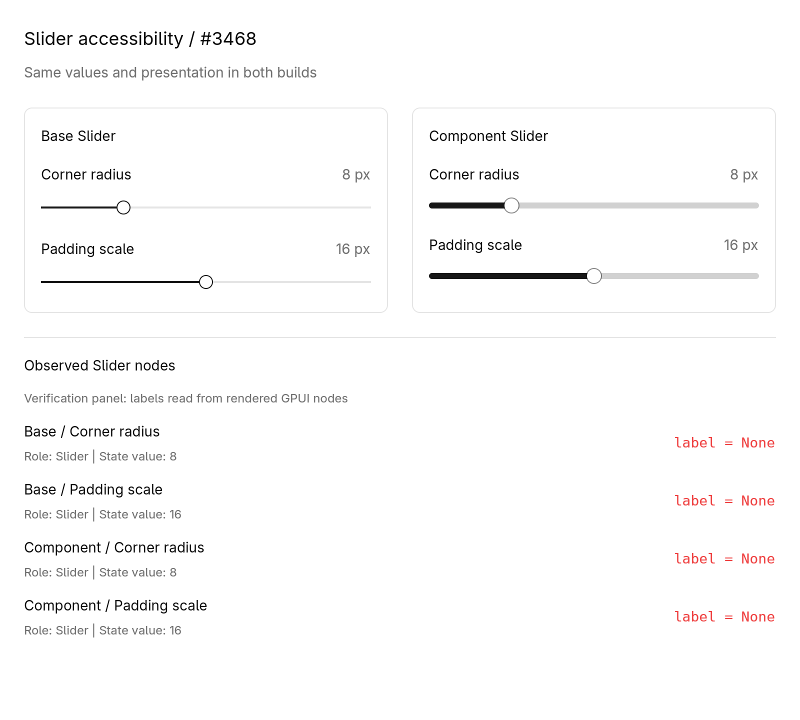 | 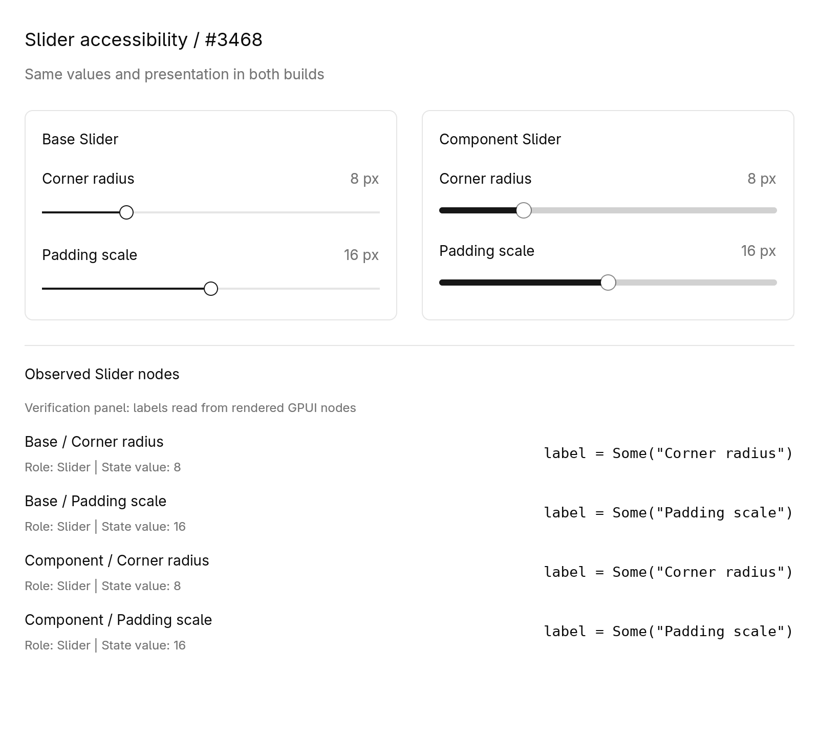 | | Dark | 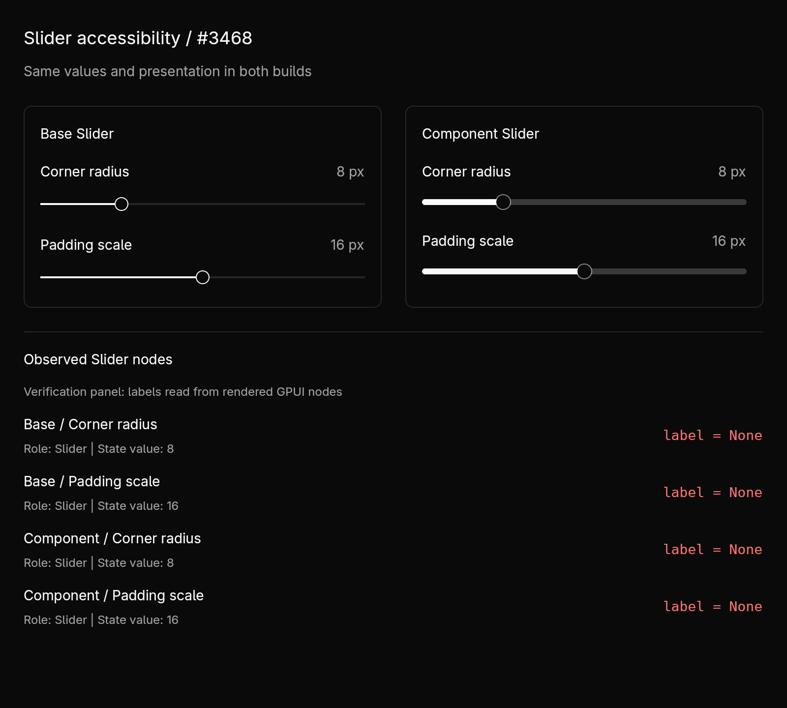 | 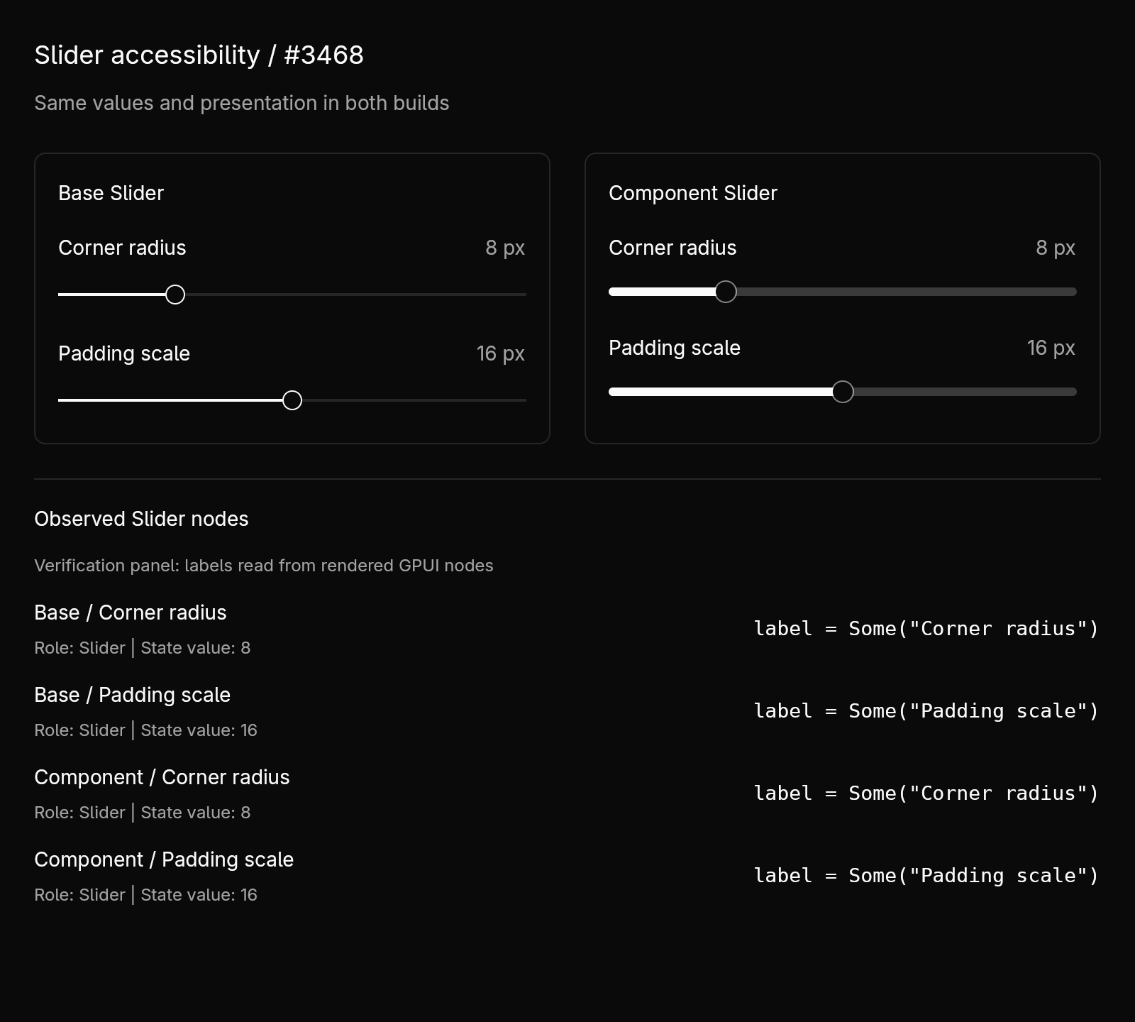 | The controls-only captures have 0 changed pixels in both themes. [Controls-only captures and raw observations](https://github.com/lurenjia534/gpui-component/tree/15684a70f17928f2b73e2f0c4fd325df24bd4c31/evidence/slider-3468) are available at a fixed evidence commit. ## Public API ### gpui-base Added to `gpui_base::slider::Slider`: ```rust pub fn accessibility_label(mut self, label: impl Into<SharedString>) -> Self ``` Sets the accessible name on the existing Slider node. ### gpui-component Added to `gpui_component::slider::Slider`: ```rust pub fn accessibility_label(mut self, label: impl Into<SharedString>) -> Self ``` Forwards the accessible name to the underlying Base Slider. ## How to Test Run from the repository root (omit `--offline` if dependencies are not cached): ```sh cargo test --locked --offline -p gpui-kit --features test-support --test integration slider_steps:: cargo test --locked --offline -p gpui-base -p gpui-component --lib slider::tests cargo check --locked --offline -p gpui-base -p gpui-component --lib cargo clippy --locked --offline -p gpui-base -p gpui-component --lib -- -D warnings cargo clippy --locked --offline -p gpui-kit --features test-support --test integration -- -D warnings rustfmt --edition 2024 --check \ crates/base/src/slider.rs \ crates/component/src/slider.rs \ crates/kit/tests/integration/slider_steps.rs git diff --check ``` All commands passed on upstream base `8d4907da456a4f363c7ee1c22c553f44c3c58500` plus commit `0825fb2f5ec5f9c1a2c93ef01cc57961d5c4443a`. There were 4 passing Slider integration tests, 4 passing Base unit tests, and 2 passing Component unit tests. The added regression queries Base and Component by their existing stable Slider IDs and checks role, node count and label across omitted labels, two distinct labels, non-ASCII renaming, and label removal on a later render. The three existing pointer/disabled integration regressions are unchanged. Independent before/after verification with the [review fixture](https://github.com/lurenjia534/gpui-component/blob/15684a70f17928f2b73e2f0c4fd325df24bd4c31/evidence/slider-3468/fixture/src/main.rs): - Before: the new builders fail to compile with exactly two `E0599` errors; the existing APIs render four Slider nodes whose labels are all `None`. - After: the new builders compile, and all six theme/case combinations pass for distinct English names, Chinese renaming and removal. - Element identity paths, roles, state values and bounds remain equal across builds. Controls-only screenshots are pixel-identical in both themes. [Rendered-node observations and image hashes](https://github.com/lurenjia534/gpui-component/tree/15684a70f17928f2b73e2f0c4fd325df24bd4c31/evidence/slider-3468) and [validation command logs](https://github.com/lurenjia534/gpui-component/tree/15684a70f17928f2b73e2f0c4fd325df24bd4c31/evidence/slider-3468/checks) are available for review. A [reproduction script](https://github.com/lurenjia534/gpui-component/blob/15684a70f17928f2b73e2f0c4fd325df24bd4c31/evidence/slider-3468/reproduce.py) recreates both clean source revisions, checks expected compilation/runtime results and compares the controls-only PNGs: ```sh git clone --branch evidence/slider-3468-0825fb2f https://github.com/lurenjia534/gpui-component.git slider-3468-review cd slider-3468-review python3 evidence/slider-3468/reproduce.py --output review-output ``` Native screen-reader speech, the native Story window and macOS/Windows runtime verification have not been performed. The offscreen fixture verifies GPUI rendering and node metadata. ## AI Assistance AI assisted with issue analysis, the optional label implementation, the rendered-node regression, bilingual documentation, static review, validation commands and the separate screenshot fixture. ## Checklist - [x] Repository contributing, design and coding guidance was consulted; the change is focused on #3468. - [x] Contributor reviewed the generated implementation and test evidence. - [x] Rust compilation, regression tests, formatting and Clippy passed. - [ ] A relevant native Story/example was run and its OS accessibility metadata was checked. - [ ] Native cross-platform verification was performed. | 7 天前 | |
speech: Pace `SpeechWaveform` at one bar per 80 ms and scroll it smoothly (#3352) ## Summary `SpeechWaveform` scrolled too fast to read and did not move smoothly. Measured against a reference dictation UI (one mark about every 80 ms, marks 7 px apart, about 88 px/s, starting empty at the trailing edge, gliding at an even pace), it now matches both the pace and the motion. ### Pace and shape - **Pace:** one level per 80 ms of audio (was 25 ms), so one bar per 80 ms. - **Spacing:** the gap between bars is 2.5× the bar width (was 1×): 2 px bars, 7 px pitch at the small sizes, about 88 px/s. - **Start:** only levels that exist are drawn, so the waveform starts empty and grows from the trailing edge until it fills the width. ### Smooth motion The waveform stepped and stalled for three reasons, each fixed: - **Scroll tied to arrivals.** The scroll restarted with each level, and levels arrive in uneven bursts as the device hands over buffers. The waveform now follows its own playhead clock. - **Playhead too close.** It ran 0.75 levels behind the newest level, less than the one level it advances between arrivals, so it caught up every interval and froze. It now runs 1.75 levels (about 140 ms) behind. Each arrival nudges its phase and its pace (a PI correction), so it settles on the pace levels actually arrive at; a pace change keeps its position, so it never jumps. - **Pixel snapping.** Quads snap to whole device pixels, so a bar moving 1.5 px per frame stepped by 1 or 2. Bars are now anti-aliased capsule paths that glide at sub-pixel positions. A bar sliding in is clipped at the trailing edge. Measured inside the app (release, 120 Hz display): one render every 8.3 ms (p10–p90 8.1–8.6 ms), the playhead advancing 12.51 levels/s against a target of 12.5 with 2 % frame-to-frame variation. In a screen recording, frames without motion dropped from 13 % to about 1 %. The example's waveform now takes the rest of the dictation bar while recording. ## Behavior changes (no signature changes) - `SpeechState::levels` yields one level per 80 ms of audio (was 25 ms). - `SpeechWaveform` leaves the part of its width without history empty, spaces bars 2.5× their width apart, draws them as paths, and trails the newest level by about 140 ms. ## Test plan - `cargo test -p gpui-component --features speech --lib speech` — 29 tests. New ones cover the waveform geometry (a short history grows from the trailing edge, a long one fills the width, nothing drawn before any audio, a bar past the edge stays out until it slides in) and the playhead (even pace between levels, an early arrival does not jerk it, it settles on 10 % fast and 15 % slow arrival paces, nothing before the first level). - `cargo test -p speech`. - `cargo clippy -p gpui-component -p speech -p gpui-component-story --features gpui-kit/speech --all-targets -- -D warnings`. - Screen recordings of the example driven by wall-clock-paced generated audio (debug and release), analyzed frame by frame against the reference recording. --------- Co-authored-by: Claude Opus 5.5 <noreply@anthropic.com> | 16 天前 | |
docs: separate Component API docs from shared Kit guides (#3006) ## Summary Component API pages currently live inside the shared Kit documentation. Move their English and Chinese sources and canonical URLs to `/component/*` and `/zh-CN/component/*`, with independent collections, sidebars and Markdown endpoints. Keep shared design, coding and future GPUI guides under `/docs`. Set the primary navigation to Docs → Component → Base → Shell → App Stories, with the corresponding Chinese navigation. Update homepage links, component demo routing, cross-references, sitemap and LLM indexes. Old component HTML addresses redirect to the new pages; old Markdown endpoints remain readable and advertise the canonical URLs. Most changed files are unchanged component documents moved to the new directory. ## Test Plan - [x] Website production build with Pagefind completes. - [x] `bun run test:seo`: all 11 checks pass, including every component page's canonical/legacy HTML and Markdown URLs, shared guide locations, separate sidebars, cross-links and navigation order. - [x] `git diff --check`. Browser automation could not initialize in the local runtime; validation covers the built pages and routes. Deployment is not part of this PR. --------- Co-authored-by: Codex <codex@openai.com> | 1 个月前 | |
docs: separate Component API docs from shared Kit guides (#3006) ## Summary Component API pages currently live inside the shared Kit documentation. Move their English and Chinese sources and canonical URLs to `/component/*` and `/zh-CN/component/*`, with independent collections, sidebars and Markdown endpoints. Keep shared design, coding and future GPUI guides under `/docs`. Set the primary navigation to Docs → Component → Base → Shell → App Stories, with the corresponding Chinese navigation. Update homepage links, component demo routing, cross-references, sitemap and LLM indexes. Old component HTML addresses redirect to the new pages; old Markdown endpoints remain readable and advertise the canonical URLs. Most changed files are unchanged component documents moved to the new directory. ## Test Plan - [x] Website production build with Pagefind completes. - [x] `bun run test:seo`: all 11 checks pass, including every component page's canonical/legacy HTML and Markdown URLs, shared guide locations, separate sidebars, cross-links and navigation order. - [x] `git diff --check`. Browser automation could not initialize in the local runtime; validation covers the built pages and routes. Deployment is not part of this PR. --------- Co-authored-by: Codex <codex@openai.com> | 1 个月前 | |
docs: separate Component API docs from shared Kit guides (#3006) ## Summary Component API pages currently live inside the shared Kit documentation. Move their English and Chinese sources and canonical URLs to `/component/*` and `/zh-CN/component/*`, with independent collections, sidebars and Markdown endpoints. Keep shared design, coding and future GPUI guides under `/docs`. Set the primary navigation to Docs → Component → Base → Shell → App Stories, with the corresponding Chinese navigation. Update homepage links, component demo routing, cross-references, sitemap and LLM indexes. Old component HTML addresses redirect to the new pages; old Markdown endpoints remain readable and advertise the canonical URLs. Most changed files are unchanged component documents moved to the new directory. ## Test Plan - [x] Website production build with Pagefind completes. - [x] `bun run test:seo`: all 11 checks pass, including every component page's canonical/legacy HTML and Markdown URLs, shared guide locations, separate sidebars, cross-links and navigation order. - [x] `git diff --check`. Browser automation could not initialize in the local runtime; validation covers the built pages and routes. Deployment is not part of this PR. --------- Co-authored-by: Codex <codex@openai.com> | 1 个月前 | |
setting: Name bool fields after their setting's title (#3524) Closes #3381 ## Description A checkbox or switch with no visible text is announced without a name. Following the direction in the review of #3440, this doesn't fall back to the element id: - `BoolField` passes the setting's title to its `Checkbox`/`Switch` as `accessibility_label`. Every bool setting used to be `Checkbox::new("check")` or `Switch::new("check")` with no name. - `Checkbox::accessibility_label` and the en/zh-CN checkbox docs now say that a checkbox without visible text must set one. Checkboxes named by their child text are unchanged. ## Screenshot No visual change. UI Automation on Windows, Settings story (`cargo run -- settings`): | Before | After | | --- | --- | | Switch: *(no name)* | Switch: "Dark Mode" | | Checkbox: *(no name)* | Checkbox: "Auto Switch Theme" | | 3 more switches: *(no name)* | named after their settings | ## How to Test - New integration test `controls::bool_settings_are_named_after_their_titles` renders `Settings` with a checkbox and a switch setting and checks their labels from the painted frame. It fails without the change (`[None, None]`). - `cargo test -p gpui-kit --features test-support,component --test integration`: 392 passed. `cargo test -p gpui-component`: 721 passed. - `cargo clippy -p gpui-component -p gpui-kit --all-targets -- -D warnings`, `cargo fmt --check`. - Windows 11: checked with UI Automation on the Settings story, as above. Not tested on macOS or Linux, but the change isn't platform-specific. ## Checklist - [x] I have read the [CONTRIBUTING](../CONTRIBUTING.md) document and followed the guidelines. - [x] Reviewed the changes in this PR and confirmed AI generated code (If any) is accurate. - [x] Passed `cargo run` for story tests related to the changes. - [x] Tested macOS, Windows and Linux platforms performance (if the change is platform-specific) 🤖 Generated with [Claude Code](https://claude.com/claude-code) --------- Co-authored-by: Claude Opus 5.5 <noreply@anthropic.com> Co-authored-by: Floyd Wang <gassnake999@gmail.com> | 3 天前 | |
docs: separate Component API docs from shared Kit guides (#3006) ## Summary Component API pages currently live inside the shared Kit documentation. Move their English and Chinese sources and canonical URLs to `/component/*` and `/zh-CN/component/*`, with independent collections, sidebars and Markdown endpoints. Keep shared design, coding and future GPUI guides under `/docs`. Set the primary navigation to Docs → Component → Base → Shell → App Stories, with the corresponding Chinese navigation. Update homepage links, component demo routing, cross-references, sitemap and LLM indexes. Old component HTML addresses redirect to the new pages; old Markdown endpoints remain readable and advertise the canonical URLs. Most changed files are unchanged component documents moved to the new directory. ## Test Plan - [x] Website production build with Pagefind completes. - [x] `bun run test:seo`: all 11 checks pass, including every component page's canonical/legacy HTML and Markdown URLs, shared guide locations, separate sidebars, cross-links and navigation order. - [x] `git diff --check`. Browser automation could not initialize in the local runtime; validation covers the built pages and routes. Deployment is not part of this PR. --------- Co-authored-by: Codex <codex@openai.com> | 1 个月前 | |
tab: Scroll a clicked tab into view with the next one peeking (#3419) ## Description When a `TabBar` overflows, clicking a partially hidden tab selects it but leaves it clipped, so there is no way to keep moving through the strip except by scrolling manually. Clicking a tab (or picking it from the overflow menu) now scrolls it into view with part of the neighboring tab showing, animated with the same spring as the selection indicator. This also works when `track_scroll` is not used. As agreed in #3021, only a click does this: changing the selection, the tabs or the layout still leaves the offset where the user put it, and a wheel or trackpad scroll during the animation takes over immediately. Reduced motion skips the animation. ## Screenshot | Before | After | | ------ | ----- | | https://github.com/user-attachments/assets/5e189ca9-9a28-446f-ba70-dc229400c5f4 | https://github.com/user-attachments/assets/1ca955cb-f3fe-4cd3-97c9-b50848d70735 | ## How to Test Run `cargo run -- tabs`, add tabs in **Dynamic Tabs** until the bar overflows, then click the clipped tabs at either edge. ## Checklist - [x] I have read the [CONTRIBUTING](../CONTRIBUTING.md) document and followed the guidelines. - [x] Reviewed the changes in this PR and confirmed AI generated code (If any) is accurate. - [x] Passed `cargo run` for story tests related to the changes. - [ ] Tested macOS, Windows and Linux platforms performance (if the change is platform-specific) --------- Co-authored-by: Claude Opus 5.5 <noreply@anthropic.com> | 12 天前 | |
docs: separate Component API docs from shared Kit guides (#3006) ## Summary Component API pages currently live inside the shared Kit documentation. Move their English and Chinese sources and canonical URLs to `/component/*` and `/zh-CN/component/*`, with independent collections, sidebars and Markdown endpoints. Keep shared design, coding and future GPUI guides under `/docs`. Set the primary navigation to Docs → Component → Base → Shell → App Stories, with the corresponding Chinese navigation. Update homepage links, component demo routing, cross-references, sitemap and LLM indexes. Old component HTML addresses redirect to the new pages; old Markdown endpoints remain readable and advertise the canonical URLs. Most changed files are unchanged component documents moved to the new directory. ## Test Plan - [x] Website production build with Pagefind completes. - [x] `bun run test:seo`: all 11 checks pass, including every component page's canonical/legacy HTML and Markdown URLs, shared guide locations, separate sidebars, cross-links and navigation order. - [x] `git diff --check`. Browser automation could not initialize in the local runtime; validation covers the built pages and routes. Deployment is not part of this PR. --------- Co-authored-by: Codex <codex@openai.com> | 1 个月前 | |
text_view: Follow the container's text color so rich text reads in filled bubbles (#3329) Closes #3326 ## Description `TextView` paints its own text color on its root, so it does not inherit the color a `Bubble` sets on its content. In a `Filled` bubble, Markdown is drawn in the theme `foreground` on the `primary` surface: white on white in dark mode. Links (`primary`) disappear too, and code backgrounds (`accent`/`muted`) are tuned for the page, not for a `primary` surface. The first revision added `BubbleVariant::text_view_style(cx)`, which callers passed to every `TextView` in a bubble. That repeated the bubble's variant at each call site and would have needed the same method on every other colored container, so the fix now lives in `TextView` itself: - **Follow the container's text color.** A `TextView` without an explicit `.style()` takes the text color its container sets (`window.text_style().color`, or its own `.text_color()`). - **Same-polarity surfaces** (Secondary, Destructive, a popover): only the body text changes. Links, code and borders keep the theme colors. - **Inverted surfaces** (`Filled`, whose `primary` fill is dark on a light page and light on a dark one): when the inherited color is more than 0.6 away from the style's foreground in Oklab lightness, links, muted text (block quotes), code and inline-code backgrounds, borders, selection, the table header and body backgrounds are all derived from it. The dark flag flips, so todo checkboxes pick the right icon. The installed syntax highlighter is left out, since its colors are made for the page. - **Opt-in in Base, on in Component.** `TextViewDefaults::with_inherit_text_color(true)` enables it. Component turns it on because its Root sets the theme foreground. A Base-only window that sets no root text color would otherwise inherit GPUI's default black. `Bubble` needs no change, since it already sets each variant's text color. ## Screenshot Filled, Secondary and Destructive bubbles with a link, inline code, a block quote, a todo list, a fenced code block and a table, in the light and dark themes, read correctly. Before this change, the Filled bubble's text, link and table were invisible in dark mode. ## Public API ### gpui-base - `gpui_base::TextViewDefaults::with_inherit_text_color(self, inherit: bool) -> Self`: makes text views without an explicit style follow the text color their container sets, adapting every color on an inverted surface. - `gpui_base::TextViewDefaults::inherit_text_color(&self) -> bool`: whether that is enabled. ### gpui-component No items are added. Text views now follow the container's text color by default, because Component installs `with_inherit_text_color(true)`. ## How to Test - `cargo test -p gpui-base -p gpui-component` - `text_color_of_a_matching_surface_only_replaces_the_body_text` and `text_color_of_an_inverted_surface_derives_every_color_from_it` cover the color derivation in both themes. - `text_view_follows_the_text_color_of_its_container` checks that a view under a container with `primary_foreground` text resolves to that color with a flipped dark flag, and that an explicit `.style()` still wins. - Manually: render `Bubble::new().child(TextView::markdown("reply", text))` with links, code, quotes, todos and a table in each variant, and toggle the theme. ## Checklist - [x] I have read the [CONTRIBUTING](../CONTRIBUTING.md) document and followed the guidelines. - [x] Reviewed the changes in this PR and confirmed AI generated code (If any) is accurate. - [x] Passed `cargo run` for story tests related to the changes. - [ ] Tested macOS, Windows and Linux platforms performance (if the change is platform-specific) (not platform-specific) 🤖 Generated with [Claude Code](https://claude.com/claude-code) --------- Co-authored-by: Claude Opus 5.5 (1M context) <noreply@anthropic.com> Co-authored-by: Jason Lee <huacnlee@gmail.com> | 19 天前 | |
input: share display_map and prewrap across text modes (#3564) ## Description Follow-up to #3540, implementing the [requested API shape](https://github.com/longbridge/gpui-kit/pull/3540): expose the existing `display_map()` and `prewrap()` on the shared `InputBaseState<M: InputModeKind>` implementation instead of adding a textarea-specific row-count getter. - Move the two existing methods out of the Editor-only implementation; their bodies and signatures are unchanged. - Document the cached count, first-layout/prewrap timing, resize/font refresh, and distinction between content rows and viewport/auto-grow limits. - Cover textarea first-frame preparation, disabled soft wrapping, fixed-row internal scrolling, host-owned preferred height with flex shrink, and Unicode wrapping across resize. Existing Editor prewrap tests remain in place. - Add a short link to the existing Editor sizing pattern in both English and Chinese textarea documentation, with a reminder to use the textarea's actual text style. No new row-count getter, wrapping implementation, cache, or dependency is introduced. Existing Editor callers are unchanged. ## Screenshot Fresh native macOS text-system + Metal-renderer captures from this branch, not the previous proposal. These are offscreen native renders, not OS IME/accessibility coverage.   ## Public API ### `gpui-base` The following existing methods now belong to `impl<M: InputModeKind> InputBaseState<M>` instead of the Editor-only implementation. They become available on `InputState` and `TextareaState`; `EditorState` retains the same API and behavior. ```rust pub fn display_map(&self) -> &DisplayMap; ``` Returns the cached display map, including `wrap_row_count()`, without forcing layout or preparing text. ```rust pub fn prewrap( &mut self, font: gpui::Font, font_size: Pixels, width: Pixels, cx: &mut Context<Self>, ); ``` Prepares wrapping using the supplied text style and text-area width before the first layout; remains a no-op after the input has been laid out. These additive methods are also reachable through the existing state re-exports used by `gpui_kit::component::input`. No re-export is added or removed, and no existing caller needs migration. ## How to Test Completed on macOS arm64: ```sh cargo test -p gpui-base --features test-support --lib # 1,384 passed cargo test -p gpui-kit --features test-support --test integration --test ui # 400 passed across the two suites cargo fmt --all -- --check cargo build -p gpui-base -p gpui-kit cargo clippy -p gpui-base -p gpui-kit --lib --tests --features gpui-kit/test-support ``` A disposable `cargo run` harness using `HeadlessAppContext`, the native platform text system, and `current_headless_renderer` also passed assertions for: - first-frame textarea prewrap; - content-driven preferred heights (3/6/20 content rows → 104/176/320px); - shrinking into a 120px viewport, internal scroll offset, and visible end-of-document caret; - Japanese text, combining characters and family emoji wrapping when narrowed; - preservation of text and the existing post-layout prewrap no-op. The harness was removed after capturing the images; the deterministic integration coverage is retained in this PR. Notes: running the base unit suite without `test-support` stops at the checkout's `a11y_disabled.rs:298` reference to feature-gated `crate::test_support`, so the command above enables that feature rather than changing an unrelated test. Cargo also reports the existing `block v0.1.6` future-incompatibility notice. Native runtime verification here is macOS only. ## Checklist - [x] Read and followed CONTRIBUTING. - [x] Reviewed the changes and the AI-assisted code. - [x] Ran the affected behavior through a native Metal `cargo run` harness and inspected its captures; this was not a story-app run. - [x] No platform-specific implementation change; existing method bodies are preserved. No Windows/Linux native verification is claimed. | 3 天前 | |
docs: expand GPUI core guides and improve documentation UI (#3225) ## Description Expand the English and Chinese GPUI guides into a source-checked reference for GPUI Kit users. The new and revised pages cover entity ownership, render lifecycles, custom elements and painting, actions and events, tasks, globals, styling, text, accessibility, animation, WebAssembly, and related APIs. Examples use practical module boundaries and distinguish API guarantees from design guidance. Improve documentation navigation, cross-links, and code examples. Add an animated memory diagram to the SharedString guide. Make article links visibly identifiable and give long tables a distinct header and alternating row backgrounds. Add a CC BY 4.0 attribution notice for eligible GPUI Kit documentation prose and original illustrations, while preserving the repository's existing Apache-2.0 permissions for software and code examples. ## Screenshot The documentation UI changes are visible in the built site: links have blue text and underlines, table headers have a filled background, and alternate body rows have a subtle tint. The SharedString guide contains a responsive SVG comparison with reduced-motion support. ## How to Test From `website/`: ```sh bun run build bun run test:seo bun run test:showcases bun run test:versioned-examples ``` All commands passed. `git diff --check` passed as well. ## Checklist - [x] Reviewed the documentation and code examples against the current GPUI and GPUI Kit APIs. - [x] Verified the English and Chinese guides and the generated documentation site. - [x] No Rust public API or platform-specific runtime behavior changed. | 26 天前 | |
date_picker: Support editing the time of day with `TimeField` (#3206) ## Summary DatePicker can now edit the time of day, down to minutes or seconds, on a 24-hour (default) or 12-hour clock. ```rust DatePickerState::new(window, cx) .time_precision(TimePrecision::Second) // or Minute; unset = date only, unchanged .hour_cycle(HourCycle::H12) // default H23 .default_time(NaiveTime::from_hms_opt(9, 0, 0).unwrap()) ``` - A time field appears below the calendar. Picking a date keeps the popup open; every date or time edit emits `Change` immediately. Clicking the selected date again (so double-clicking a date) closes the popup without emitting, as do Enter, Escape and a click outside. - The display format follows the precision and hour cycle (e.g. `%Y/%m/%d %H:%M:%S`, `%Y/%m/%d %I:%M %p`) unless `date_format` is set. - A range picker edits dates only, even with a `time_precision`; a range with times is composed from two single pickers (see docs). - Enter now also closes an open picker (previously it did nothing while open). - The time field and, while editing times, the trigger use tabular figures (`tnum`) so digits keep their width while typing; the AM/PM segment stacks both labels so it keeps the wider one's width. The 24-hour default follows fixed-format libraries (Ant Design, Element) and the conventions of our Chinese-market and trading UIs; GPUI does not expose the system's hour-cycle preference that native pickers follow. ### New `TimeField` - `gpui-base` (**Base-layer change**): unstyled `TimeField` / `TimeFieldState` owning focus, the keyboard model and segment editing (`Role::TimeInput`). - Up/Down step the selected segment and wrap without carry; Left/Right and Tab/Shift-Tab move between segments; digits type with a two-digit buffer and auto-advance; `a`/`p` set AM/PM; Backspace resets the segment. - `gpui-component`: styled `TimeField`, usable on its own in forms. - Docs: `website/component/time-field.md` and `website/base/primitives/time-field.md` (en + zh-CN), catalog entries, the gpui-kit skill, a `TimeField` gallery story and a `time-field` base showcase. ## Public API ### `gpui-base` - `pub struct TimeFieldState` — retained editing behavior for a segmented time field. - `pub fn new(window: &mut Window, cx: &mut Context<Self>) -> Self` - `pub fn precision(self, precision: TimePrecision) -> Self` / `pub fn set_precision(&mut self, precision: TimePrecision, window, cx)` — minutes or seconds. - `pub fn hour_cycle(self, hour_cycle: HourCycle) -> Self` / `pub fn set_hour_cycle(&mut self, hour_cycle: HourCycle, window, cx)` — 24- or 12-hour clock. - `pub fn time(&self) -> NaiveTime` / `pub fn set_time(&mut self, time: NaiveTime, window, cx)` — read or replace the value without emitting. - `pub fn selected_segment(&self) -> TimeSegment` — the segment keyboard editing applies to. - `pub fn focus(&self, window: &mut Window, cx: &mut App)` — focus the field. - `pub enum TimeFieldEvent { Change(NaiveTime) }` — emitted on user edits. - `pub enum TimePrecision { Minute, Second }` — `format(self, HourCycle) -> &'static str`, `truncate(self, NaiveTime) -> NaiveTime`. - `pub enum HourCycle { H23, H12 }` — how the hours of a day are counted; names follow Unicode `hourCycle`. - `pub enum TimeSegment { Hour, Minute, Second, Period }` — one editable component. - `pub struct TimeField` — unstyled element: `new(id, &Entity<TimeFieldState>)`, `disabled(bool)`, `render_segment(renderer)`, `Styled`. - `pub struct TimeFieldSegment` — pre-wired segment passed to the segment slot (`Styled`, `ParentElement`, `InteractiveElement`); `clear_children()` removes the default label. - `pub struct TimeFieldSegmentState` — `segment()`, `value()`, `is_selected()`, `is_disabled()` for decorating a segment. ### `gpui-component` - `time_field::TimeField` — styled time field: `new(&Entity<TimeFieldState>)`, `invalid(bool)`, `Sizable`, `Disableable`, `Styled`. Re-exports `TimeFieldState`, `TimeFieldEvent`, `TimePrecision`, `HourCycle`, `TimeSegment`. - `date_picker::DateTime` — `Single(Option<NaiveDateTime>)` / `Range(Option<NaiveDateTime>, Option<NaiveDateTime>)`, with `is_some`, `is_complete`, `start`, `end`, `date() -> Date`, `format(&str)`. - `DatePickerState::time_precision(self, TimePrecision) -> Self` — edit the time of day too (single mode). - `DatePickerState::hour_cycle(self, HourCycle) -> Self` — 24- or 12-hour time field. - `DatePickerState::default_time(self, NaiveTime) -> Self` — the time a date gets before it is edited. - `DatePickerState::date_time(&self) -> DateTime` / `set_date_time(&mut self, impl Into<DateTime>, window, cx)` — the whole value. - `DateRangePreset::date_time(label, impl Into<DateTime>) -> Self` and `DateRangePresetValue::DateTime(DateTime)` — presets with times. ### `gpui-component-shell` (JavaScript, `gpui-component` module) - `TimeFieldState(): TimeFieldState` — retained 24-hour, minute-precision time state. - `new TimeField(state: TimeFieldState): TimeFieldElement` — segmented time field; `.disabled(disabled: boolean)`. - Mirrored in the JS gallery (`time-field` route) and `component-inventory.json`. ## Breaking Changes `DatePickerEvent::Change` carries `DateTime` instead of `Date`: ```diff cx.subscribe(&picker, |this, _, event, _| match event { - DatePickerEvent::Change(date) => match date { + DatePickerEvent::Change(value) => match value.date() { Date::Single(Some(date)) => { /* … */ } _ => {} }, }); ``` `format` keeps its signature, so `value.format("%Y-%m-%d")` still works unchanged. `DateRangePresetValue` gains a `DateTime` variant, so exhaustive matches on it need a new arm. ## Test plan - [x] `TimeField` editing rules unit tests in `gpui-base` (24- and 12-hour typing, stepping, midnight/noon labels) - [x] `test_time_field_builder` in `gpui-component` - [x] Integration tests in `crates/kit/tests/date_picker.rs`: live changes while the popup stays open; 12-hour typing with `p`; range picker stays date-only and keeps owner-set times - [x] `cargo test` for base, component, kit date_picker, shell - [x] `cargo clippy --workspace --all-targets -- --deny warnings` - [ ] Check the 12-hour field layout in the story (`cargo run -- DatePicker`, "Date and time") - [ ] Check the `TimeField` story and the `time-field` base showcase (`cargo run -p gpui-base-examples -- time-field`); the WASM showcase build is left to CI --------- Co-authored-by: Claude Opus 5.5 (1M context) <noreply@anthropic.com> | 26 天前 | |
website: Keep versioned docs links inside their version (#3243) Documentation pages read under `/versions/main` or `/versions/<tag>` linked back to the default version through site-root links (`/docs/entity`, `/component/...`), which often 404 there because the default is the latest release. ## Links stay in their version - 124 site-root links in `docs`, `component`, `base`, `shell` (en and zh-CN) now link the `.md` file relatively. zh-CN pages that linked English Base pages now link the Chinese ones. - `remarkDocLinks` prefixes any remaining site-root docs link with the build's base, so released snapshots (v0.6.6 still has such links) stay inside `/versions/<tag>` too. - Redirect destinations (`/docs/dock` → `/component/dock`, …) and the zh-CN → en language switch kept dropping the version base; both are fixed. - The 404 page, which GitHub Pages serves for every missing path, looks for the same page in the other versions and offers it ("This page is not in the v0.6.6 (latest) documentation, but it exists in main."). It also now loads the site stylesheet; it was unstyled before. ## GPUI snapshot version in one place Pages write `{{gpui_pre_version}}` in prose, code and docs.rs links. It resolves from the `gpui` entry of the workspace `Cargo.toml`; `script/build-website-versions` passes each revision's own value. The `.md` endpoints and `llms-full.txt` expand it as well. ## Maturity labels `maturity: [preview | experimental | showcase-only | platform-dependent | stable]` in frontmatter renders mono labels under the title, linking to a new Maturity section on the docs home. Marked: Mobile and WebView (Experimental, Platform-dependent), WebAssembly (Showcase only: it currently serves the component showcases, not shipped applications), all GPUI Shell pages (Preview), Native Extensions, SystemNotification and TitleBar (Platform-dependent). Unmarked pages are Stable. ## Checks - `bun run test:docs` (sources, no build): no site-root docs links; relative links resolve, in the same locale when possible; no hand-written pinned `gpui-pre` version or versioned docs.rs gpui-pre URL; known variables only; en/zh-CN maturity match. - `bun run test:links`: every `<a>` and redirect in a build reaches a built page; `test:versioned-examples` repeats it at `/versions/test/`, where leaving the version fails. - Test Docs now also runs on `Cargo.toml` changes. Verified locally with a production-shaped build (v0.6.6 at `/`, this branch at `/versions/main`): all website tests pass, the v0.6.6 snapshot passes the link check at `/versions/v0.6.6/`, and the 404 fallback works for `/docs/entity` and `/zh-CN/docs/entity`. Publishing a release that contains the new GPUI guides is what makes `/docs/` show them; this PR does not change which version is the default. 🤖 Generated with [Claude Code](https://claude.com/claude-code) --------- Co-authored-by: Claude Opus 5.5 (1M context) <noreply@anthropic.com> | 25 天前 | |
docs: separate Component API docs from shared Kit guides (#3006) ## Summary Component API pages currently live inside the shared Kit documentation. Move their English and Chinese sources and canonical URLs to `/component/*` and `/zh-CN/component/*`, with independent collections, sidebars and Markdown endpoints. Keep shared design, coding and future GPUI guides under `/docs`. Set the primary navigation to Docs → Component → Base → Shell → App Stories, with the corresponding Chinese navigation. Update homepage links, component demo routing, cross-references, sitemap and LLM indexes. Old component HTML addresses redirect to the new pages; old Markdown endpoints remain readable and advertise the canonical URLs. Most changed files are unchanged component documents moved to the new directory. ## Test Plan - [x] Website production build with Pagefind completes. - [x] `bun run test:seo`: all 11 checks pass, including every component page's canonical/legacy HTML and Markdown URLs, shared guide locations, separate sidebars, cross-links and navigation order. - [x] `git diff --check`. Browser automation could not initialize in the local runtime; validation covers the built pages and routes. Deployment is not part of this PR. --------- Co-authored-by: Codex <codex@openai.com> | 1 个月前 | |
toolbar: Add Toolbar and ToolbarGroup components (#3128) ## Description Adds horizontal `Toolbar` and `ToolbarGroup` components for application command rows, with behavior in `gpui-base` and density/theme presentation in `gpui-component`. - **`gpui-base` owns behavior.** `Toolbar` exposes the horizontal toolbar accessibility role and roving Left/Right focus across focusable descendants, including wrapping and disabled navigation. `ToolbarGroup` adds labeled semantic groups without imposing presentation. - **`gpui-component` owns presentation.** The styled Toolbar propagates one density to hosted controls, aligns mixed controls on one center line, and automatically presents hosted Buttons as `ghost + compact` commands. - **Source-order composition.** Controls and content render in the order they are appended. Flexible spacers such as `content(div().flex_1())` handle trailing alignment; there are no `left` or `right` regions. - **Application-oriented density.** Toolbar defaults to `Small`, supports `XSmall`, `Small`, and `Medium`, uses equal padding on every edge, and treats `Large` as `Medium`. - **Examples and documentation.** The component Story covers document/history/formatting commands, Input, Select, Combobox, size options, and a Disabled toggle. The `gpui-base` showcase demonstrates groups, separators, a trailing Search input, keyboard behavior, and visible command feedback. English and Chinese documentation are included. ## Public API ### `gpui-base` - `Toolbar::new(id)` creates a horizontal toolbar. - `Toolbar::disabled(value)` disables roving keyboard navigation. Hosted controls remain owned by the caller. - `ToolbarGroup::new(id)` creates a semantic subgroup. - `ToolbarGroup::label(label)` supplies its accessible name. - Toolbar and ToolbarGroup implement the standard GPUI styling, parent, interaction, and rendering traits. ### `gpui-component` - `Toolbar::new(id)` creates a transparent, borderless Small toolbar. - `child` / `children` append `Sizable` controls and propagate the final toolbar size. - `content` / `contents` append separators, labels, spacers, and custom content without resizing them. - `disabled(value)` disables Toolbar navigation; callers also disable hosted controls. - `with_size(size)` supports `XSmall`, `Small`, and `Medium`; `Large` falls back to `Medium`. - `ToolbarGroup` propagates its inherited size to grouped controls. - Hosted `Button` values automatically receive the compact ghost toolbar presentation. ## Breaking Changes None. These components are new in this PR. ## Test Plan - `cargo fmt --check` - `git diff --check` - `cargo test -p gpui-base toolbar --lib` - `cargo test -p gpui-component toolbar::tests --lib` - `cargo check -p gpui-component-story -p gpui-component-shell` - `cargo check --manifest-path crates/base/examples/native/Cargo.toml --bin components` - Open the Toolbar Story and verify XSmall/Small/Medium, Disabled, mixed-control alignment, popup behavior, and keyboard focus. - Open the gpui-base Toolbar showcase and verify command feedback, groups, separators, trailing Search input, and Left/Right focus movement. ## AI Assistance The implementation and review were completed with agent assistance; commits include the corresponding `Co-authored-by` trailers. --------- Co-authored-by: GLM (ZCode) <noreply@z.ai> Co-authored-by: Jason Lee <huacnlee@gmail.com> Co-authored-by: Codex <codex@openai.com> | 28 天前 | |
tooltip: Make show delay and grace period configurable with `TooltipDefaults` (#3376) ## Description Managed tooltips (the ones components set up through `.tooltip()`, shown by the per-window `TooltipOverlay`) had their timing hard-coded in `gpui-base`: a 500 ms show delay and a 300 ms grace period. Applications could not change either. - **Application-wide:** `gpui_base::TooltipDefaults` holds the show delay and grace period and is installed as a global, following the `TextViewDefaults` pattern. `TooltipOverlay` reads it on every show and hide request, so installing new defaults also applies to windows that are already open. Without it, timing is unchanged. - **Per trigger:** `TooltipRequest::with_show_delay` overrides the show delay for one request. The components with built-in tooltips expose it as `tooltip_show_delay`. A zero delay shows the tooltip immediately instead of going through a timer. - The grace period stays application-wide only: it governs moving from one trigger to another, so a per-trigger value has no clear meaning. ```rust gpui_kit::init(cx); TooltipDefaults::new() .with_show_delay(Duration::from_millis(300)) .with_grace_period(Duration::from_millis(200)) .install(cx); Button::new("help") .tooltip("Help") .tooltip_show_delay(Duration::ZERO) ``` Direct GPUI `.tooltip()` calls (including `Attachment`'s tooltip) bypass `TooltipOverlay` and are not affected; they keep using GPUI's own `.tooltip_show_delay()`. The docs say so. `TooltipRequest`'s setters now use the `with_` prefix required for public data types with non-boolean fields: `placement` becomes `with_placement` and stays as a deprecated alias. The Tooltip story gains a "Show delay" section with immediate, default and 1 s triggers in one row. The English and Chinese Tooltip docs (component and Base primitive) describe the timing and both settings. This is an AI-assisted implementation. ## Screenshot https://github.com/user-attachments/assets/46cf6320-a488-4517-b7af-a539d55d5028 ## Public API ### gpui-base - `gpui_base::TooltipDefaults` — application-wide timing for tooltips shown through `TooltipOverlay`. `Clone + Copy + Debug + PartialEq + Eq + Default`; implements `Global`. - `TooltipDefaults::new() -> Self` — the Base defaults: 500 ms show delay, 300 ms grace period. - `TooltipDefaults::with_show_delay(self, delay: Duration) -> Self` — sets how long the pointer must rest on a trigger before its tooltip shows. - `TooltipDefaults::with_grace_period(self, period: Duration) -> Self` — sets how long a tooltip stays after the pointer leaves; entering another trigger within it switches immediately. - `TooltipDefaults::show_delay(&self) -> Duration` — reads the show delay. - `TooltipDefaults::grace_period(&self) -> Duration` — reads the grace period. - `TooltipDefaults::install(self, cx: &mut App)` — installs the defaults for the whole application. - `TooltipDefaults::global(cx: &App) -> Self` — returns the installed defaults, or the Base ones when none were installed. - `TooltipRequest::with_show_delay(self, delay: Duration) -> Self` — overrides `TooltipDefaults::show_delay` for this request. - `TooltipRequest::with_placement(self, placement: Placement) -> Self` — prefers a side for the tooltip; replaces `placement`. - `TooltipRequest::placement` — now `#[deprecated]`, forwarding to `with_placement`. ### gpui-component - `gpui_component::tooltip::TooltipDefaults` — re-export of `gpui_base::TooltipDefaults`. - `Button::tooltip_show_delay(self, delay: Duration) -> Self` — overrides the show delay of the button's tooltip. - `Toggle::tooltip_show_delay(self, delay: Duration) -> Self` — same, for `Toggle`. - `Switch::tooltip_show_delay(self, delay: Duration) -> Self` — same, for `Switch`. - `Checkbox::tooltip_show_delay(self, delay: Duration) -> Self` — same, for `Checkbox`. - `Radio::tooltip_show_delay(self, delay: Duration) -> Self` — same, for `Radio`. - `Clipboard::tooltip_show_delay(self, delay: Duration) -> Self` — same, for `Clipboard`. - `InputGroupButton::tooltip_show_delay(self, delay: Duration) -> Self` — same, for `InputGroupButton`. ## Breaking Changes `TooltipRequest::placement` is deprecated in favor of `with_placement`. It still compiles and behaves the same, with a deprecation warning. ```diff - TooltipRequest::new(bounds, build).placement(Placement::Right) + TooltipRequest::new(bounds, build).with_placement(Placement::Right) ``` ## How to Test - `cargo test -p gpui-base --lib tooltip` — 5 passed, including the new `show_delay_follows_defaults_and_request_override`: with a 100 ms default the tooltip is absent at 99 ms and present at 100 ms, and a zero `with_show_delay` shows it synchronously. - `cargo test -p gpui-component --lib` — 603 passed (`test_button_builder` covers `tooltip_show_delay`). - `RUSTFLAGS="-D warnings" cargo clippy -p gpui-base -p gpui-component --lib --tests -- --deny warnings` and `cargo clippy -p gpui-component-story -- --deny warnings` — passed. - `cargo fmt --check` — passed. - `cargo run`, open **Tooltip → Show delay** on macOS: Immediate shows at once, Default after about 0.5 s, Slow after about 1 s, and moving between them within the grace period switches without waiting. ## Checklist - [x] I have read the [CONTRIBUTING](../CONTRIBUTING.md) document and followed the guidelines. - [x] Reviewed the changes in this PR and confirmed AI generated code (If any) is accurate. - [x] Passed `cargo run` for story tests related to the changes. - [x] Tested macOS, Windows and Linux platforms performance (if the change is platform-specific) --------- Co-authored-by: Claude Opus 5.5 <noreply@anthropic.com> | 14 天前 | |
scroll: Bounce scrollable content like NSScrollView, by default on macOS (#3500) ## Description Scrollable content now bounces at its ends the way `NSScrollView` does, and on macOS it does so by default, as native scroll views do. Bounce comes from one shared overscroll engine and one wrapper, `ScrollBounce`. It covers multiline inputs, List, DataTable, Tree, Scrollable, Select, Command, Sidebar, Diff, MessageScroller, the settings page and scrollable TextView. Logical scroll positions stay clamped. Content moves inside its clip, while input frames, table headers, search fields, footers and scrollbars stay fixed. Bounce depends on how precise the scroll input is, not on the device name: - Trackpads and Magic Mouse send precise pixel scrolling (`ScrollDelta::Pixels`). It bounces. - Ordinary mouse wheels send line scrolling (`ScrollDelta::Lines`). It only scrolls, and cancels any bounce in progress. ### One default, one rule for nested areas - **Default.** `ScrollBounce::enabled_by_default()` is the only place the default is decided. It is on for iOS, Android and macOS, the platforms whose own scroll views bounce, and off elsewhere. Components keep their `scroll_bounce(bool)` builder as an override; when it is not set, they defer to `ScrollBounce`. Inputs use the same default. - **Nested areas.** These follow the platform. The innermost area under the pointer takes the whole gesture, including at its ends: it bounces there rather than handing the rest of the gesture to the area around it. - **How it works.** Each area claims the wheel event in the capture phase, before its children paint, so the innermost claim is the one that stands. Only that area then acts. Text inputs take part through the same claim. - **Disabled areas.** An area whose bounce is disabled still scrolls its own child and keeps the gesture; it just stops at its ends. - **Effect on GPUI divs.** Until now, nested GPUI scroll divs scrolled together. - **Popup menus.** These do not bounce, matching macOS menus. ### Matching NSScrollView The desktop motion is fitted to a native `NSScrollView`, measured on macOS by driving it with synthesized trackpad events, and cross-checked against AppKit's own rubber-band functions: | | NSScrollView | This PR | | --- | --- | --- | | Stretch for 100 px of travel past the end (300 px viewport) | 7 px | 7 px | | Largest stretch, by drag or fling | 36 px in Finder | 36 px, eased into | | Release held still: time to halve | 55 ms, moving at once | 55 ms | | Fling into the edge at 1500 px/s: peak | ≈14 px, ≈80 ms after impact | ≈14 px, ≈80 ms | - **Stretch.** It follows AppKit's hyperbolic curve (coefficient 0.075). AppKit stretches by unaccelerated travel, which GPUI does not report, so a hard swipe would run far past native. `ScrollBounceMotion` therefore gains a maximum stretch, 36 px by default on desktop. The stretch eases into it, and a fling never throws the edge past it. - **Return.** A released or struck edge follows `(x + 0.31·v·t)·e^(-12.5t)`, using the same constants as AppKit's `_NSElasticDeltaForTimeDelta`. A fling throws the edge once per gesture, and momentum back into the content scrolls it while the edge returns. - **Fling speed.** It is read over the last 50 ms. Scroll packets carry no timestamp, so a slow frame hands over several at once. Read one by one, a fling through a long list hit the top about 4× too hard. - **Touch and lift.** GPUI reports `MayBegin` as `Started`, and a cancelled touch as a `Moved` of nothing. A touch that lifts without moving now lets go of a held edge. iOS and Android keep the UIScrollView tuning (`0.55`, 524 ms, no maximum). Reduced motion disables displacement. Component documentation is synchronized in English and Chinese. ## Public API ### gpui-base - `pub const fn ScrollBounce::enabled_by_default() -> bool`: whether scroll areas bounce unless told otherwise. True on iOS, Android and macOS. - `pub fn ScrollBounce::scroll_wheel(self, enabled: bool) -> Self`: chooses whether the wrapper owns vertical wheel scrolling through the shared engine. Defaults to true. Pass false for the child-owned touch mode. - `pub fn ScrollBounceMotion::with_max_stretch(self, max_stretch: f32) -> Self`: the farthest the edge goes past its end, whether stretched or thrown. - `pub fn ScrollBounceMotion::max_stretch(&self) -> Option<f32>`: reads it back. - `impl Default for ScrollBounceMotion`: now depends on the platform. Unchanged on iOS and Android. Elsewhere it is fitted to NSScrollView: `tracking` 0.075, `response` ≈503 ms, `max_stretch` 36 px. - `pub fn InputBaseState<M: MultiLineMode>::scroll_bounce(self, scroll_bounce: bool) -> Self`: precise-scroll boundary bounce for TextareaState and EditorState. - `pub fn InputBaseState<M: MultiLineMode>::set_scroll_bounce(&mut self, scroll_bounce: bool, cx: &mut Context<Self>)`: changes the setting at runtime. ### gpui-component Each of these overrides the platform default for that component: - `pub fn List<D: ListDelegate>::scroll_bounce(self, enabled: bool) -> Self` - `pub fn DataTable<D: TableDelegate>::scroll_bounce(self, enabled: bool) -> Self`: headers and scrollbars stay fixed. - `pub fn Tree::scroll_bounce(self, enabled: bool) -> Self` - `pub fn Scrollable<E>::scroll_bounce(self, enabled: bool) -> Self` - `pub fn Select<D>::scroll_bounce(self, enabled: bool) -> Self` - `pub fn Command::scroll_bounce(self, enabled: bool) -> Self`: the search field and footer stay fixed. ## Breaking Changes No existing signature changes. Every existing call still compiles. Four defaults change behavior, compared with `main`: **1. `ScrollBounce` is enabled by default on macOS.** On `main` it was enabled only on iOS and Android. A `ScrollBounce` created without `.enabled(..)` now bounces on macOS too. To keep it still: ```diff - ScrollBounce::new(id, &handle, child) + ScrollBounce::new(id, &handle, child).enabled(false) ``` **2. `ScrollBounce` owns vertical wheel scrolling by default.** On `main`, the child scrolled itself and the wrapper only stretched the deltas the child left unused. Now the wrapper scrolls the handle itself, through the shared engine. Code that relied on the child-owned mode, such as touch emulation or synthesized drags, must ask for it: ```diff - ScrollBounce::new(id, &handle, child).enabled(true) + ScrollBounce::new(id, &handle, child).enabled(true).scroll_wheel(false) ``` **3. `ScrollBounceMotion::default()` changes on macOS, Windows and Linux.** The defaults are now tuned to match NSScrollView, replacing the UIScrollView tuning: - `tracking` goes from 0.55 to 0.075. - `response` goes from 524 ms to ≈503 ms. - The stretch is capped at 36 px. iOS and Android are unchanged. To keep the previous feel: ```diff - ScrollBounce::new(id, &handle, child) + ScrollBounce::new(id, &handle, child).motion( + ScrollBounceMotion::default() + .with_tracking(0.55) + .with_response(Duration::from_millis(524)), + ) ``` **4. Scrollable components scroll differently.** - **They bounce on macOS.** Scrollable (`overflow_y_scrollbar()`), List, DataTable, Tree, Select, Command, Textarea, Editor, Sidebar, Diff, MessageScroller, the settings page and scrollable TextView now bounce on precise scrolling. On `main` none of them did. Each one that has a builder can turn it off: ```diff - List::new(&state) + List::new(&state).scroll_bounce(false) ``` - **Nested areas no longer scroll together, on every platform.** The innermost area under the pointer takes the whole gesture, including at its ends. On `main`: - Nested GPUI scroll divs scrolled together. - MessageScroller handed the wheel to an ancestor scroller once it reached an end. Neither happens now. Sidebar, Diff, MessageScroller, the settings page and TextView have no `scroll_bounce` builder; they always follow the platform default. Everything else listed under Public API is new in this PR, and so additive. ## Validation - `cargo test -p gpui-base -p gpui-component --lib` passes (1361 + 670). The tests include: - Tests pinned to the NSScrollView measurements: stretch, the 36 px limit, still release, fling peak and single throw, reverse momentum without a jump. - A fling whose packets arrive in a burst after slow frames. - A touch that lifts without moving. - Nested areas, where the inner one takes the gesture whether it is enabled or disabled, and a textarea inside a bouncing area. - Bounce interruption, ordinary-wheel exclusion, fixed input/scrollbar geometry, real List/DataTable scrolling and fixed table headers. - The CI test command (`cargo test --workspace --exclude gpui-shell --features gpui-component-story/test-support` with the example crates excluded), `cargo test -p gpui-base-examples`, `cargo clippy` with `--deny warnings`, `cargo fmt --check`, `typos` and `script/check-ai` pass. - The stretch and return match AppKit's `_NSHyperbolicElasticDeltaForReboundDelta` and `_NSElasticDeltaForTimeDelta`, called directly. The maximum stretch follows a measurement in Finder. - Checked in the Story Gallery with a physical trackpad: list and command palette edges, top and bottom. ## AI assistance The original Input bounce implementation was AI-assisted with Claude Code. Codex assisted with the shared engine, review corrections, component integration, regression tests, and synchronized feature documentation. Claude Code measured NSScrollView, refitted the motion, fixed the momentum and release behavior, made bounce the macOS default with one nesting rule, and added Select, Command, Sidebar, Diff, MessageScroller, settings page and TextView support. 🤖 Generated with [Claude Code](https://claude.com/claude-code) --------- Co-authored-by: Jason Lee <huacnlee@gmail.com> Co-authored-by: Claude Opus 5.5 <noreply@anthropic.com> | 6 天前 | |
docs: separate Component API docs from shared Kit guides (#3006) ## Summary Component API pages currently live inside the shared Kit documentation. Move their English and Chinese sources and canonical URLs to `/component/*` and `/zh-CN/component/*`, with independent collections, sidebars and Markdown endpoints. Keep shared design, coding and future GPUI guides under `/docs`. Set the primary navigation to Docs → Component → Base → Shell → App Stories, with the corresponding Chinese navigation. Update homepage links, component demo routing, cross-references, sitemap and LLM indexes. Old component HTML addresses redirect to the new pages; old Markdown endpoints remain readable and advertise the canonical URLs. Most changed files are unchanged component documents moved to the new directory. ## Test Plan - [x] Website production build with Pagefind completes. - [x] `bun run test:seo`: all 11 checks pass, including every component page's canonical/legacy HTML and Markdown URLs, shared guide locations, separate sidebars, cross-links and navigation order. - [x] `git diff --check`. Browser automation could not initialize in the local runtime; validation covers the built pages and routes. Deployment is not part of this PR. --------- Co-authored-by: Codex <codex@openai.com> | 1 个月前 |
| 文件 | 最后提交记录 | 最后更新时间 |
|---|---|---|
| 1 个月前 | ||
| 13 天前 | ||
| 1 个月前 | ||
| 25 天前 | ||
| 1 个月前 | ||
| 1 个月前 | ||
| 19 天前 | ||
| 1 个月前 | ||
| 1 个月前 | ||
| 1 个月前 | ||
| 22 天前 | ||
| 3 天前 | ||
| 17 天前 | ||
| 25 天前 | ||
| 22 天前 | ||
| 1 个月前 | ||
| 6 天前 | ||
| 4 天前 | ||
| 26 天前 | ||
| 1 个月前 | ||
| 13 天前 | ||
| 6 天前 | ||
| 25 天前 | ||
| 13 天前 | ||
| 6 天前 | ||
| 1 个月前 | ||
| 25 天前 | ||
| 1 个月前 | ||
| 30 天前 | ||
| 25 天前 | ||
| 25 天前 | ||
| 23 天前 | ||
| 14 天前 | ||
| 8 天前 | ||
| 17 天前 | ||
| 1 个月前 | ||
| 1 个月前 | ||
| 6 天前 | ||
| 30 天前 | ||
| 14 天前 | ||
| 1 个月前 | ||
| 29 天前 | ||
| 28 天前 | ||
| 3 天前 | ||
| 1 个月前 | ||
| 1 个月前 | ||
| 23 天前 | ||
| 30 天前 | ||
| 1 个月前 | ||
| 19 天前 | ||
| 1 个月前 | ||
| 1 个月前 | ||
| 8 天前 | ||
| 28 天前 | ||
| 6 天前 | ||
| 6 天前 | ||
| 27 天前 | ||
| 28 天前 | ||
| 1 个月前 | ||
| 1 个月前 | ||
| 1 个月前 | ||
| 7 天前 | ||
| 16 天前 | ||
| 1 个月前 | ||
| 1 个月前 | ||
| 1 个月前 | ||
| 3 天前 | ||
| 1 个月前 | ||
| 12 天前 | ||
| 1 个月前 | ||
| 19 天前 | ||
| 3 天前 | ||
| 26 天前 | ||
| 26 天前 | ||
| 25 天前 | ||
| 1 个月前 | ||
| 28 天前 | ||
| 14 天前 | ||
| 6 天前 | ||
| 1 个月前 |